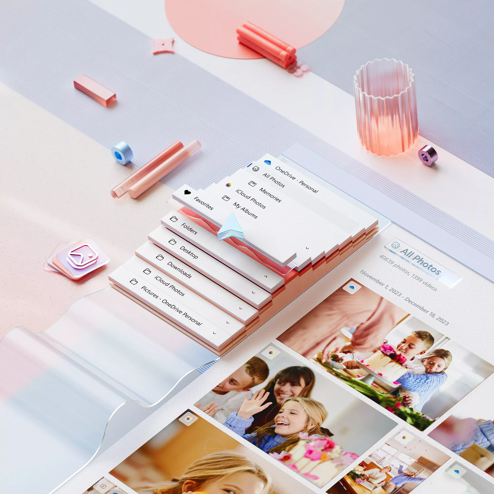
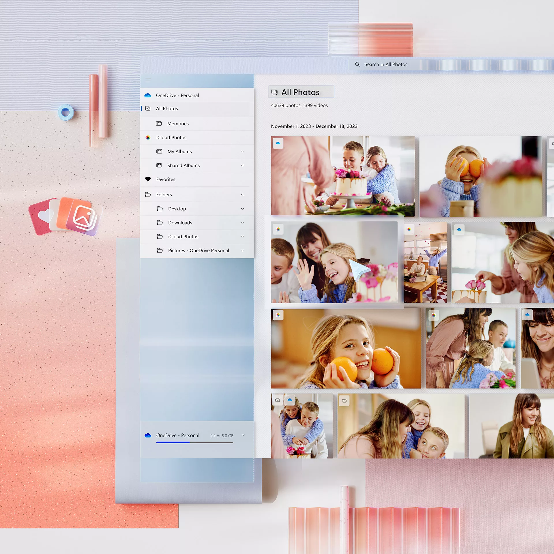
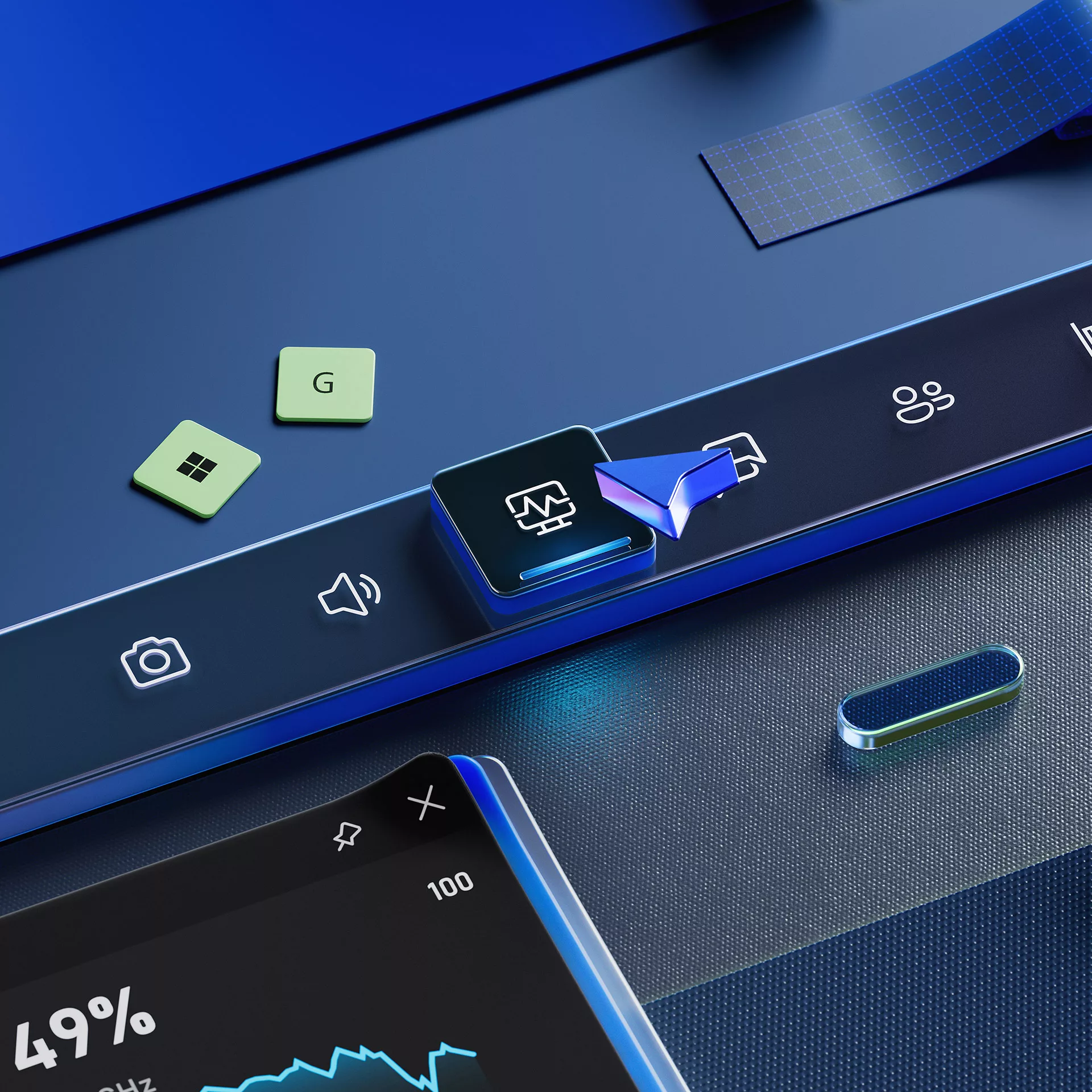
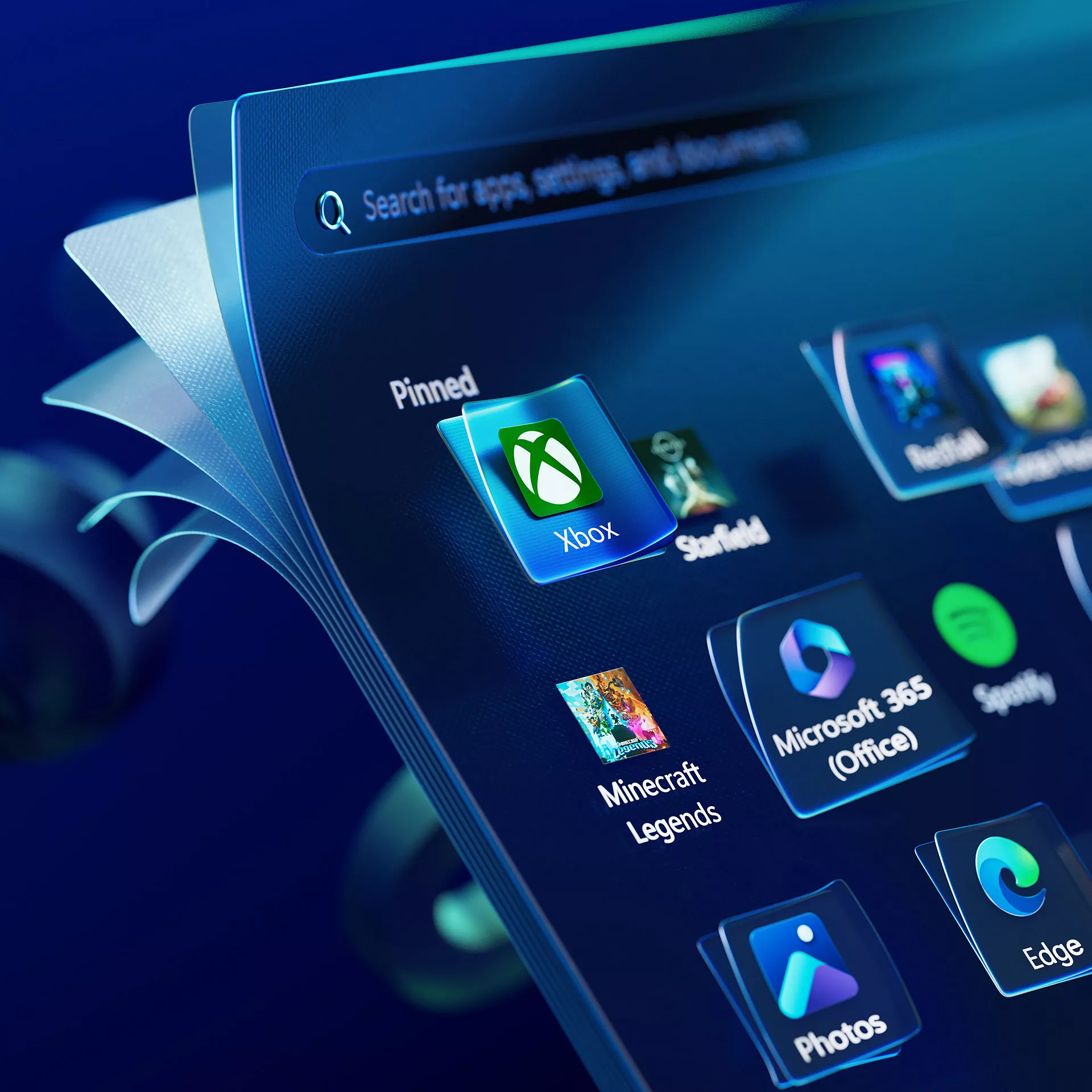
Windows 11 — Holidays 2024.
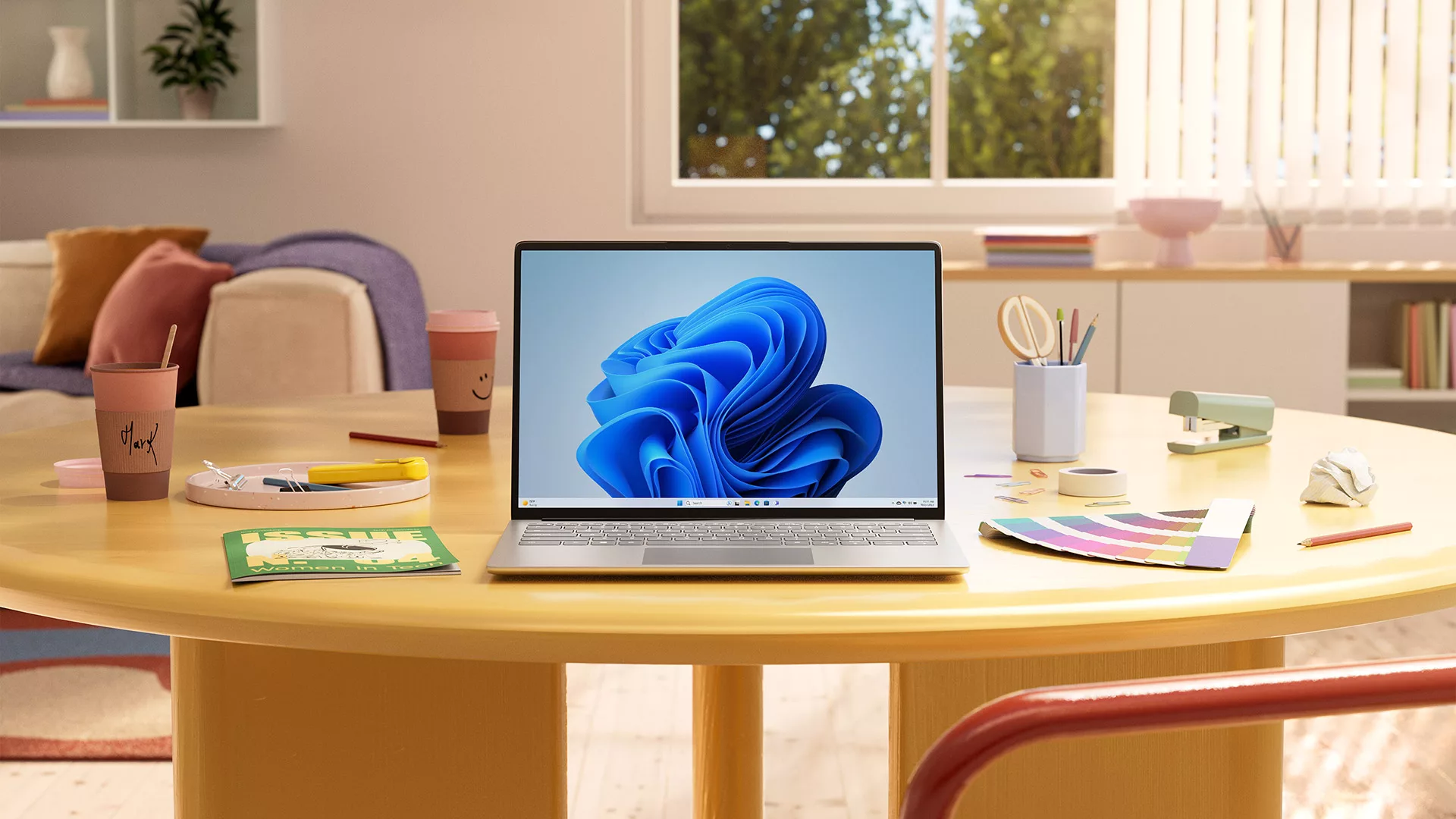
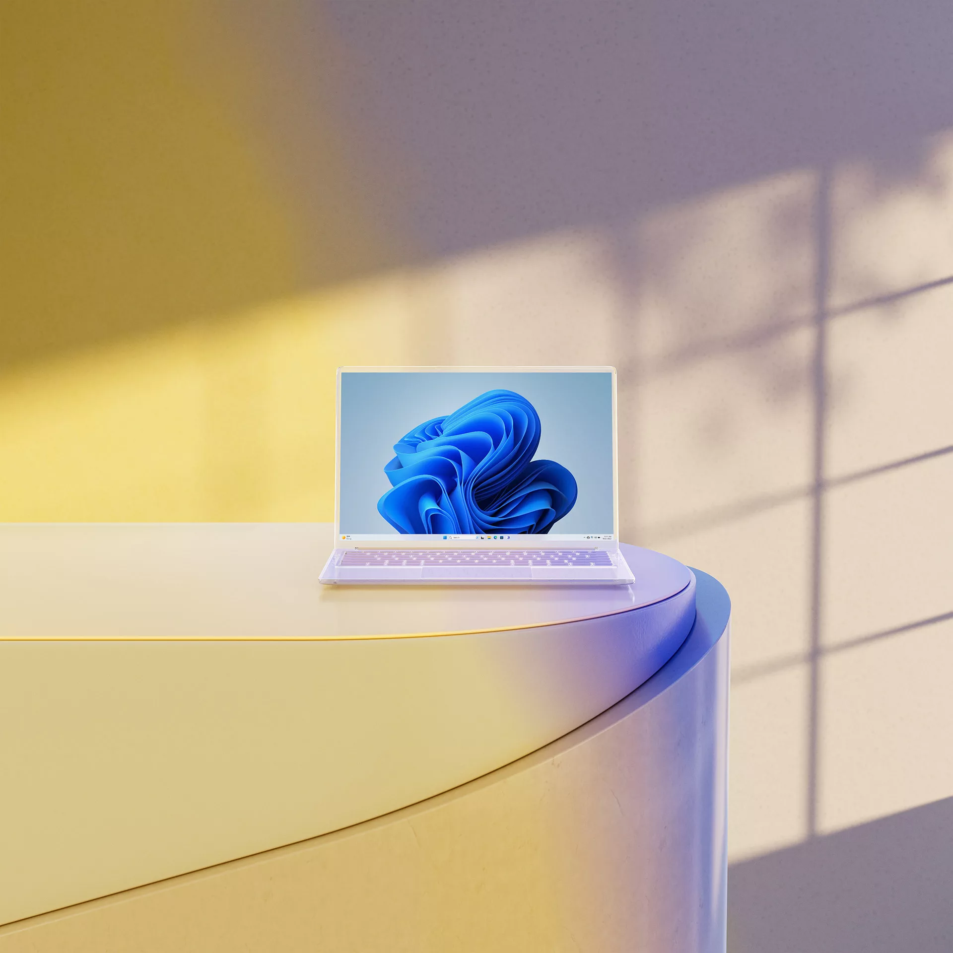
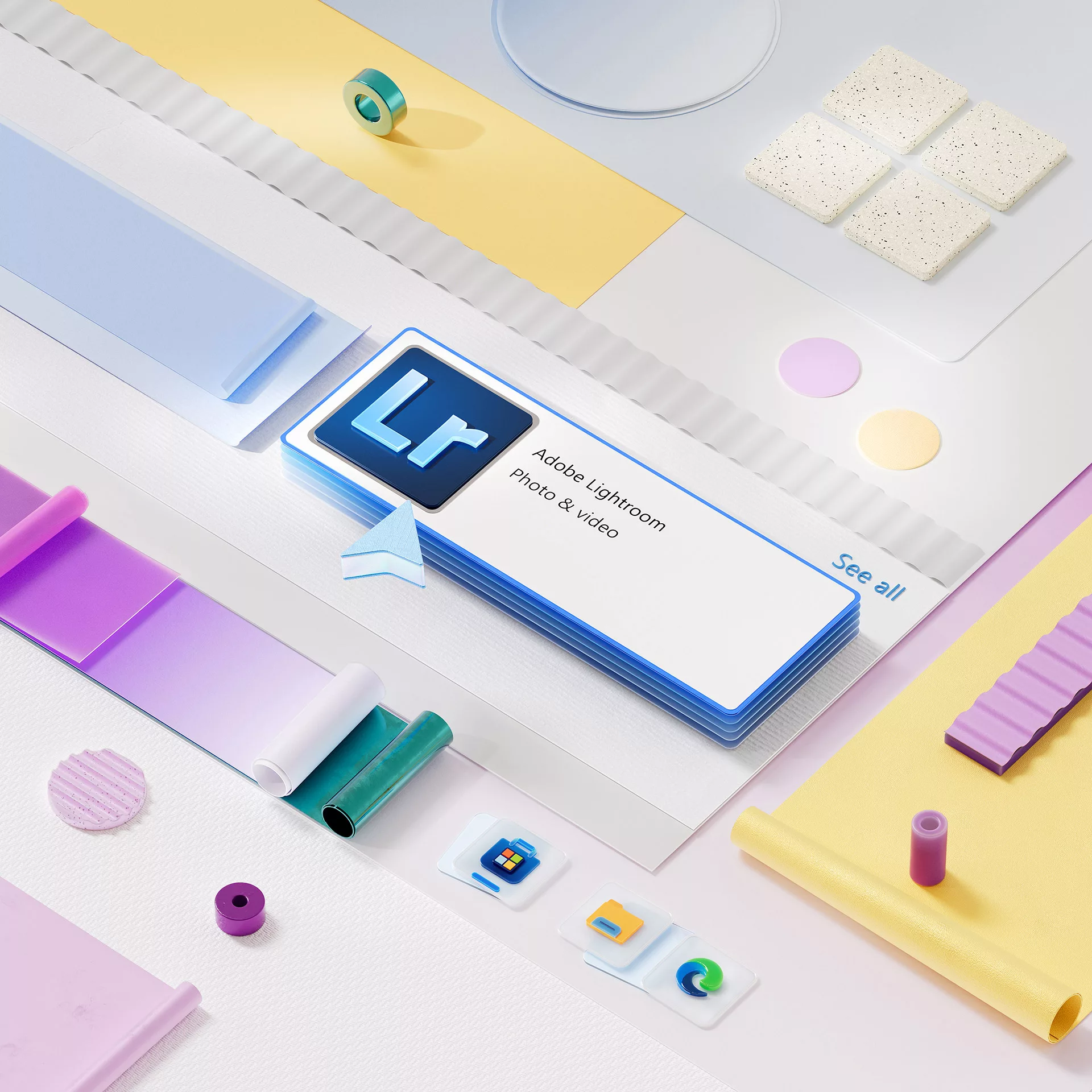
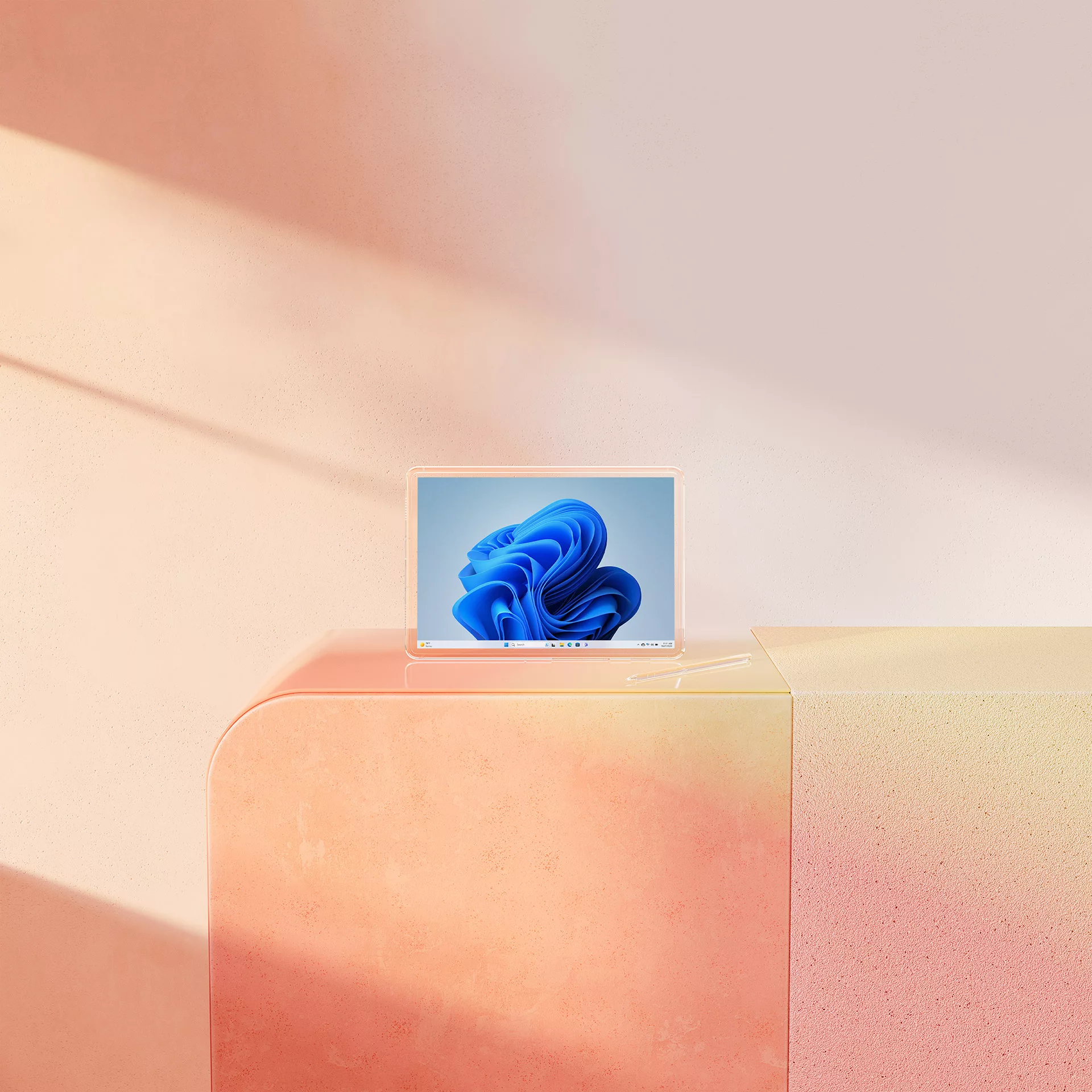
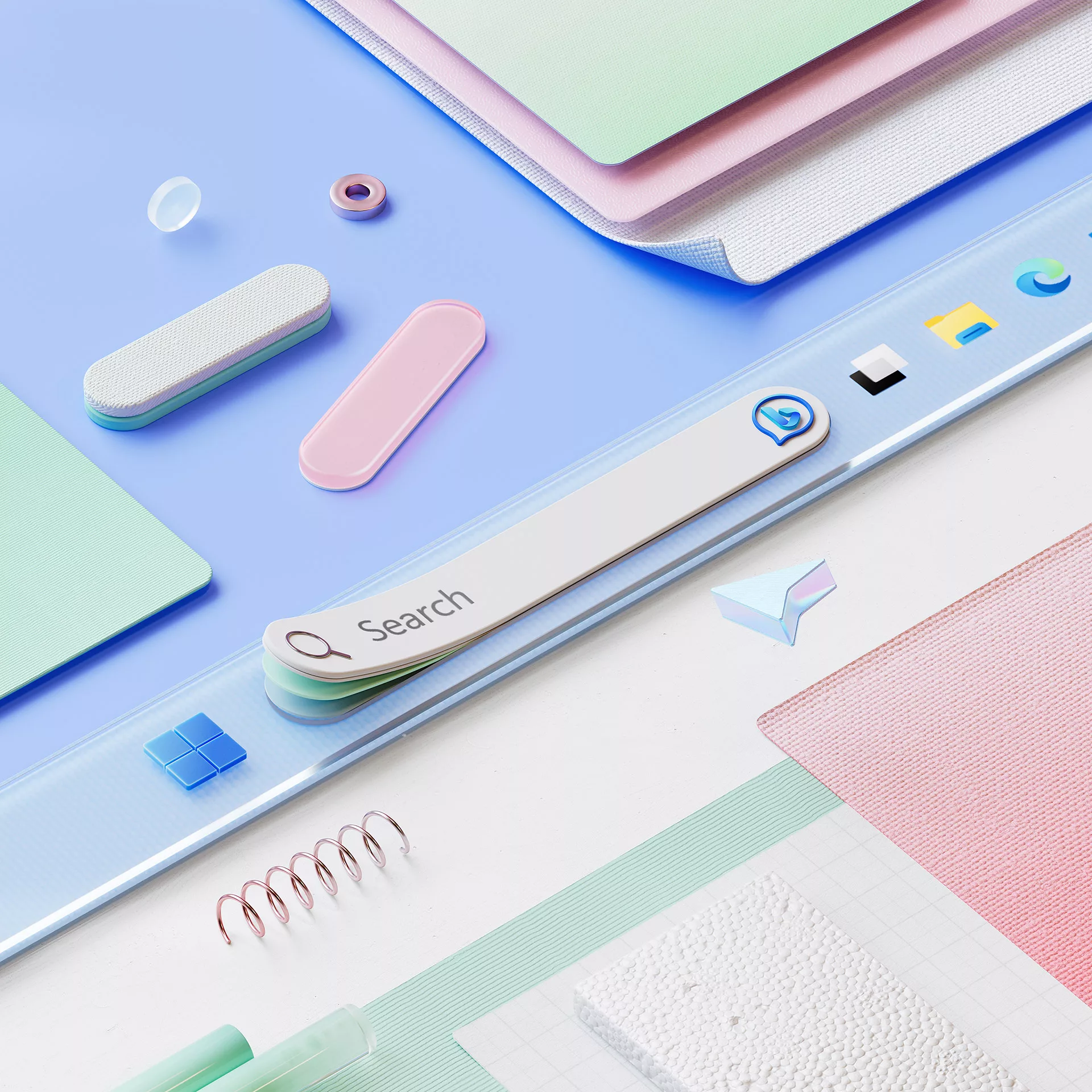
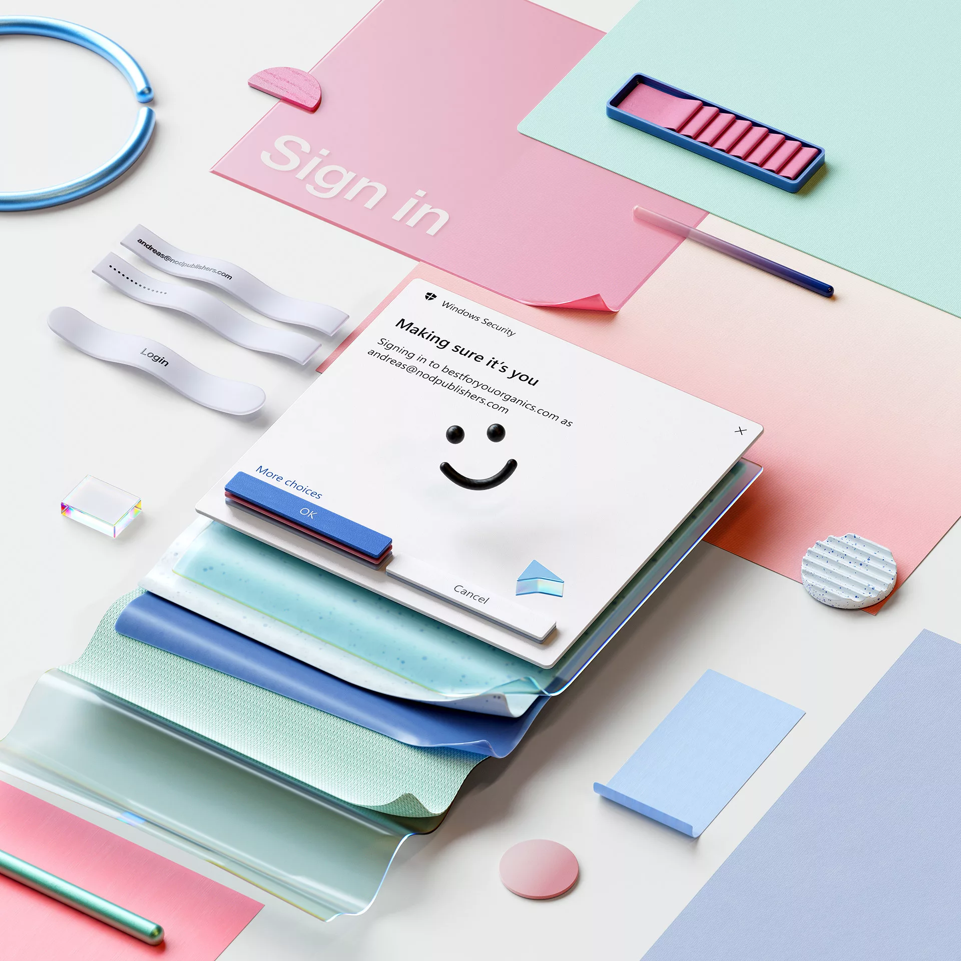
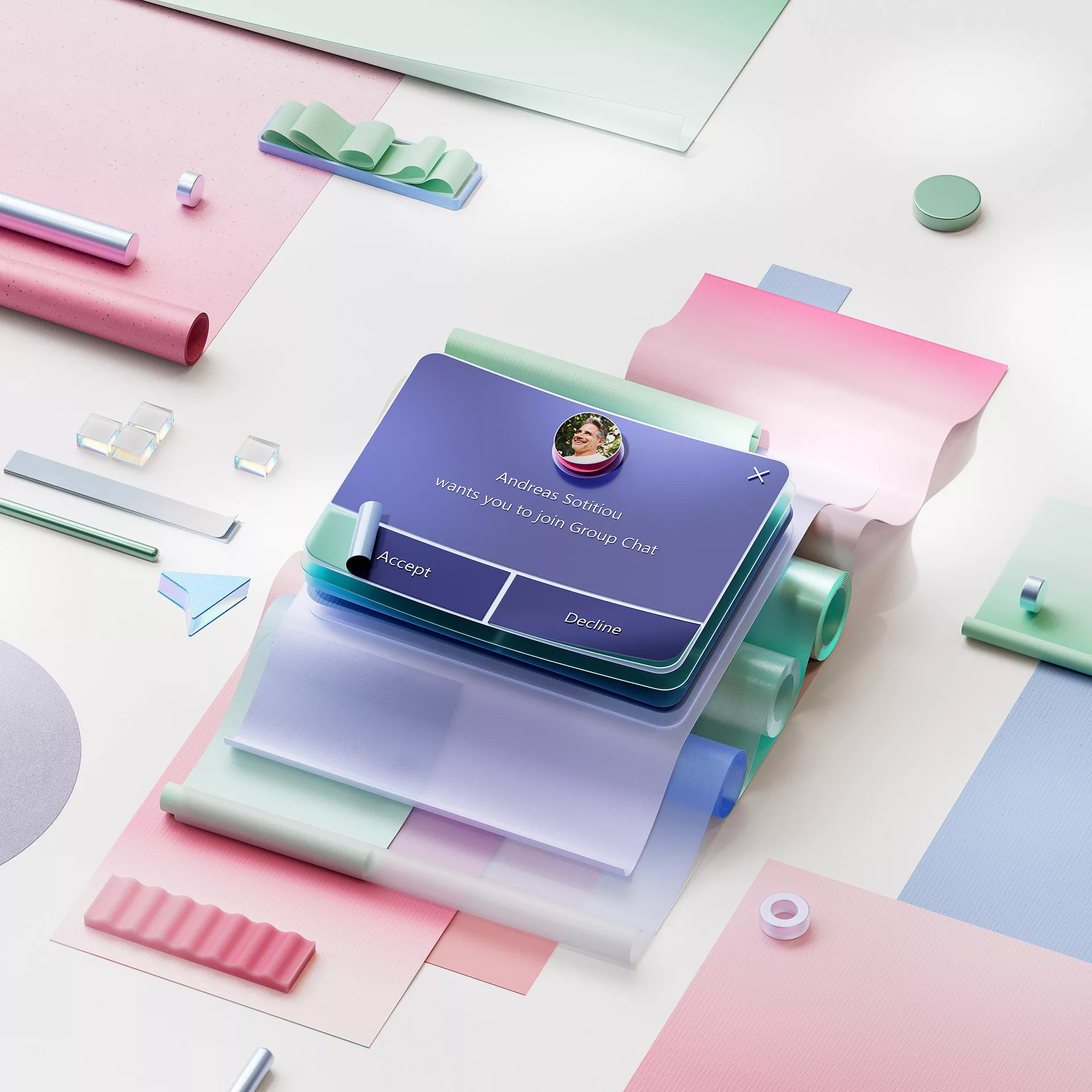
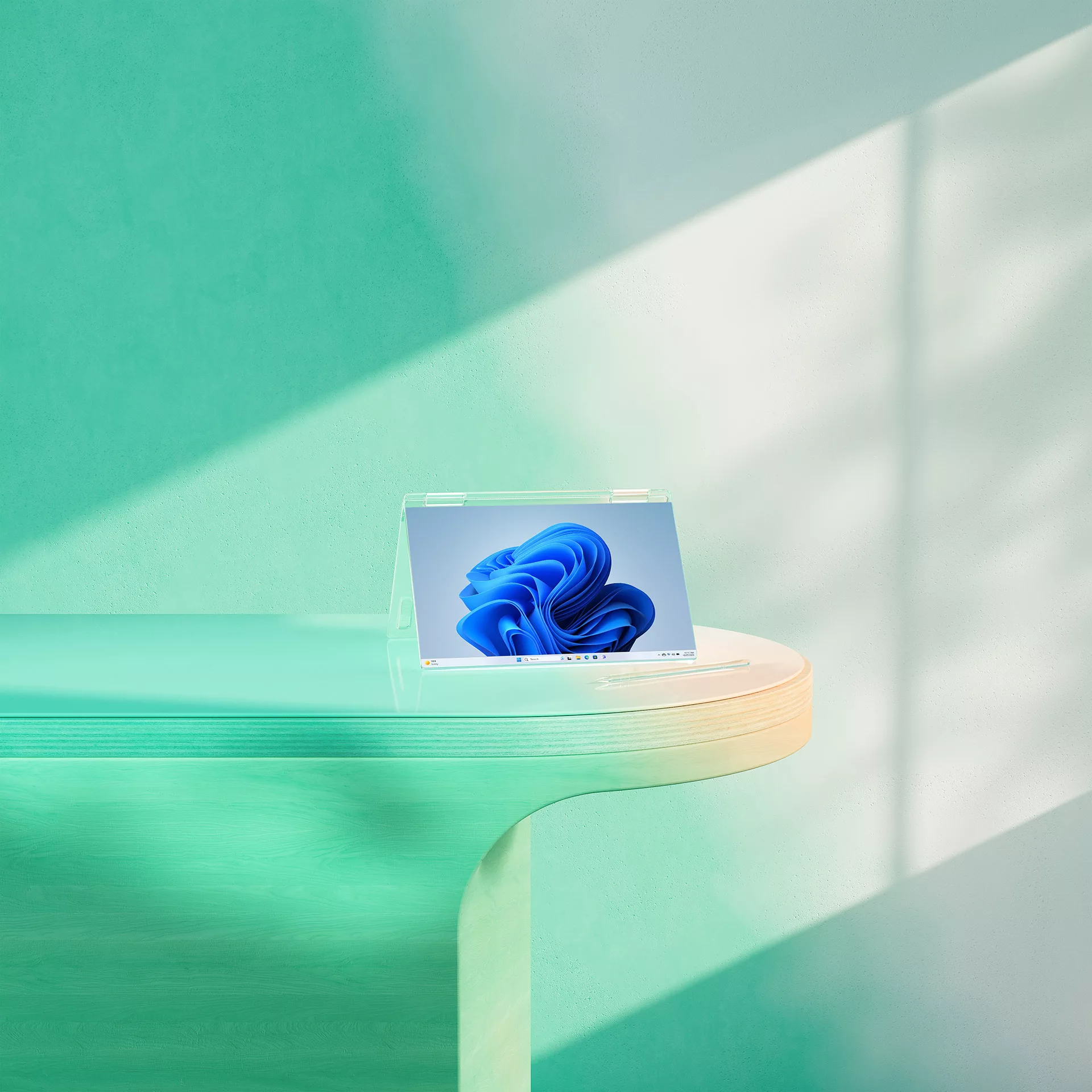
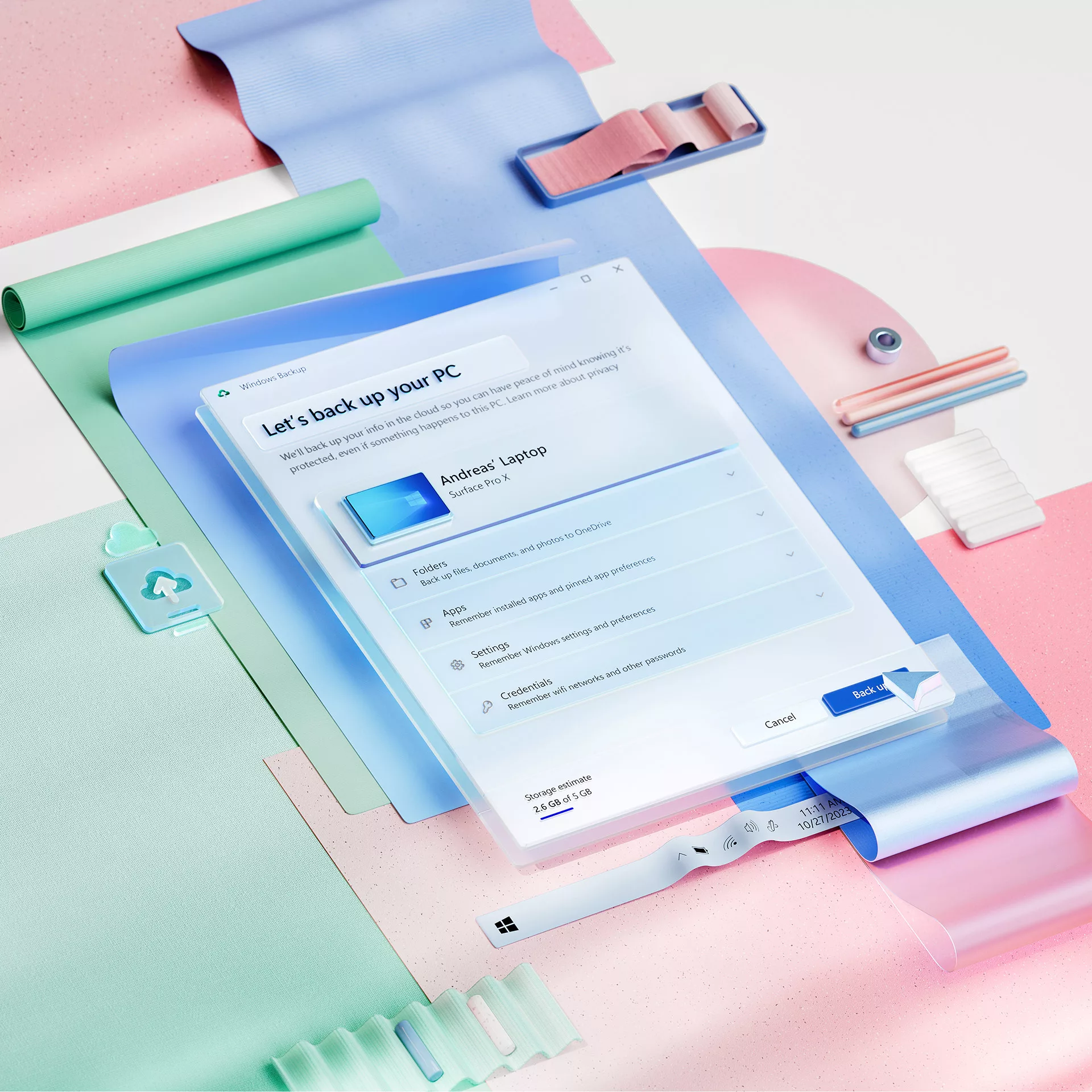
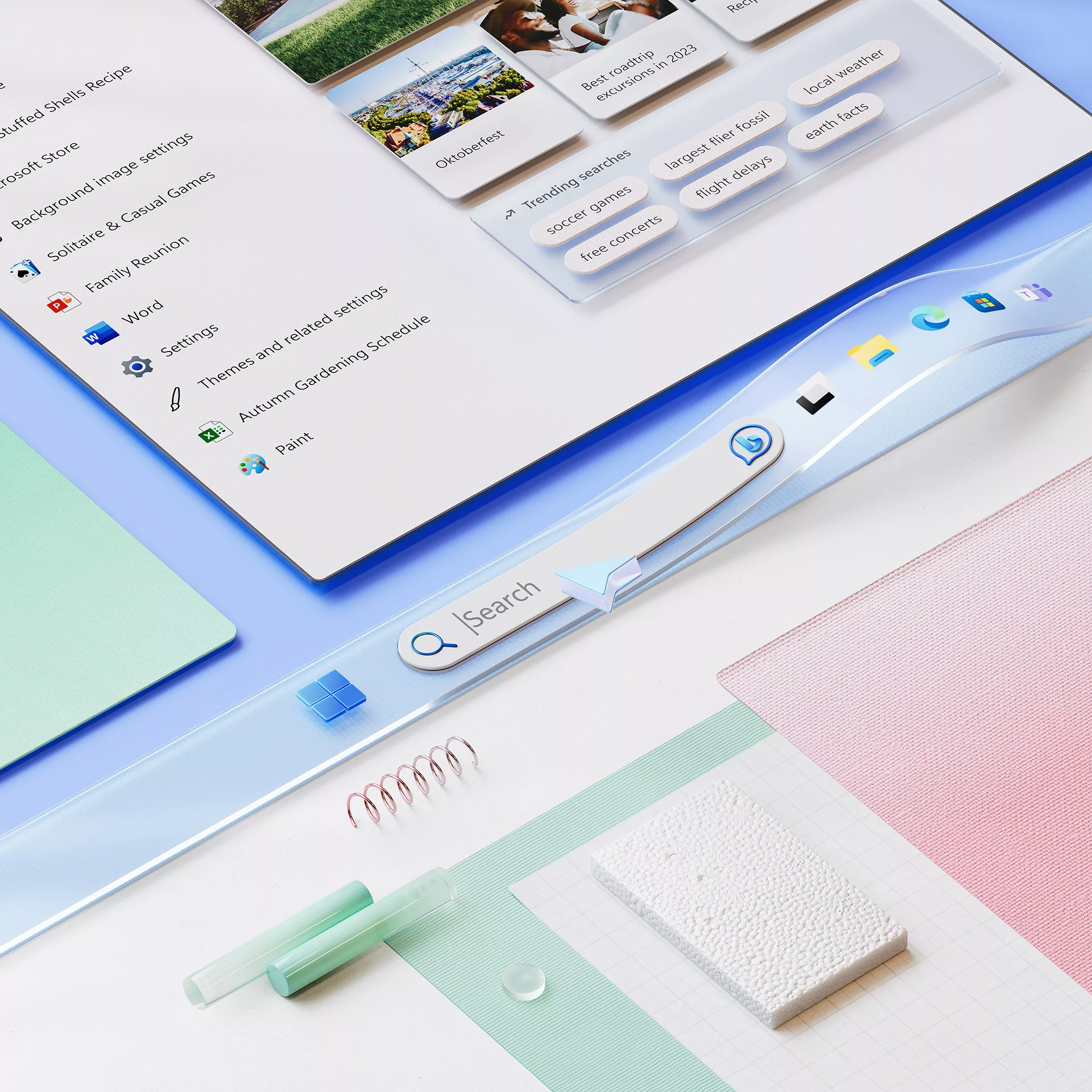
Microsoft approached us with an enticing proposition: to collaborate on expanding the Windows 11 campaign, understanding that the essence of their software resides in the hearts of the people who engage with it on a daily basis.
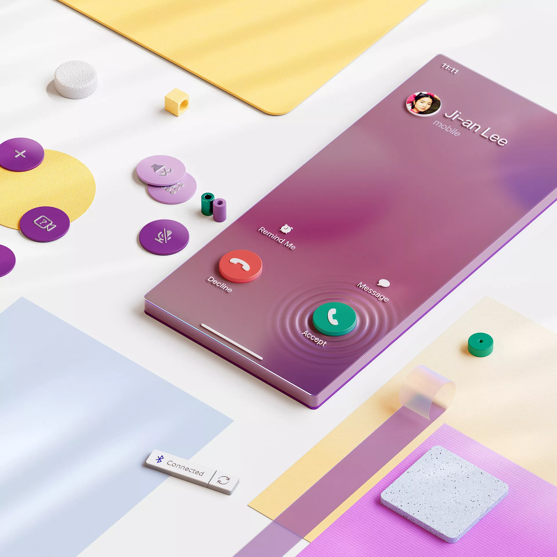
So we embarked on a comprehensive journey to create a resonant and engaging experience. The first step was to develop fictitious brands that could help represent different consumers, each embodying distinct lifestyles and needs. To bring these personas to life, we crafted then detailed scenarios that illustrated where these individuals live, work, and use Windows 11 in their daily routines.
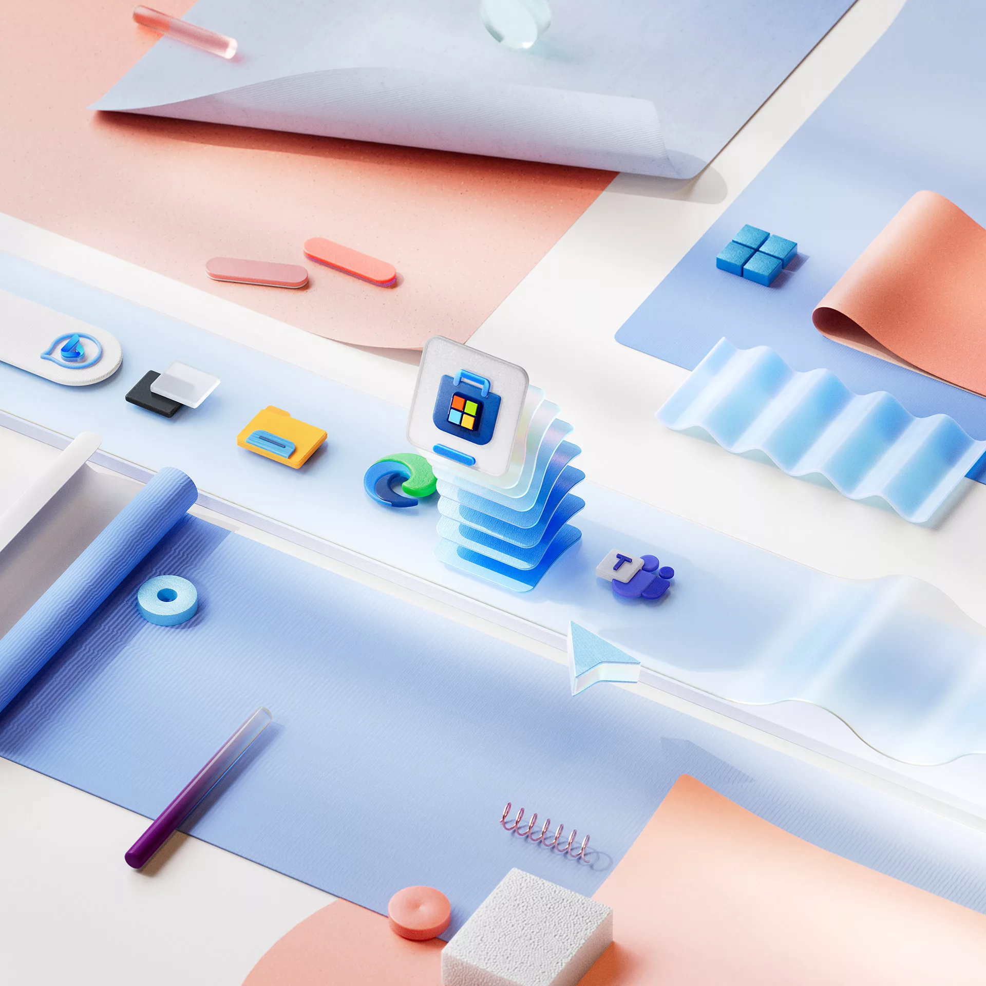
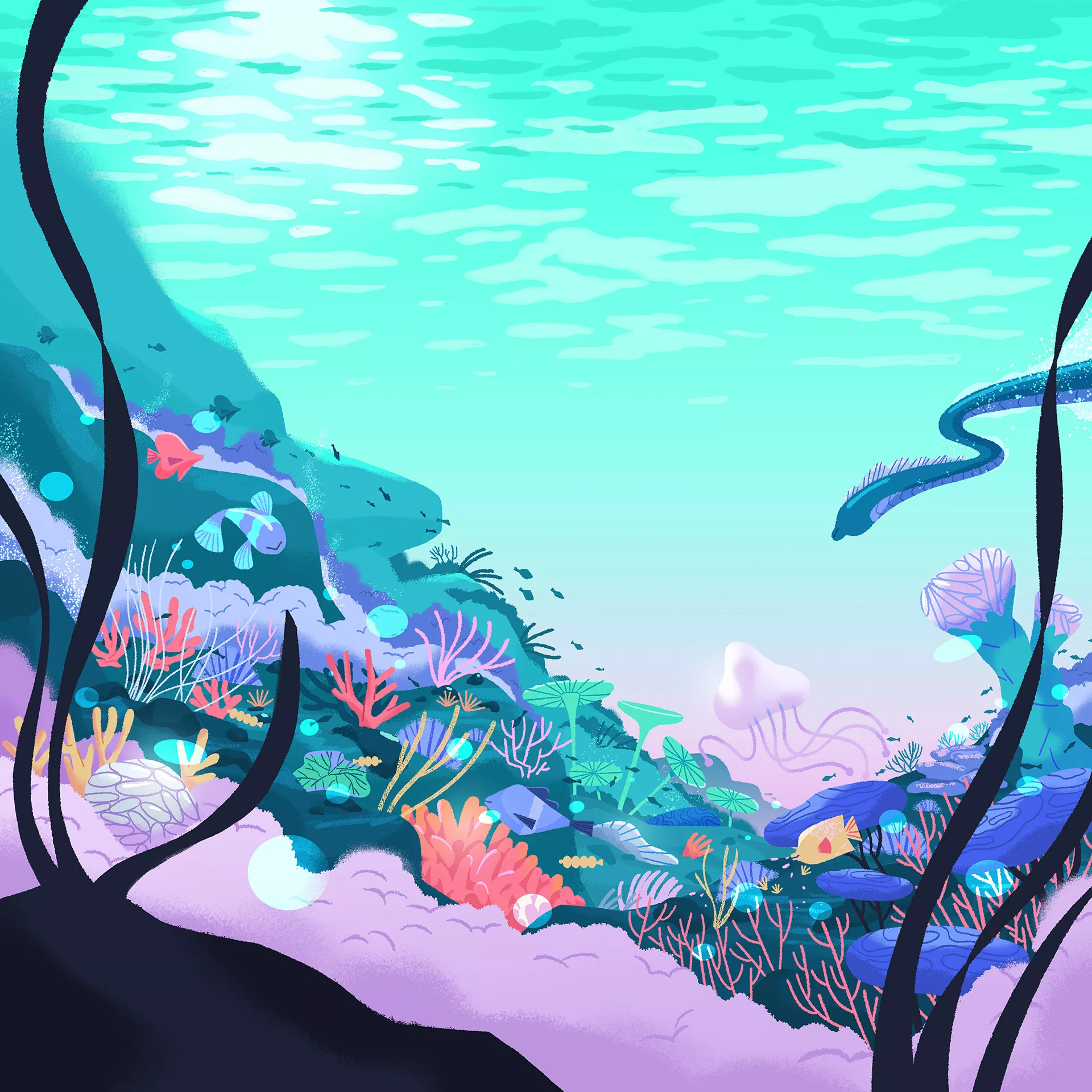
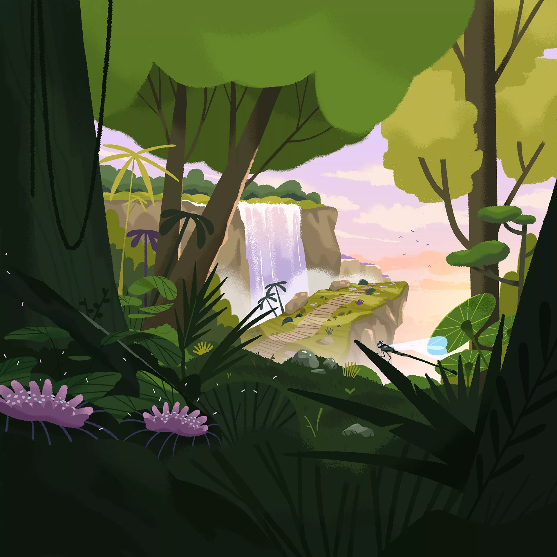
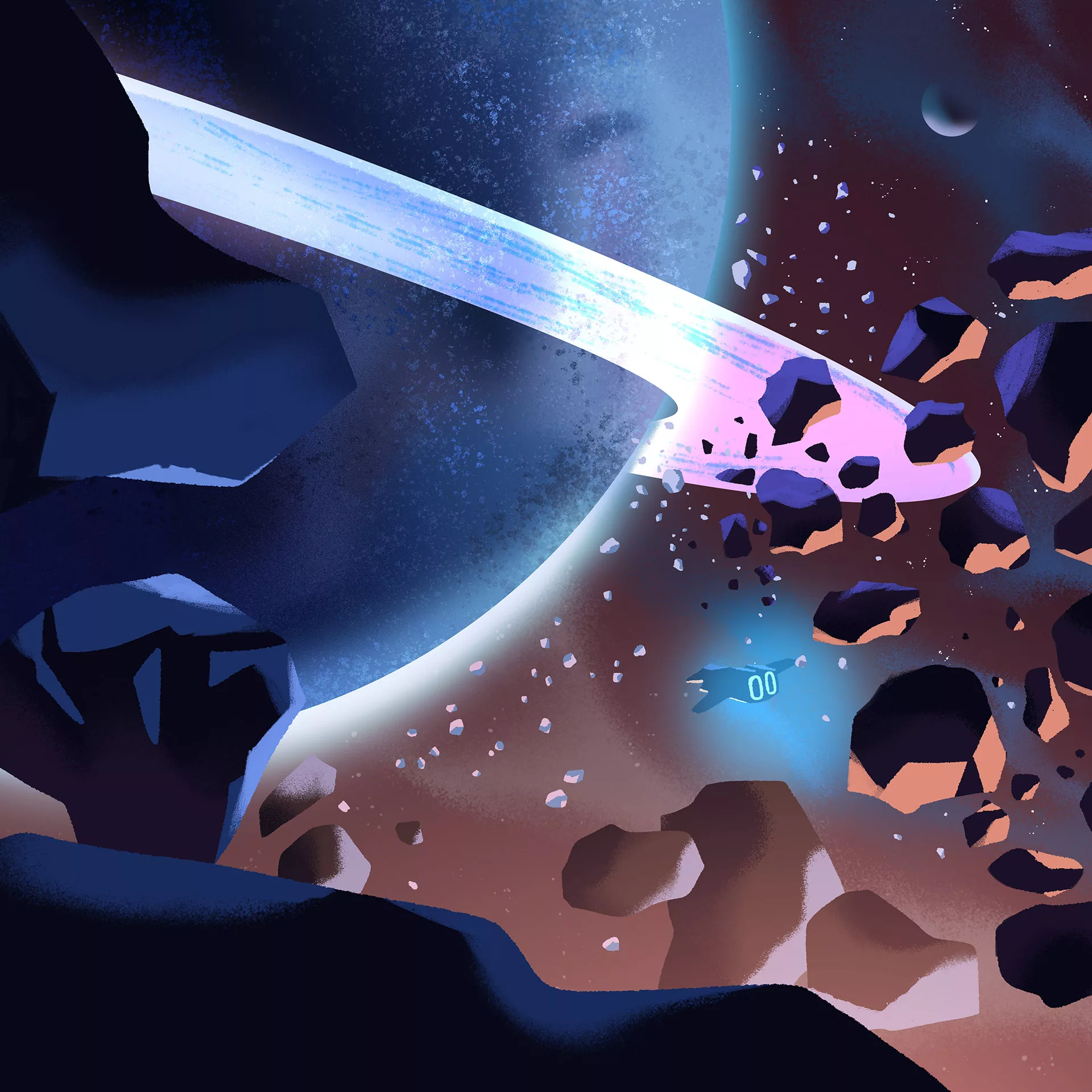
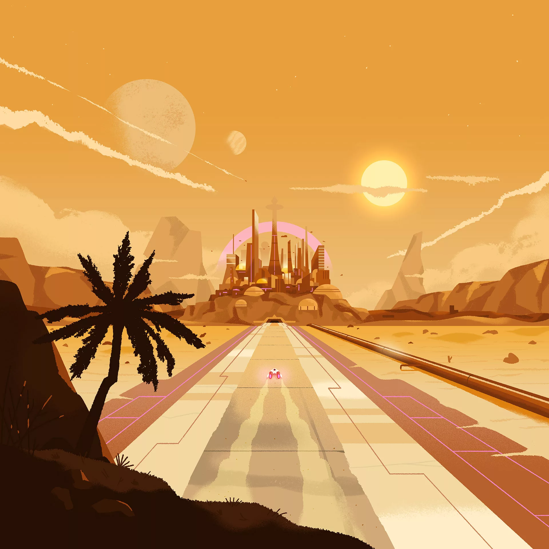
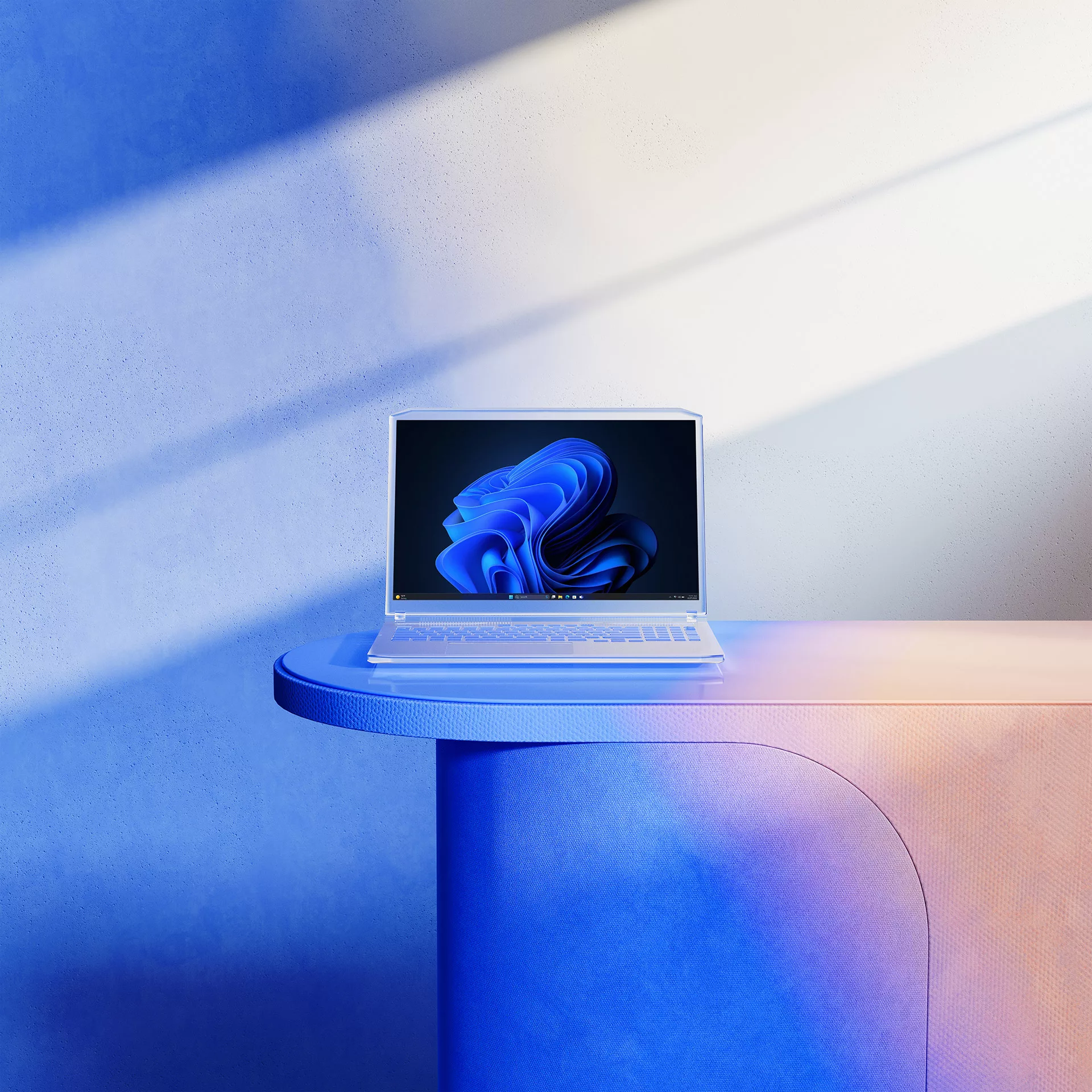
We envisioned these digital backgrounds not merely as backdrops but as extensions of users' daily environments, evoking a sense of familiarity and warmth, hence the concept of "live-in spaces." Additionally, we developed agnostic scenarios to depict evergreen situations, ensuring the campaign's relevance and adaptability across various contexts.
The result was a large-scale, multifaceted campaign that established a warm and close connection with the audience. By showcasing relatable and authentic representations of diverse user experiences, we achieved a compelling and inclusive narrative that resonated deeply with our target audience.
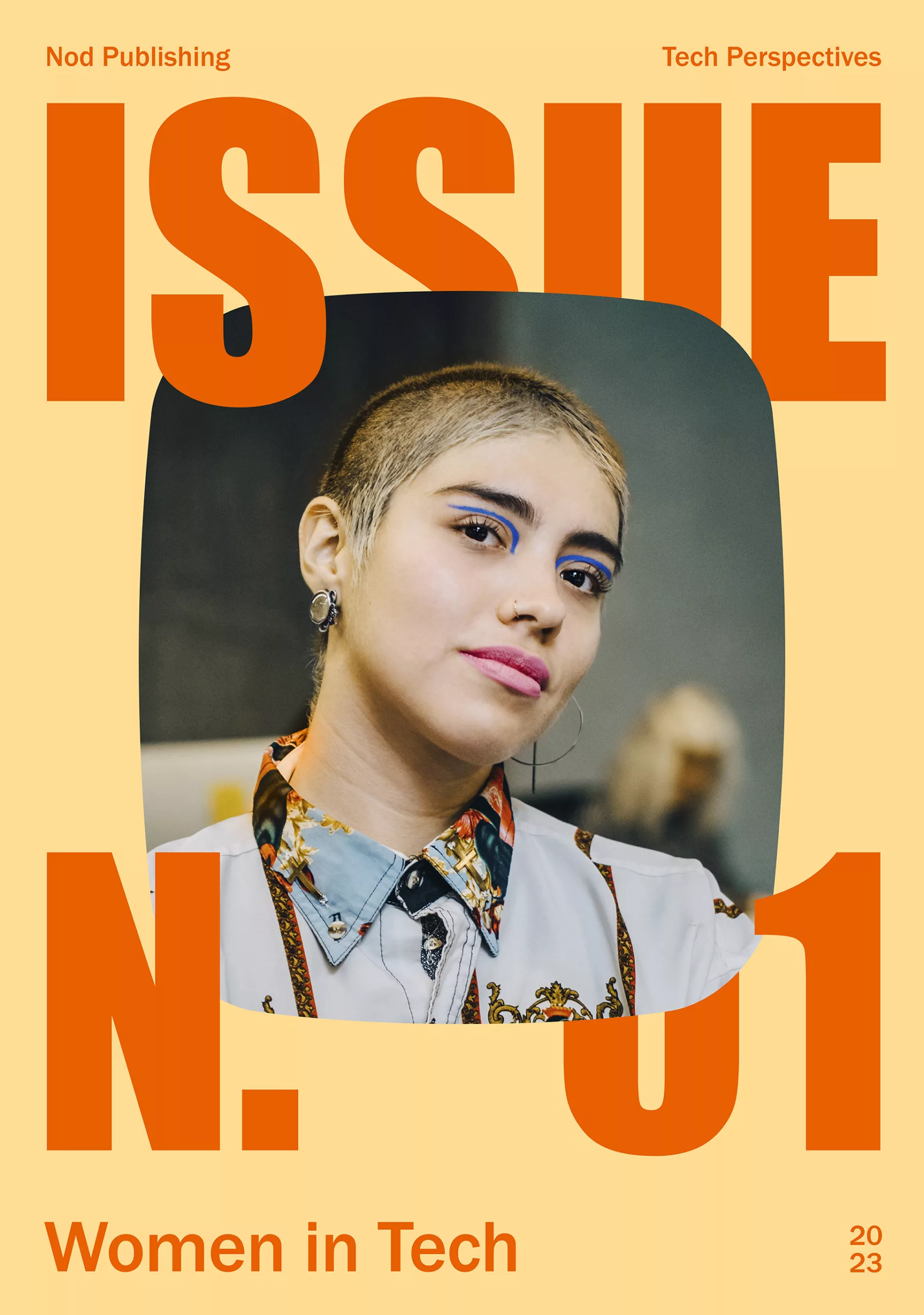
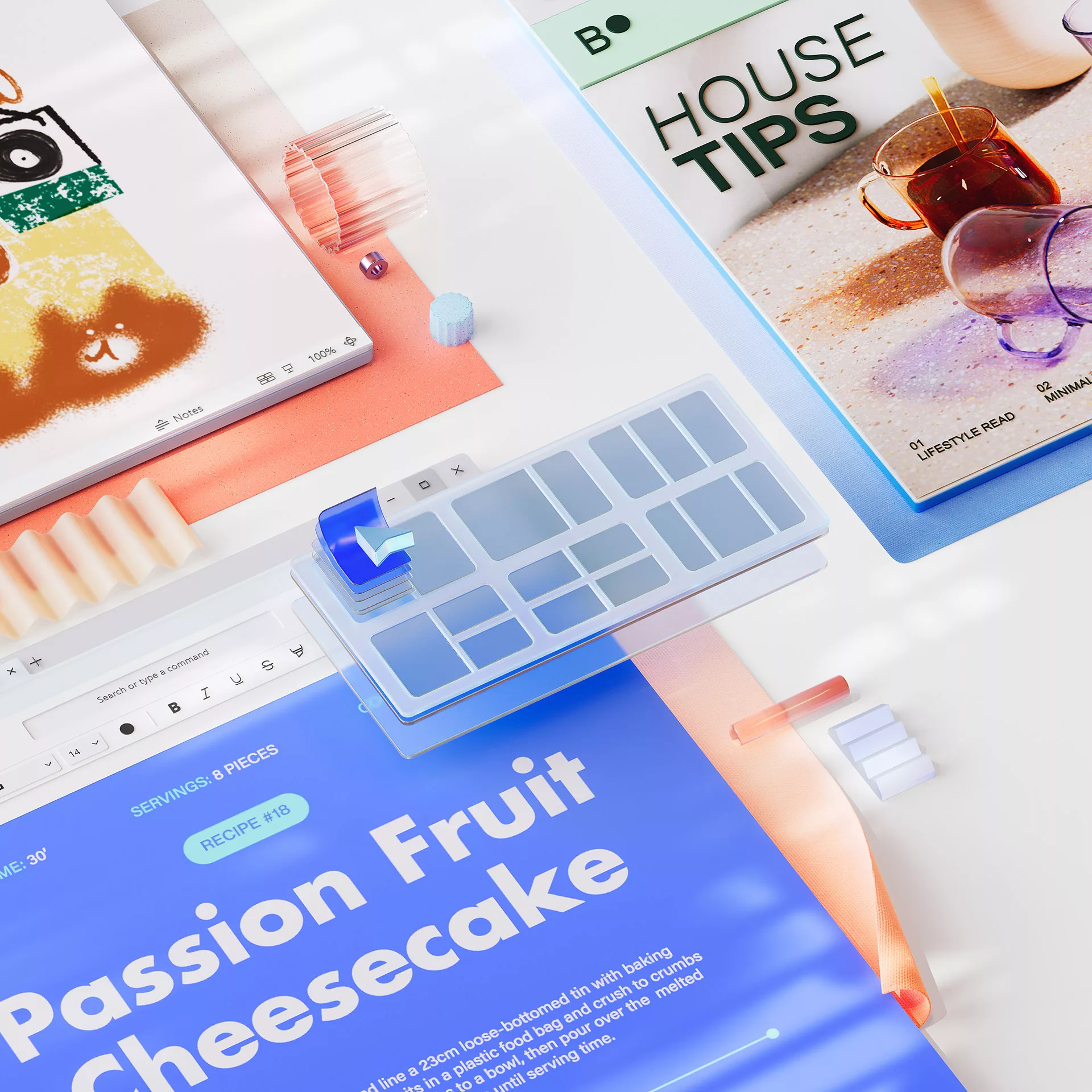
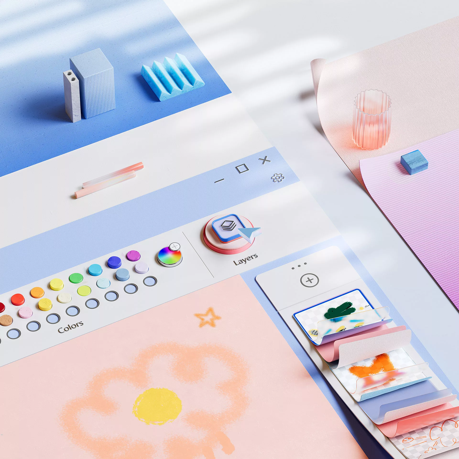
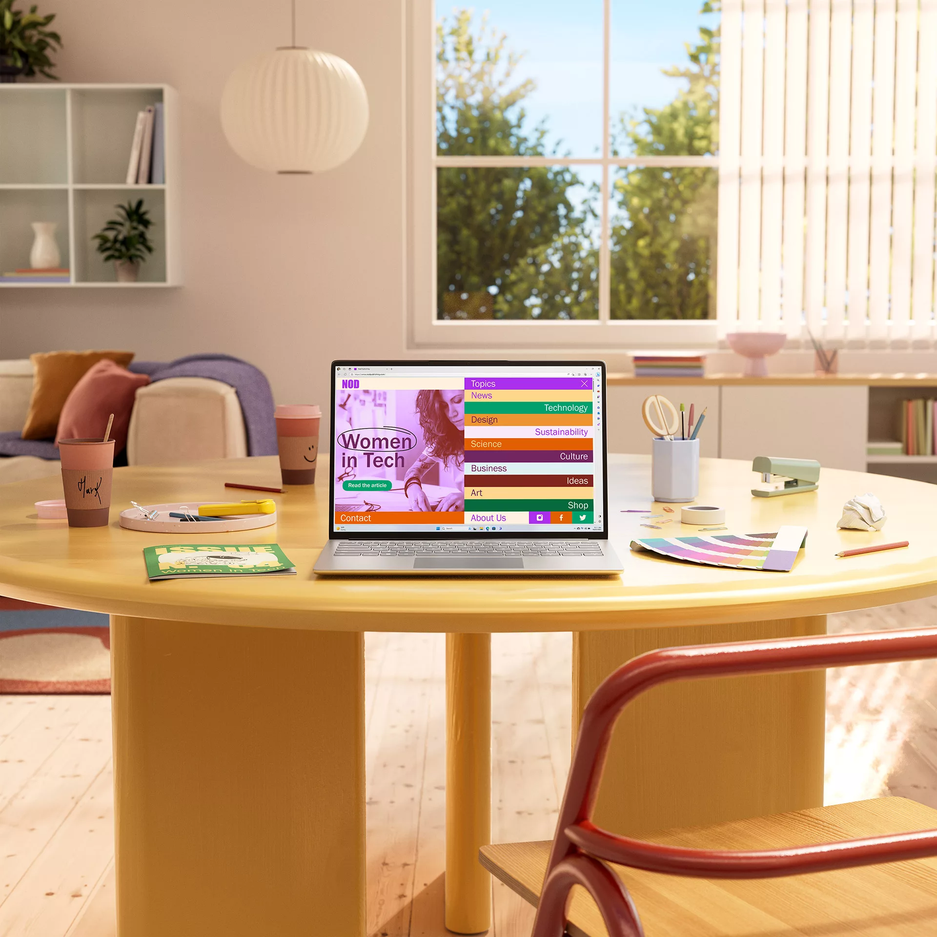
NOD Mag - Prosumer
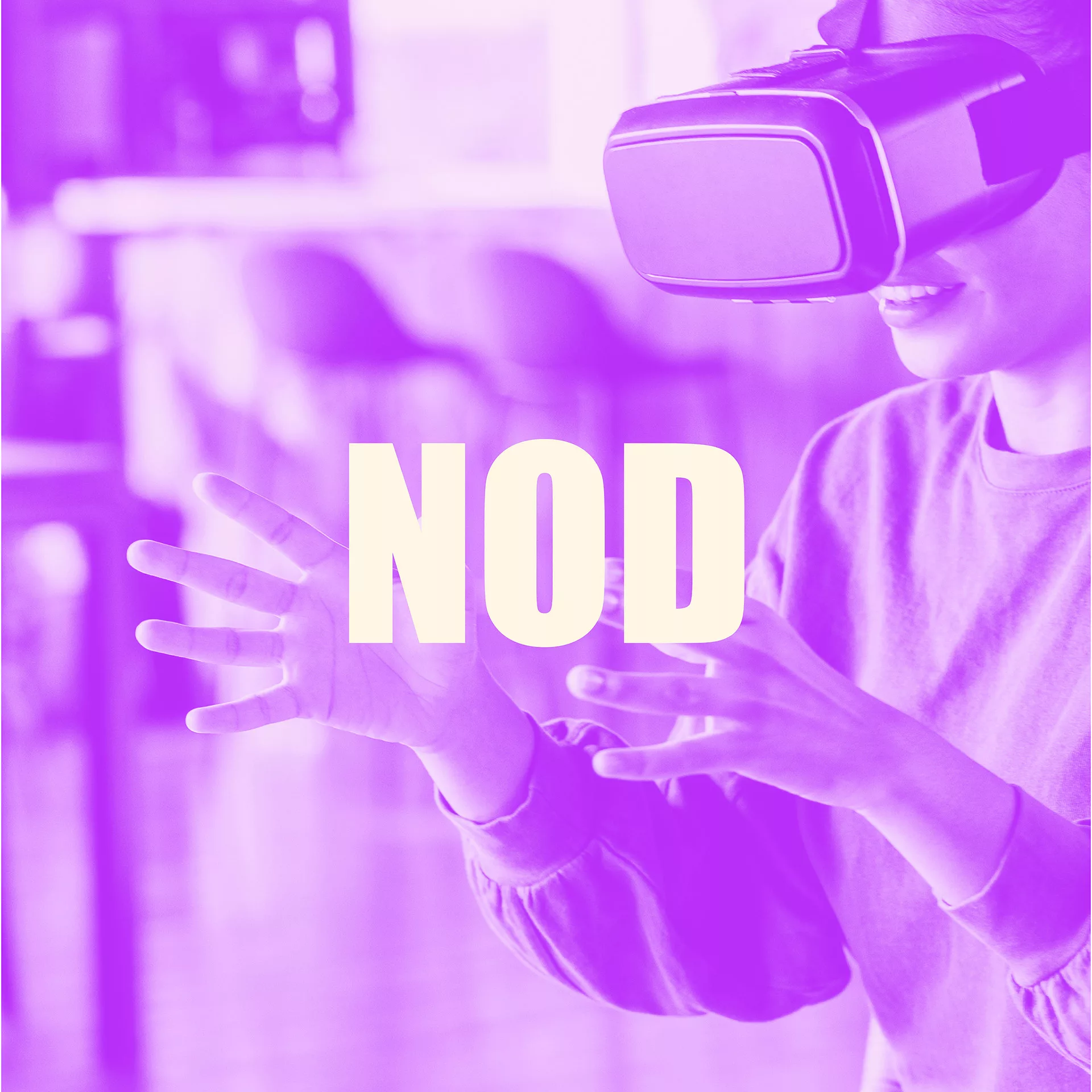
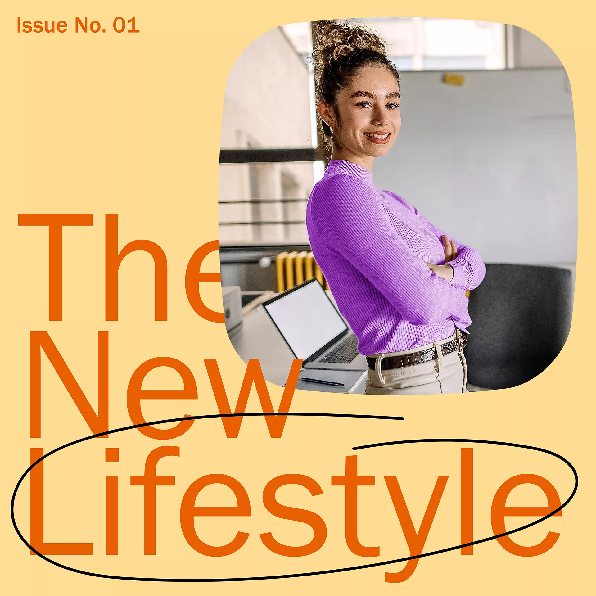
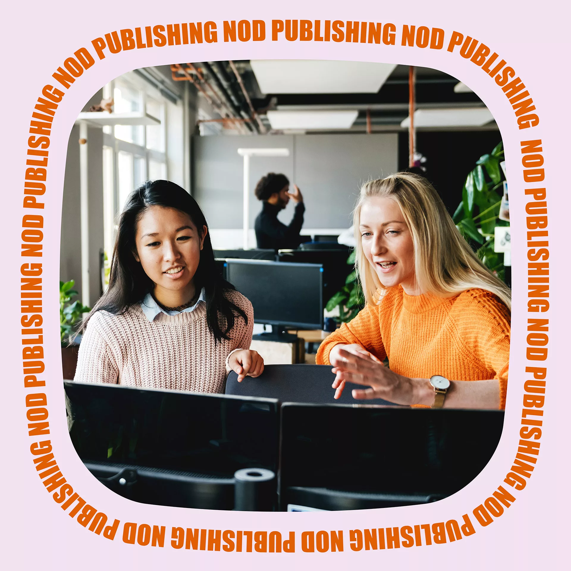
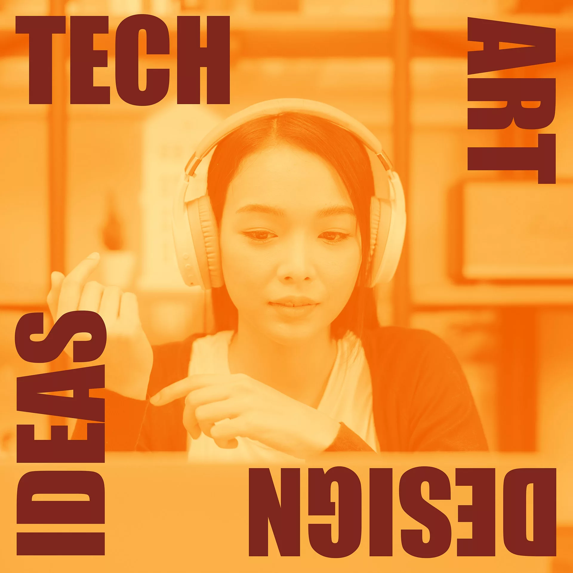
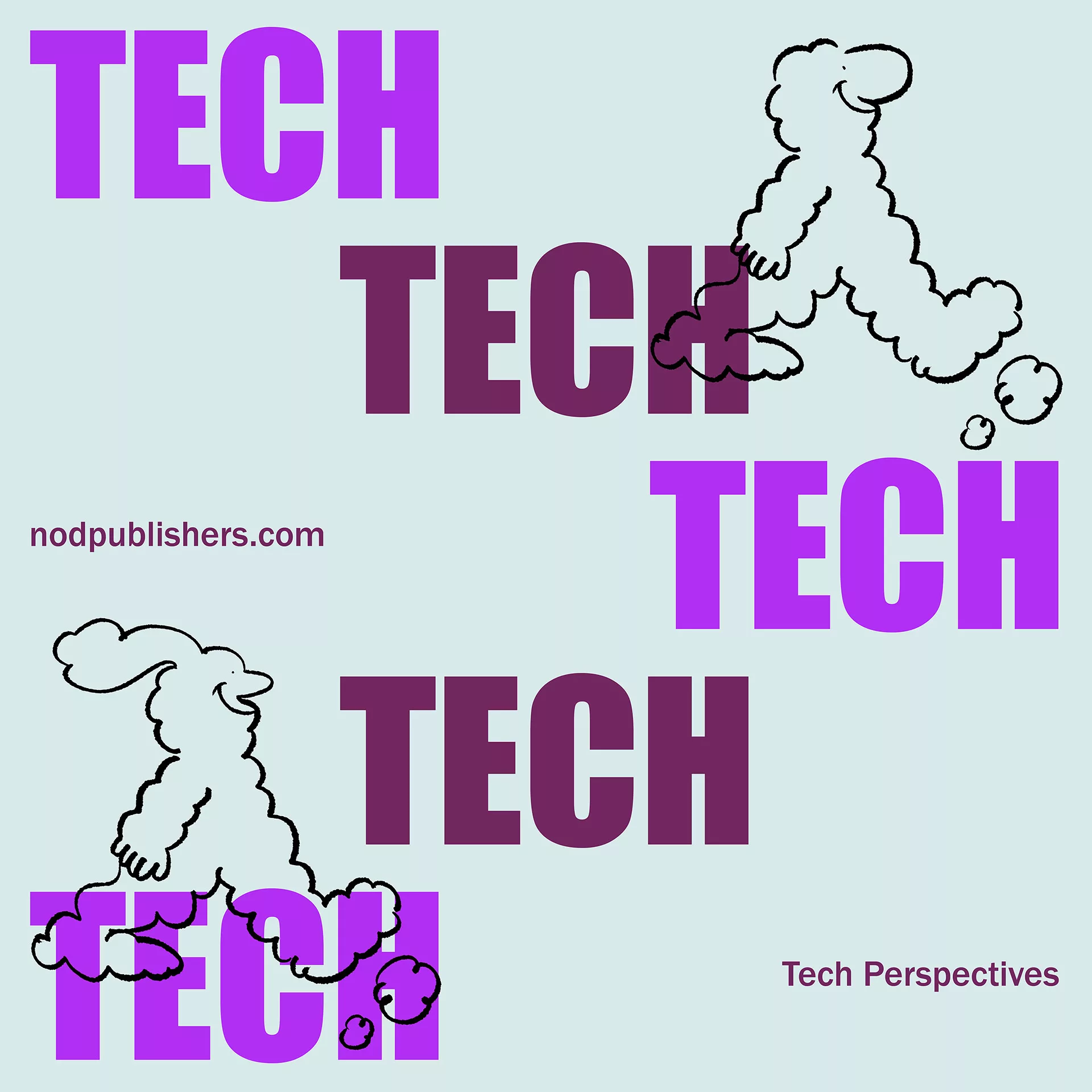
For our first user, Prosumer, we develop NOD, a magazine that unites designers, entrepreneurs, and change makers driven by a shared commitment to shaping a brighter future through their work.
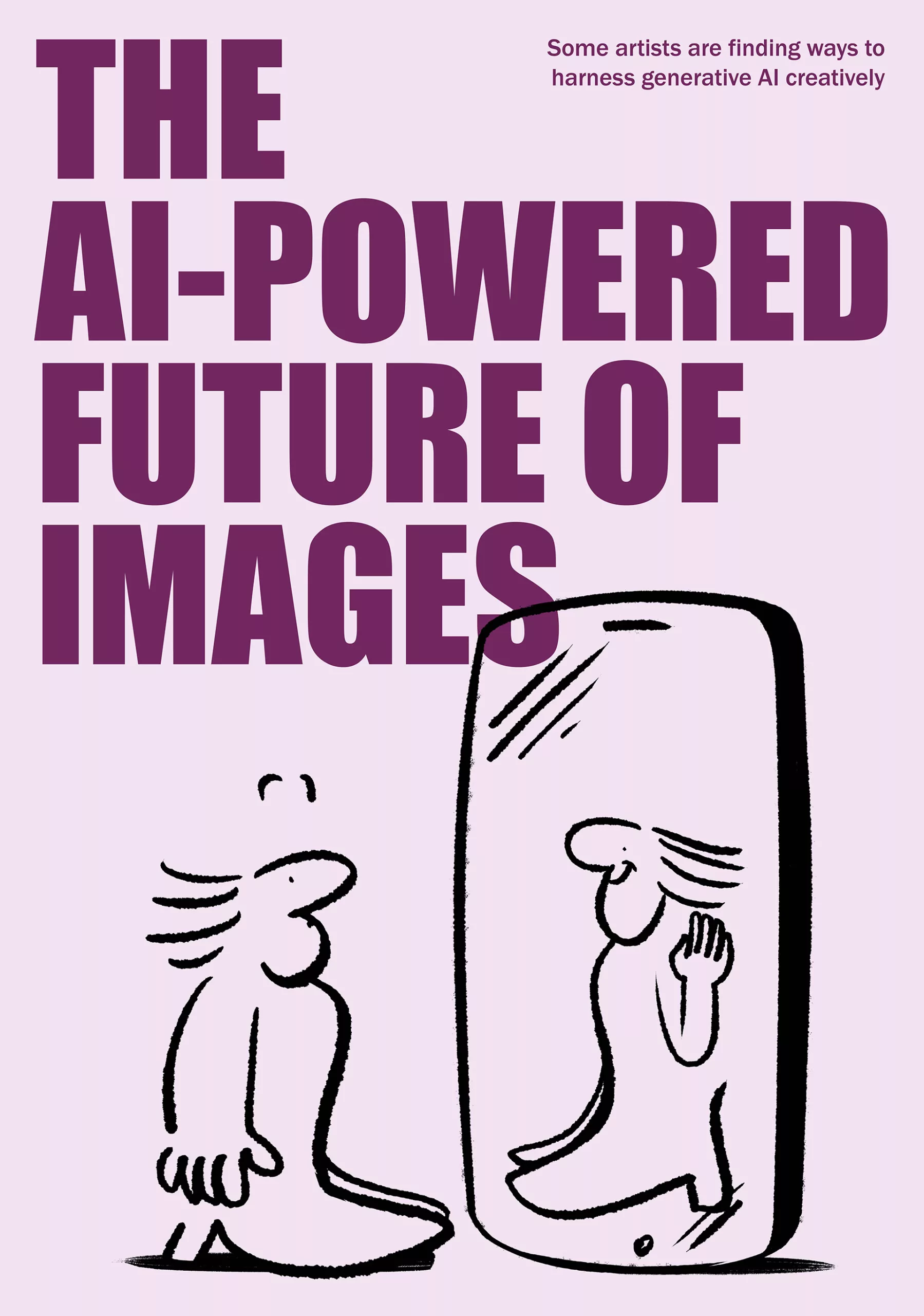
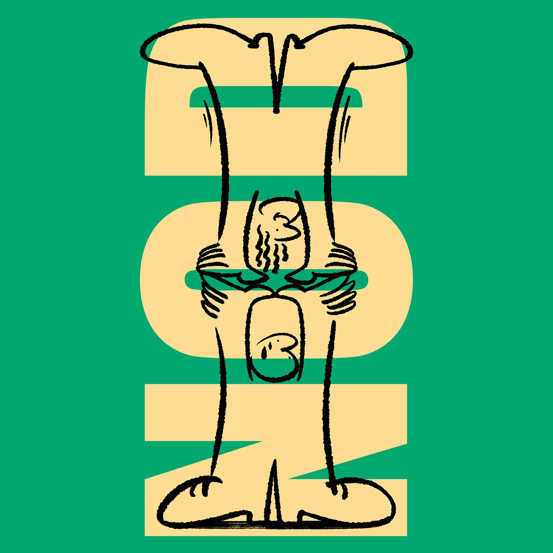
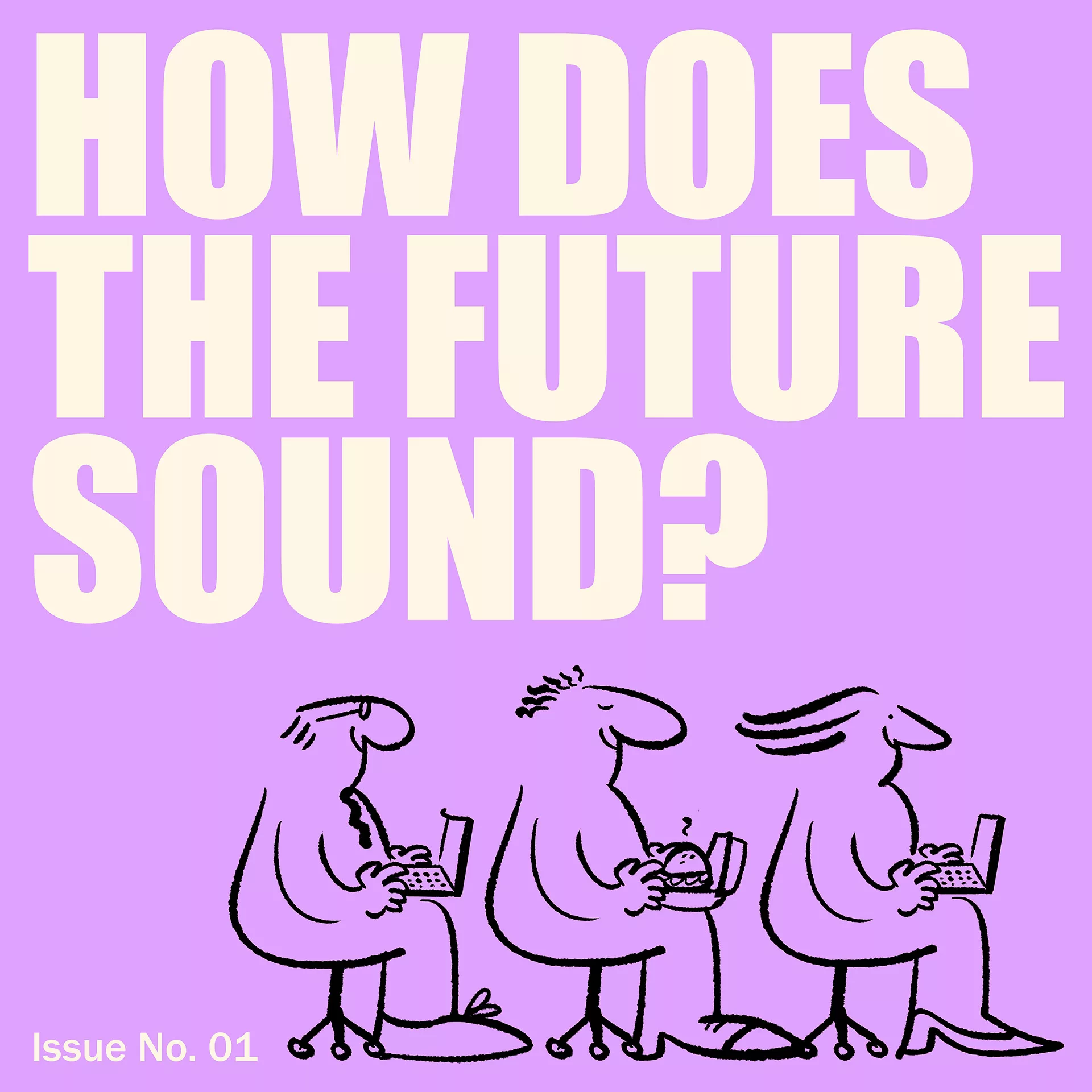
Our focus is on crafting a bold brand identity tailored to resonate with Gen Z and millennials, inspiring them to channel their creativity into designs that marry aesthetics with sustainability, ethics, and impact. This journey embodies the core values of collaboration, sustainability, connection, and inclusion.
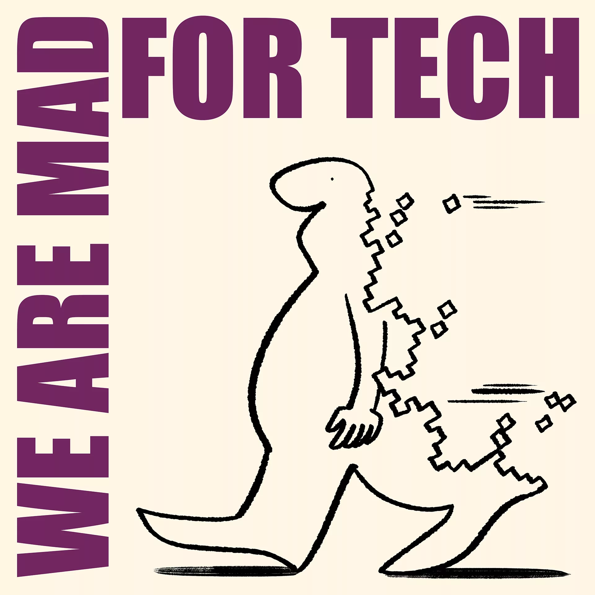
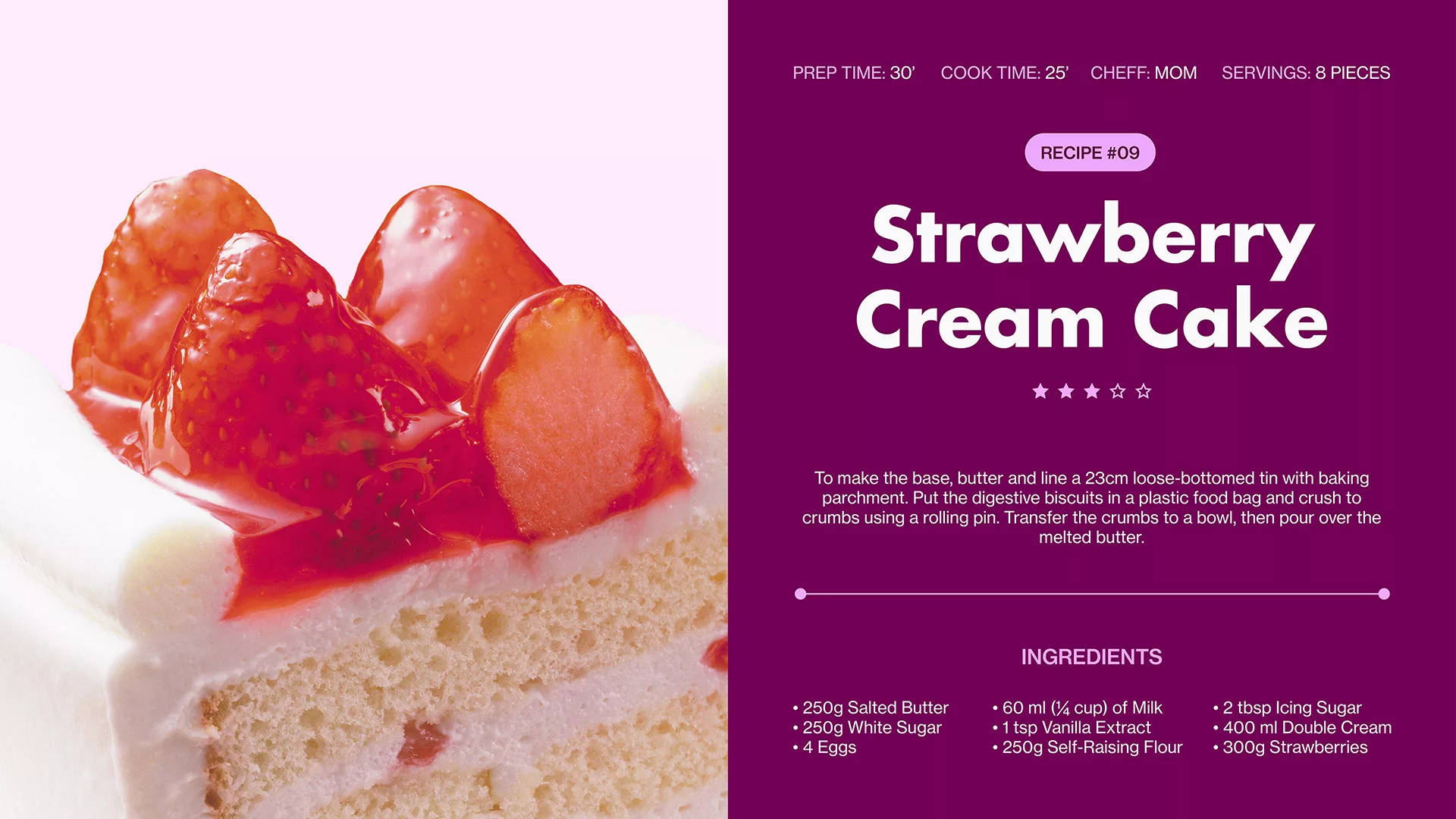
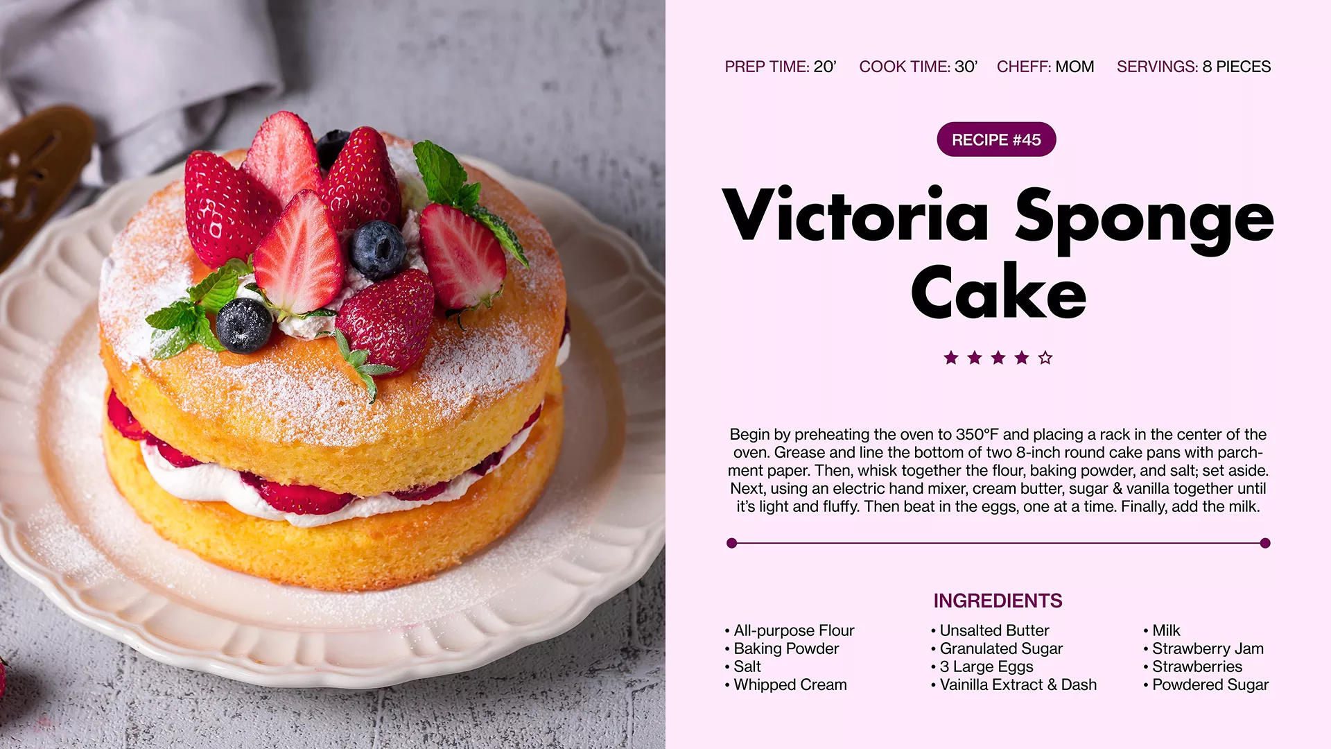
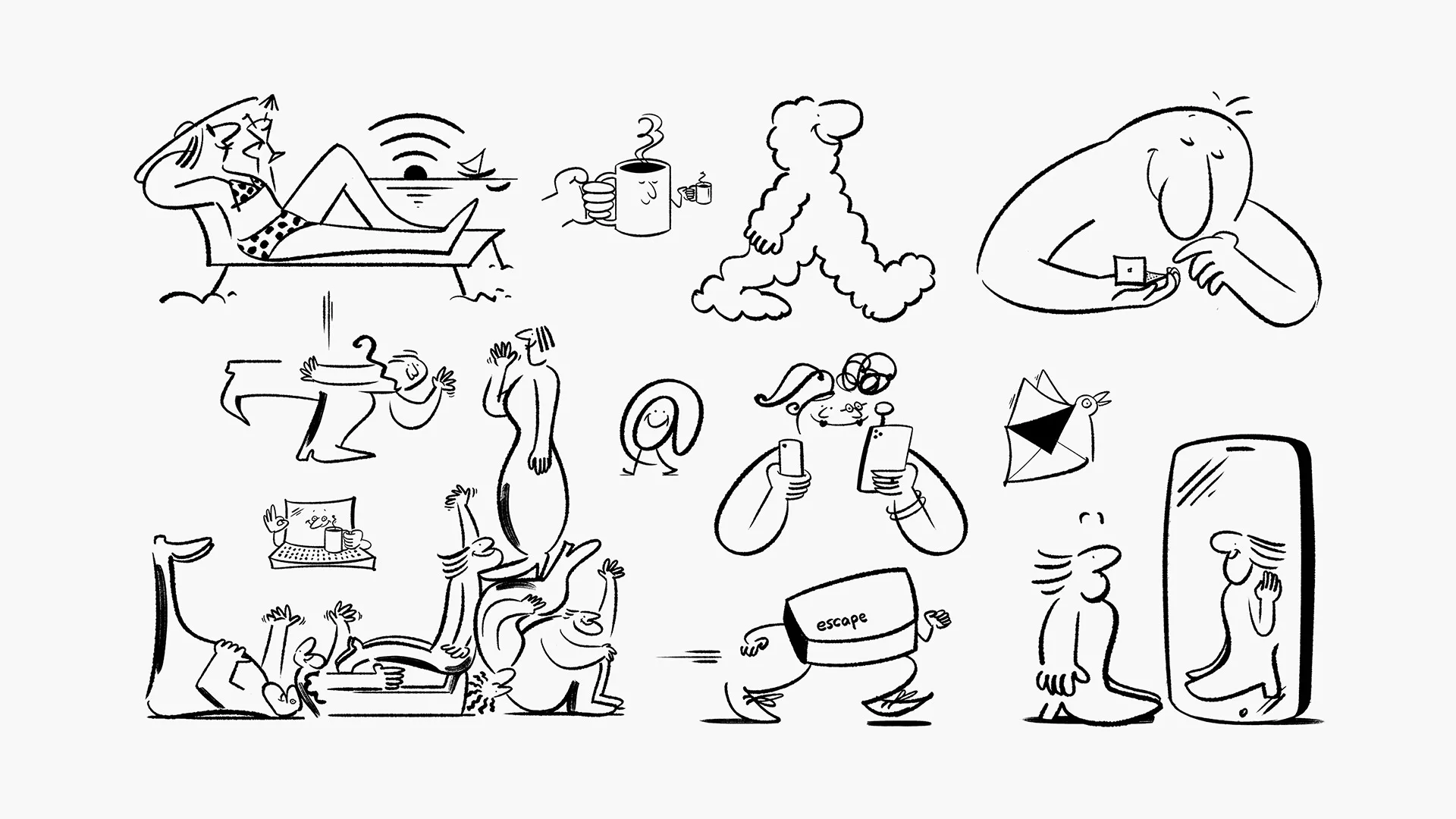
Photography captures transient moments, while illustrations articulate abstract concepts and visionary ideas. Paired with bold typography and dynamic compositions, they form the cornerstone of our design ethos, infusing our visual identity with vibrancy and vitality.
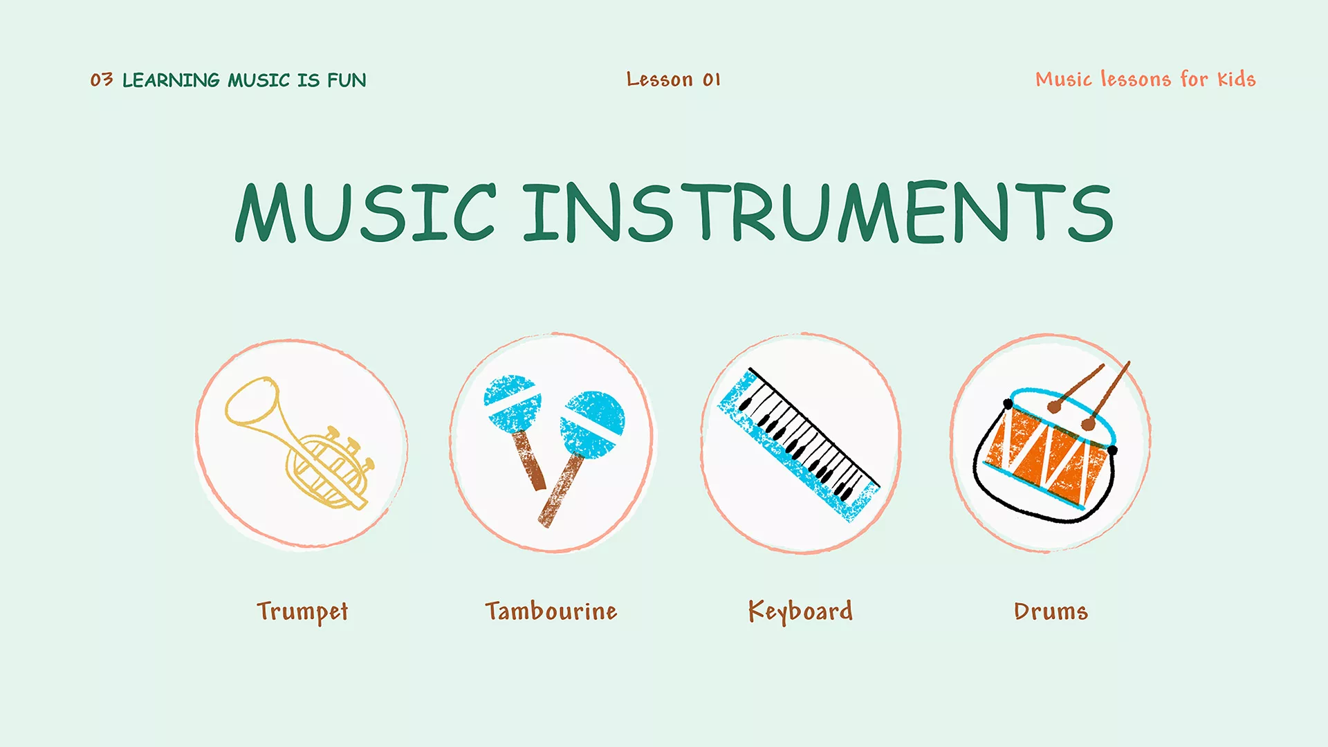
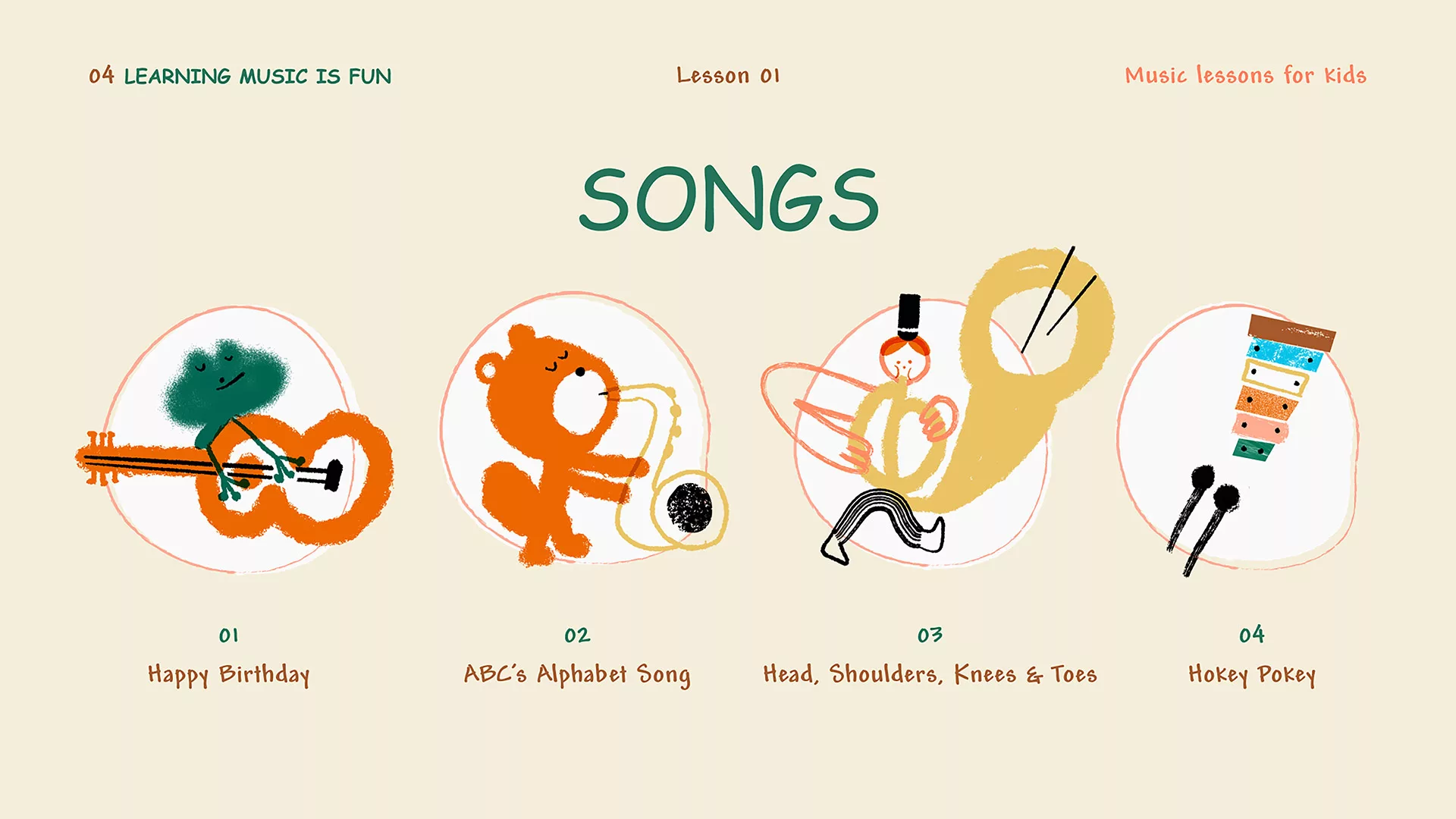
Family Fun Squad Mag - Modern Parent
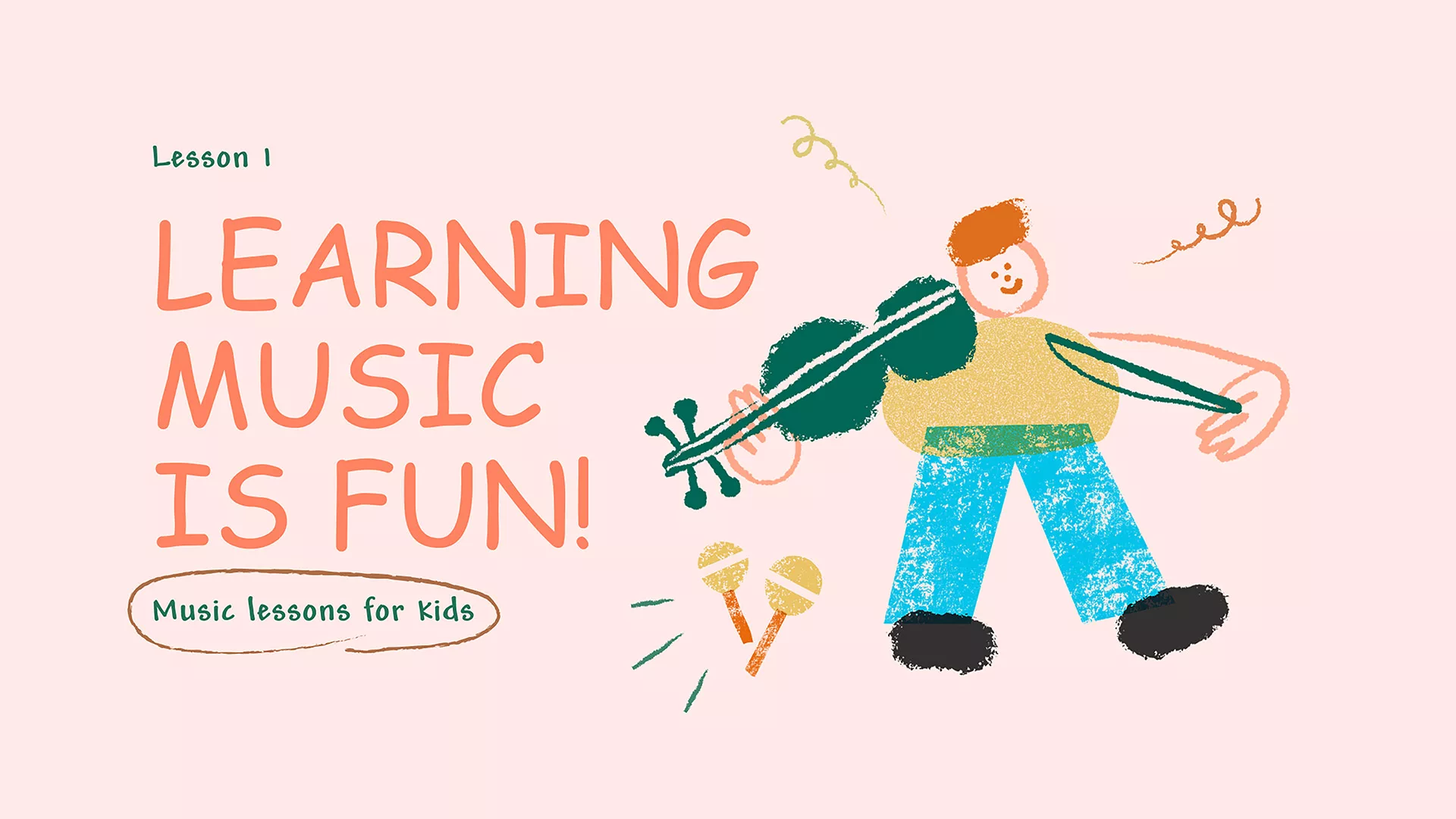
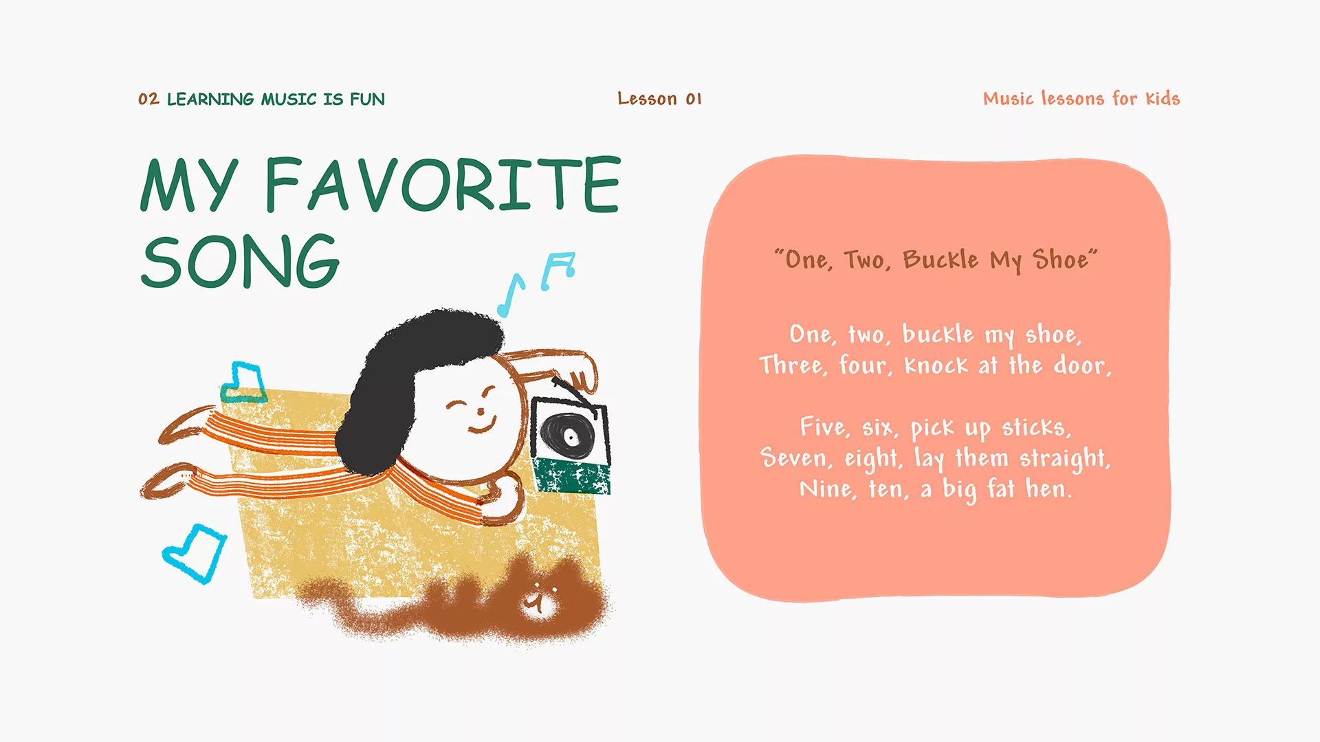
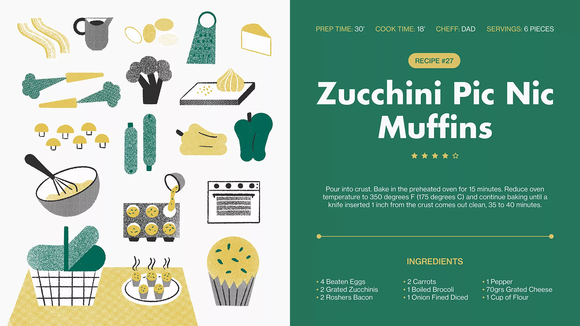
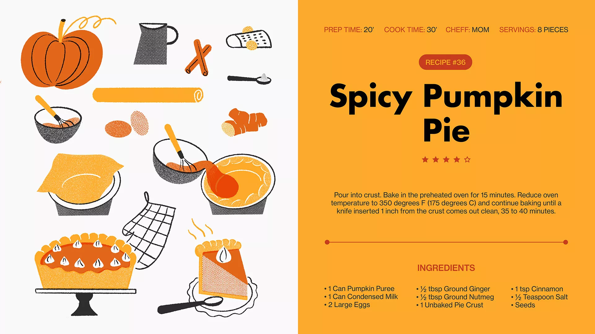
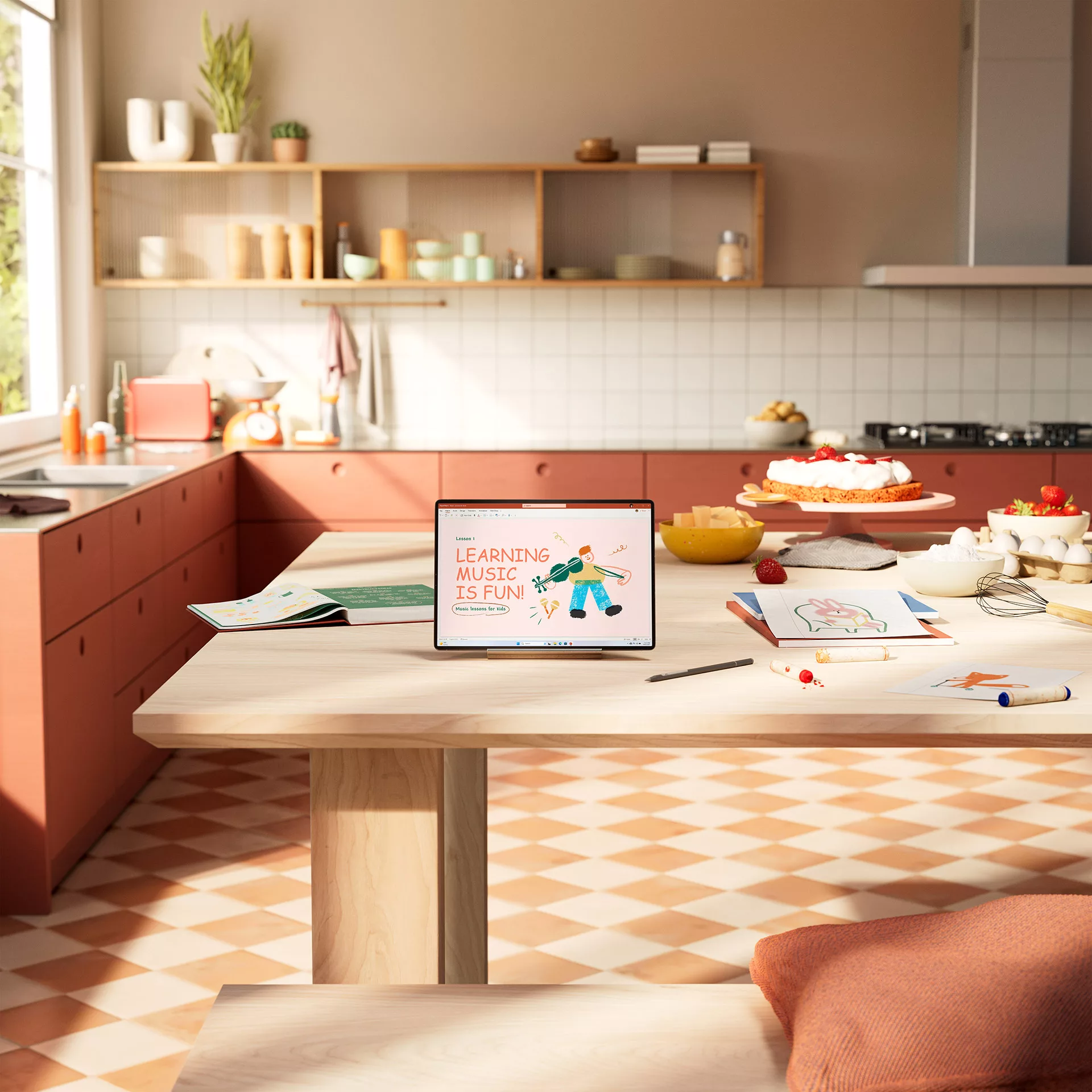
Family Fun Squad is all about embracing the human touch, aiming to evoke the warmth and authenticity of homemade creations.
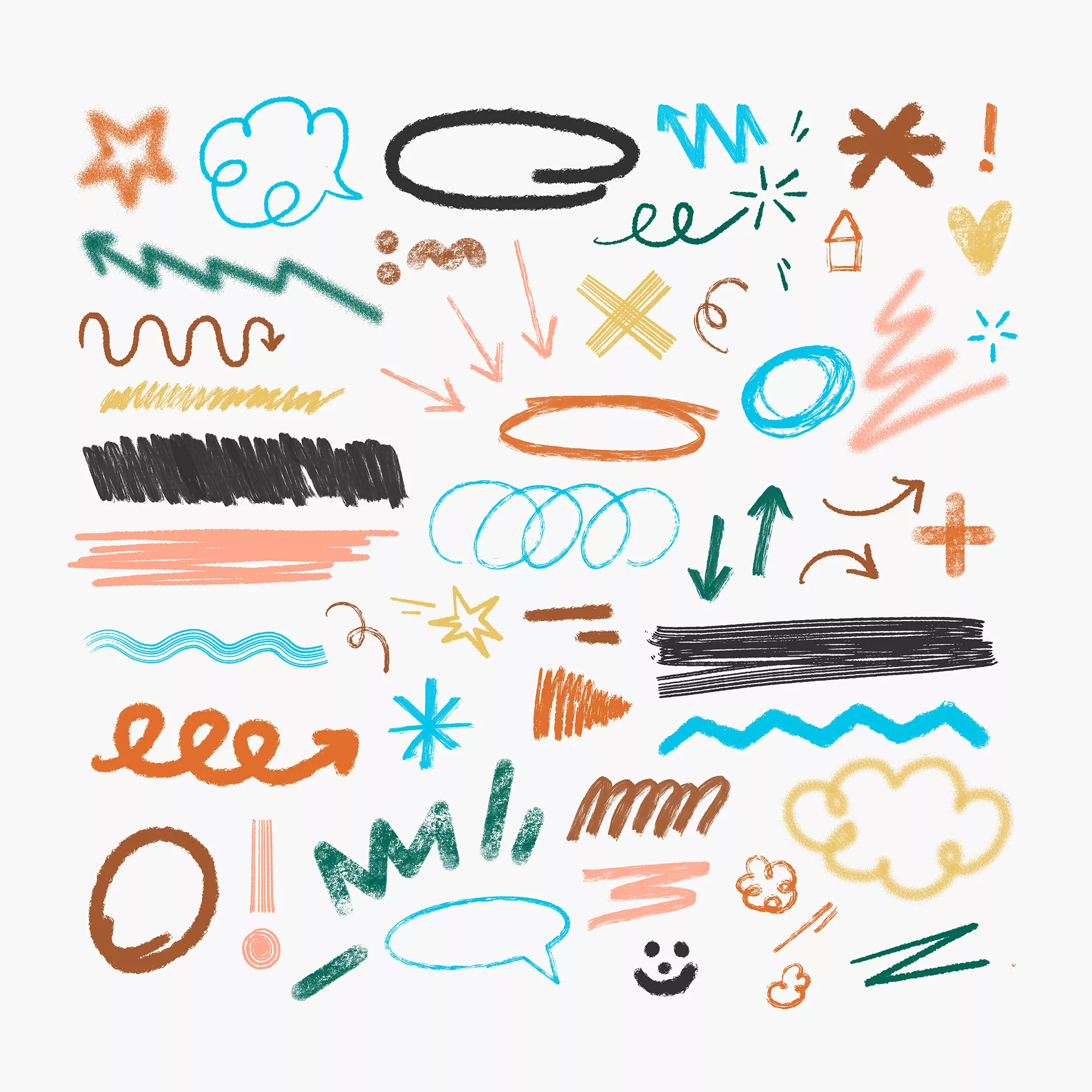
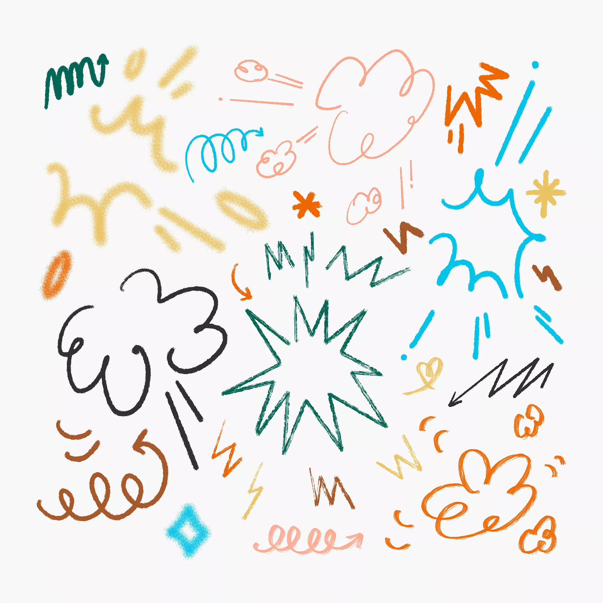
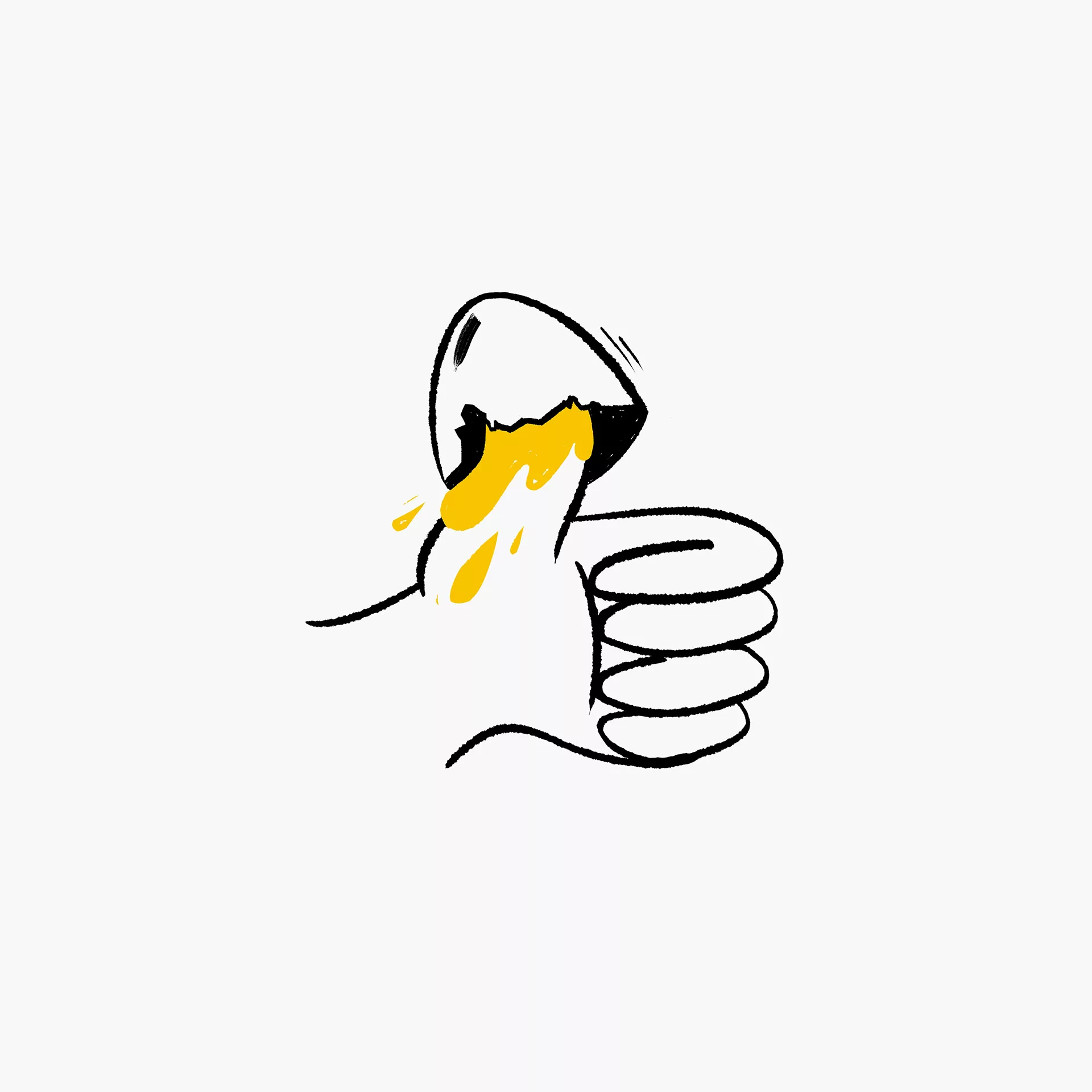
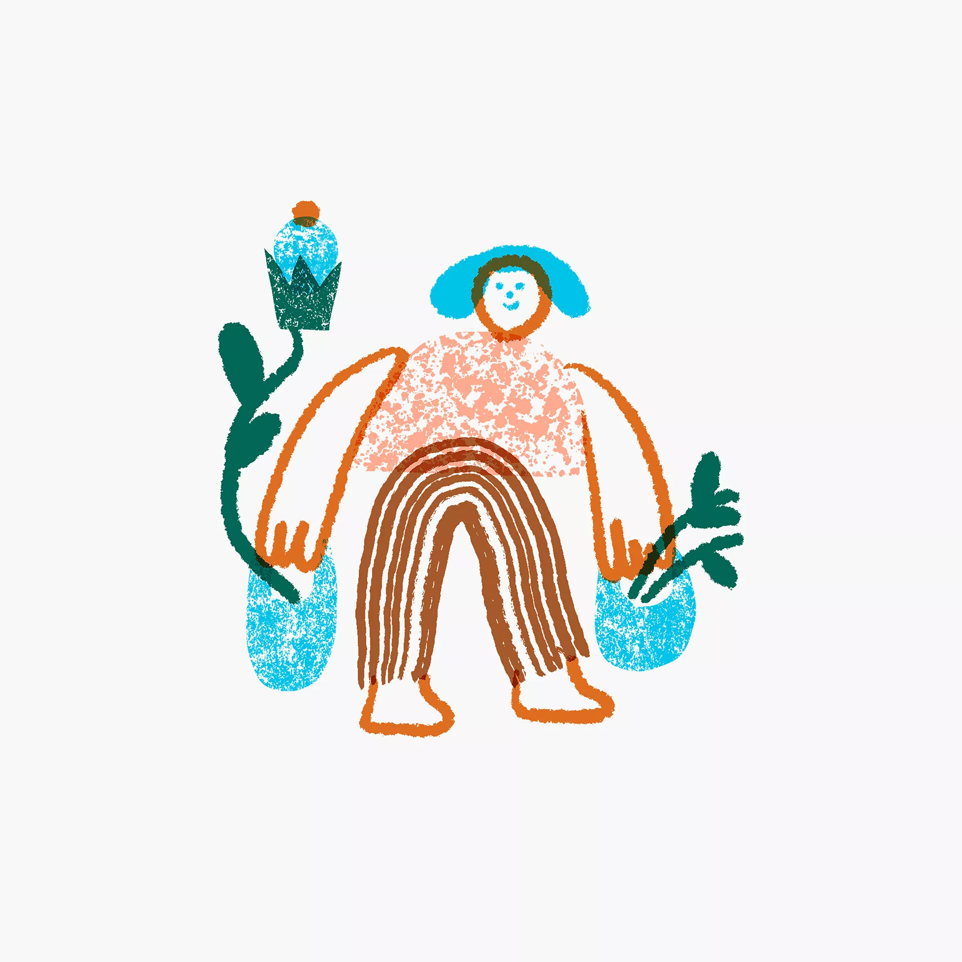
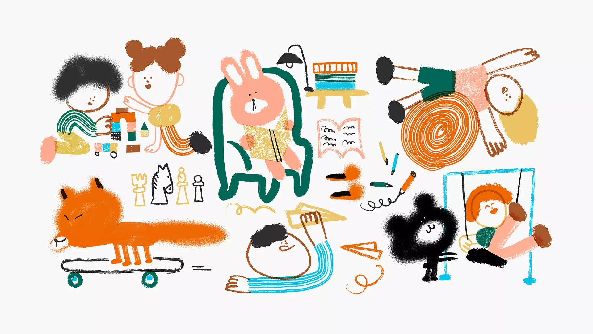
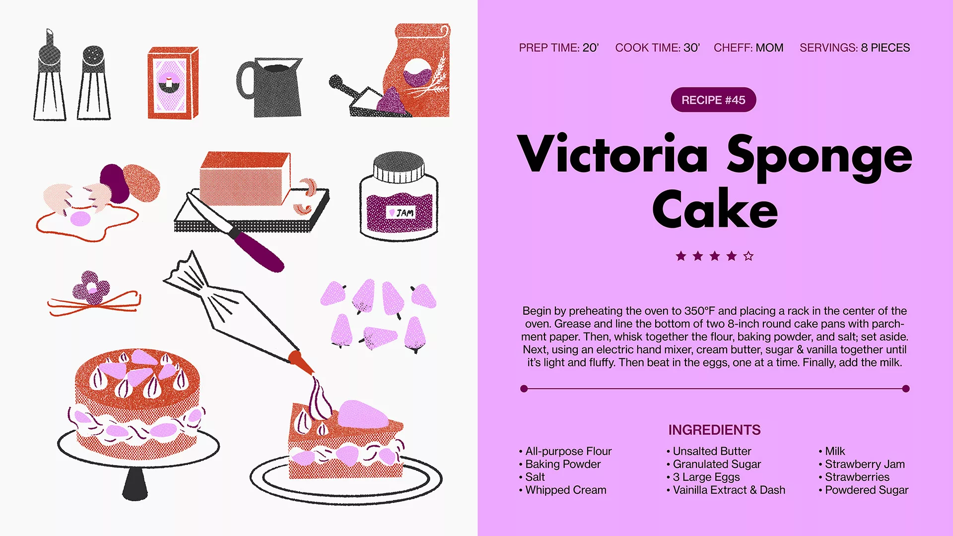
For the Modern Parent approach, our focus lies primarily on crafting illustrations that highlight children’s creations, spanning themes like music, sports, and food. To further enhance the personal connection, we integrate hand-drawn elements into our designs, imparting a sense of craftsmanship and individuality. Additionally, we've curated an initial collection of illustrations featuring parents' recipes.
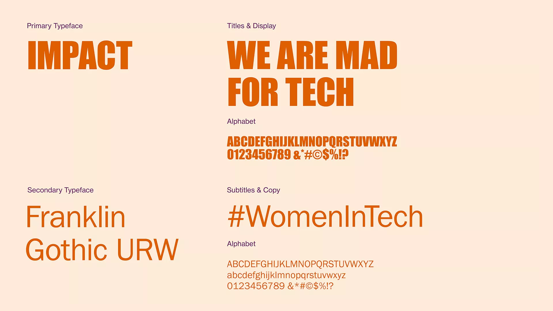
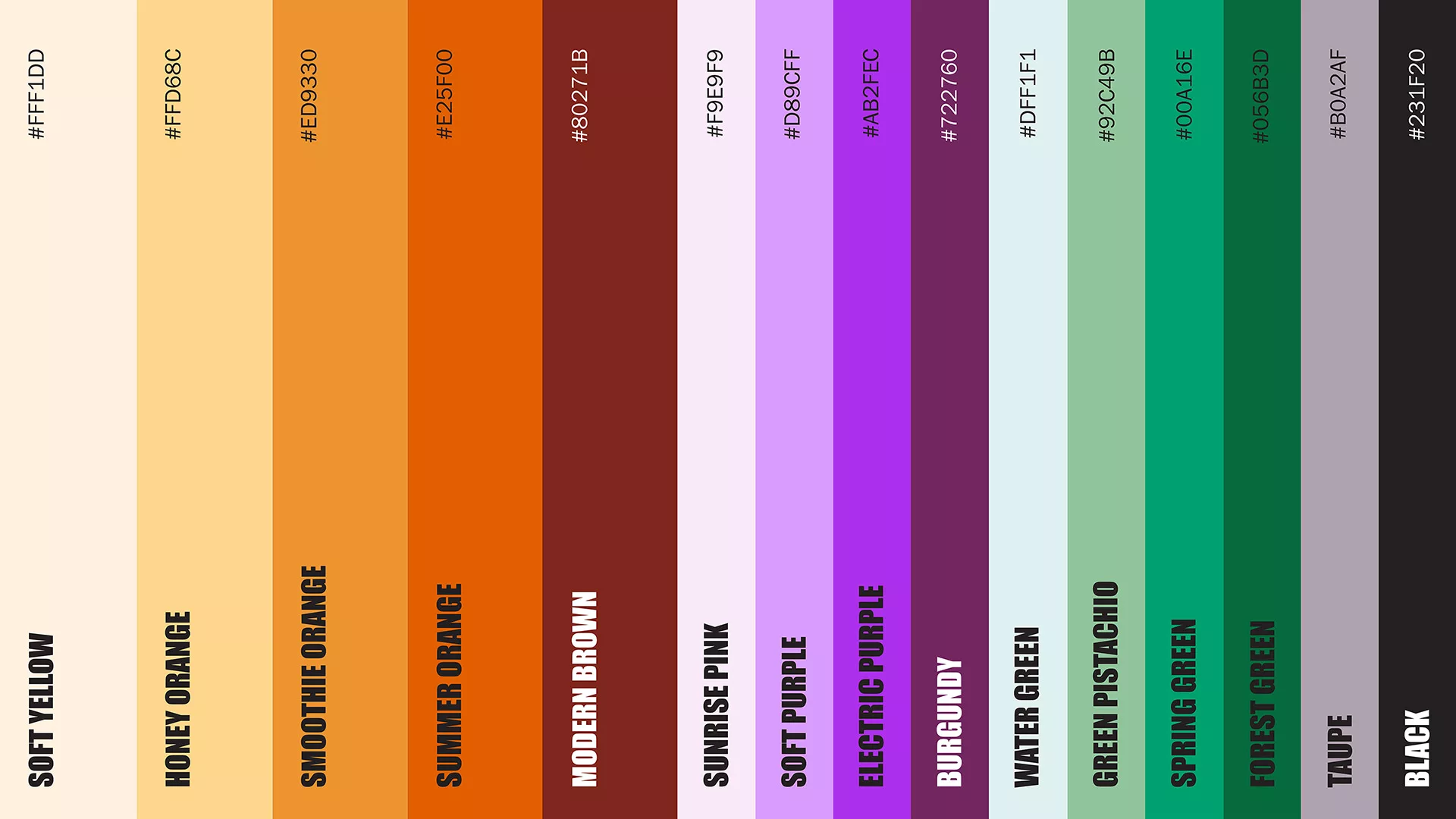
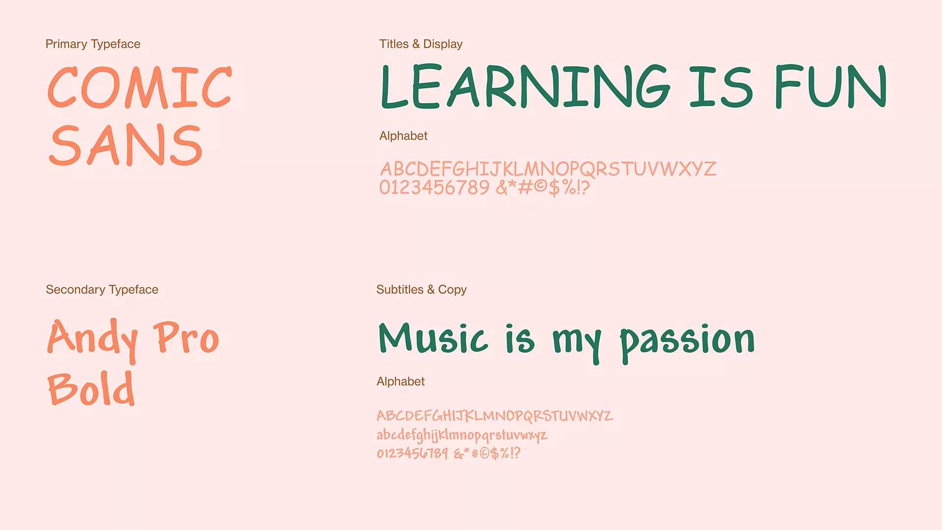
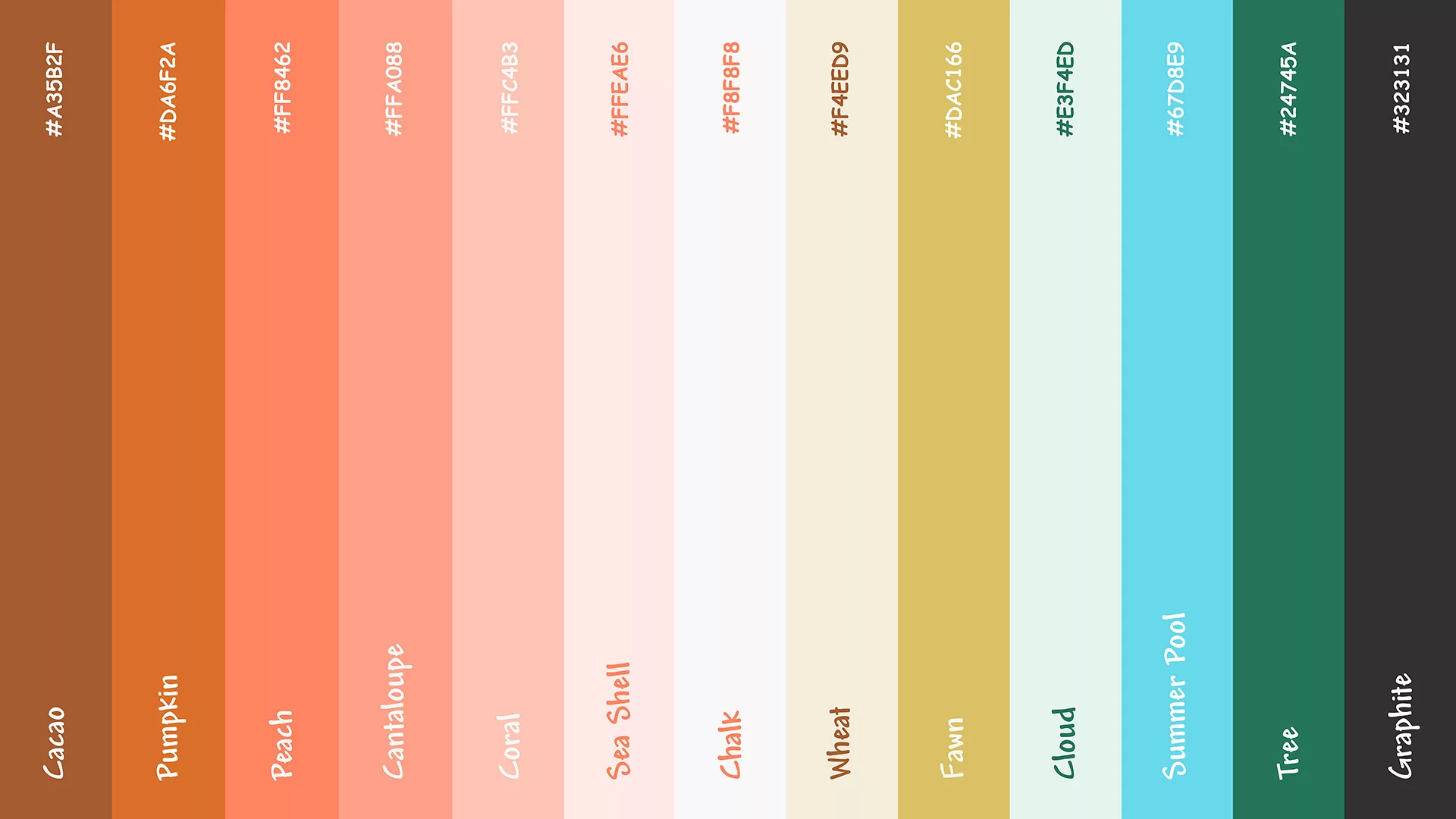
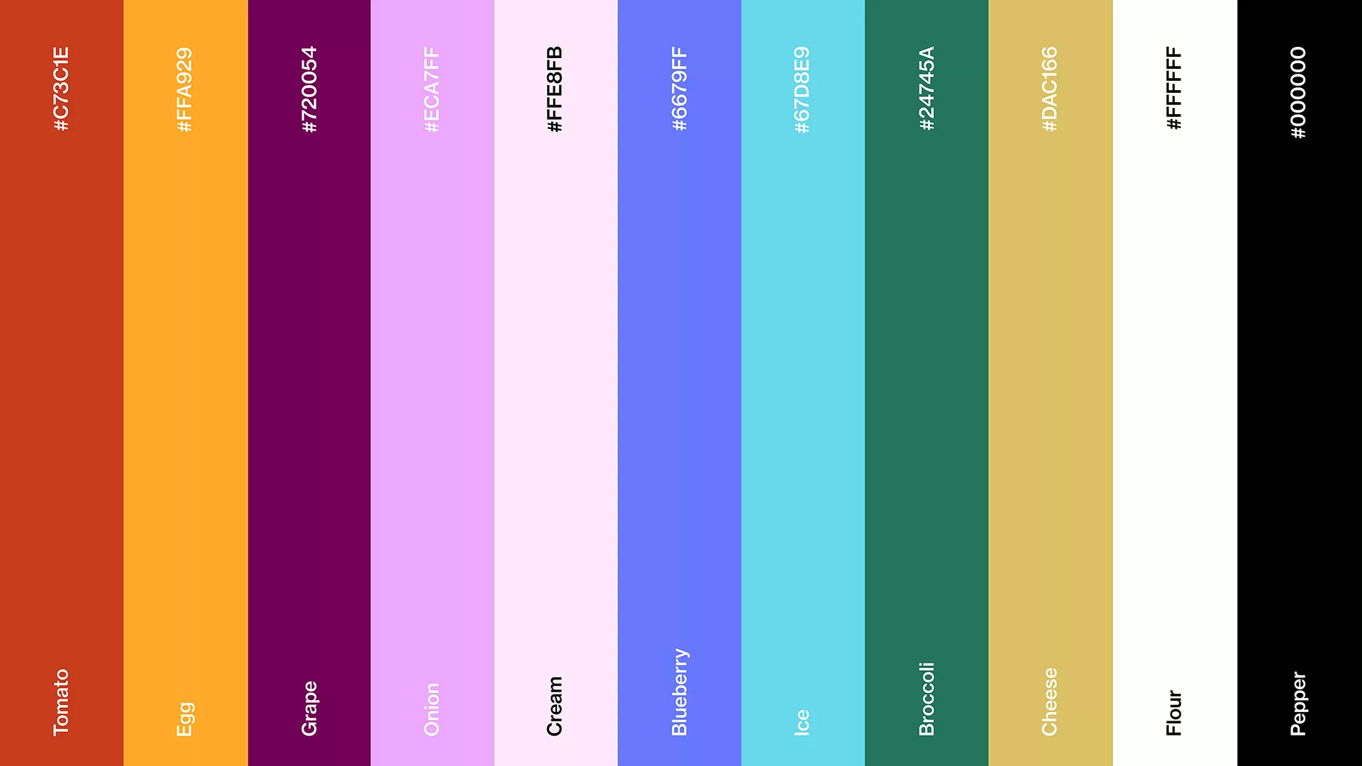
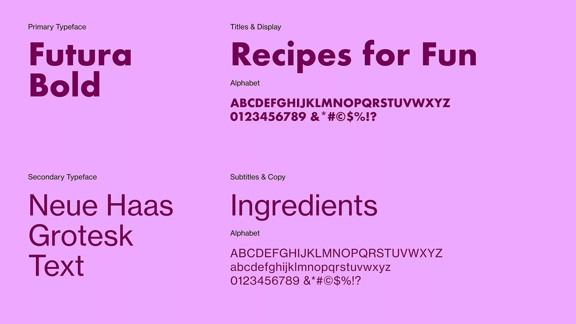
Who would have thought comic sans could look so fun? We've opted for a simple and expressive typography choice amidst our exploration of organic shapes. Paired with our cozy color palette of oranges, yellows, greens, and browns, it fits right in!
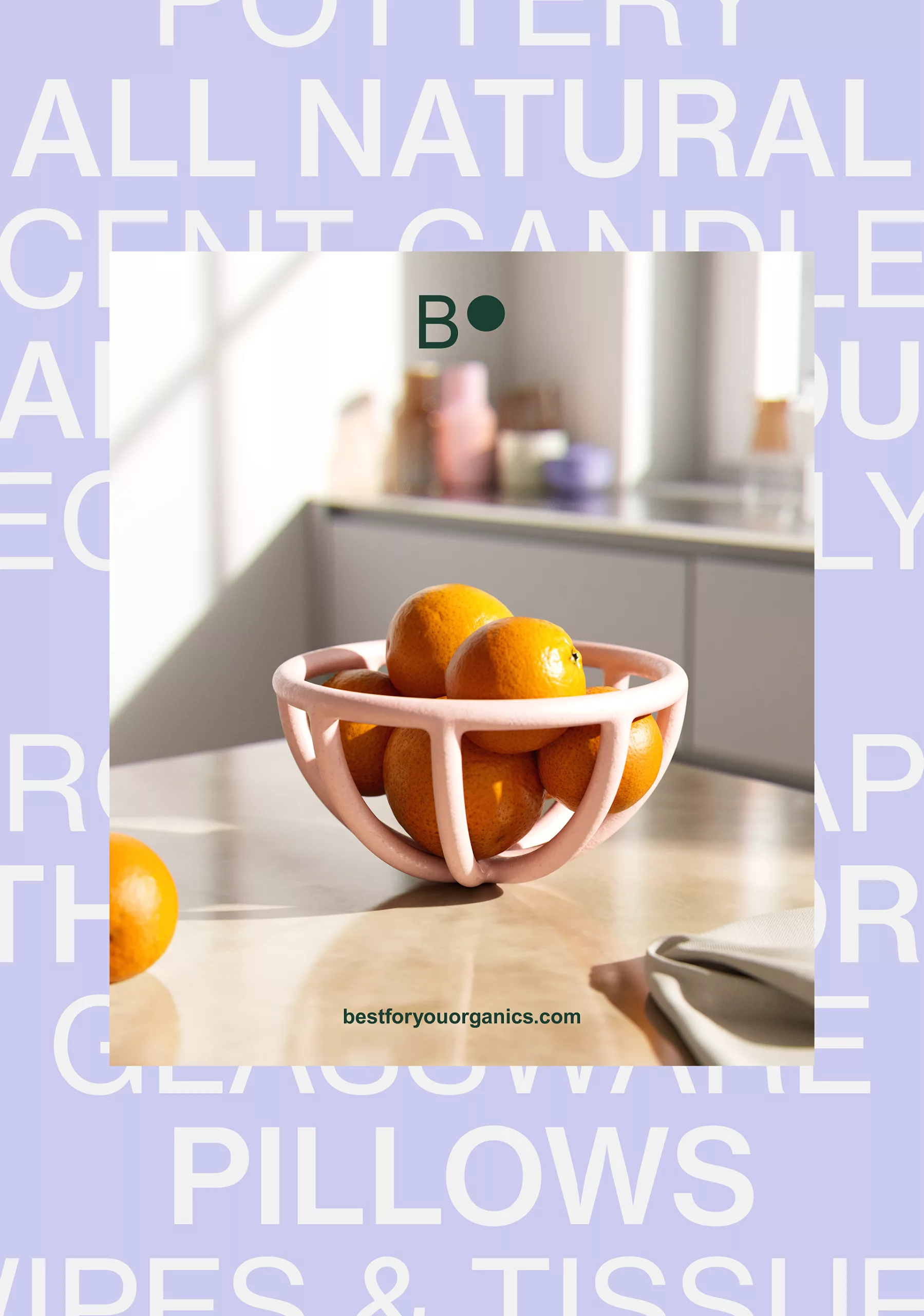
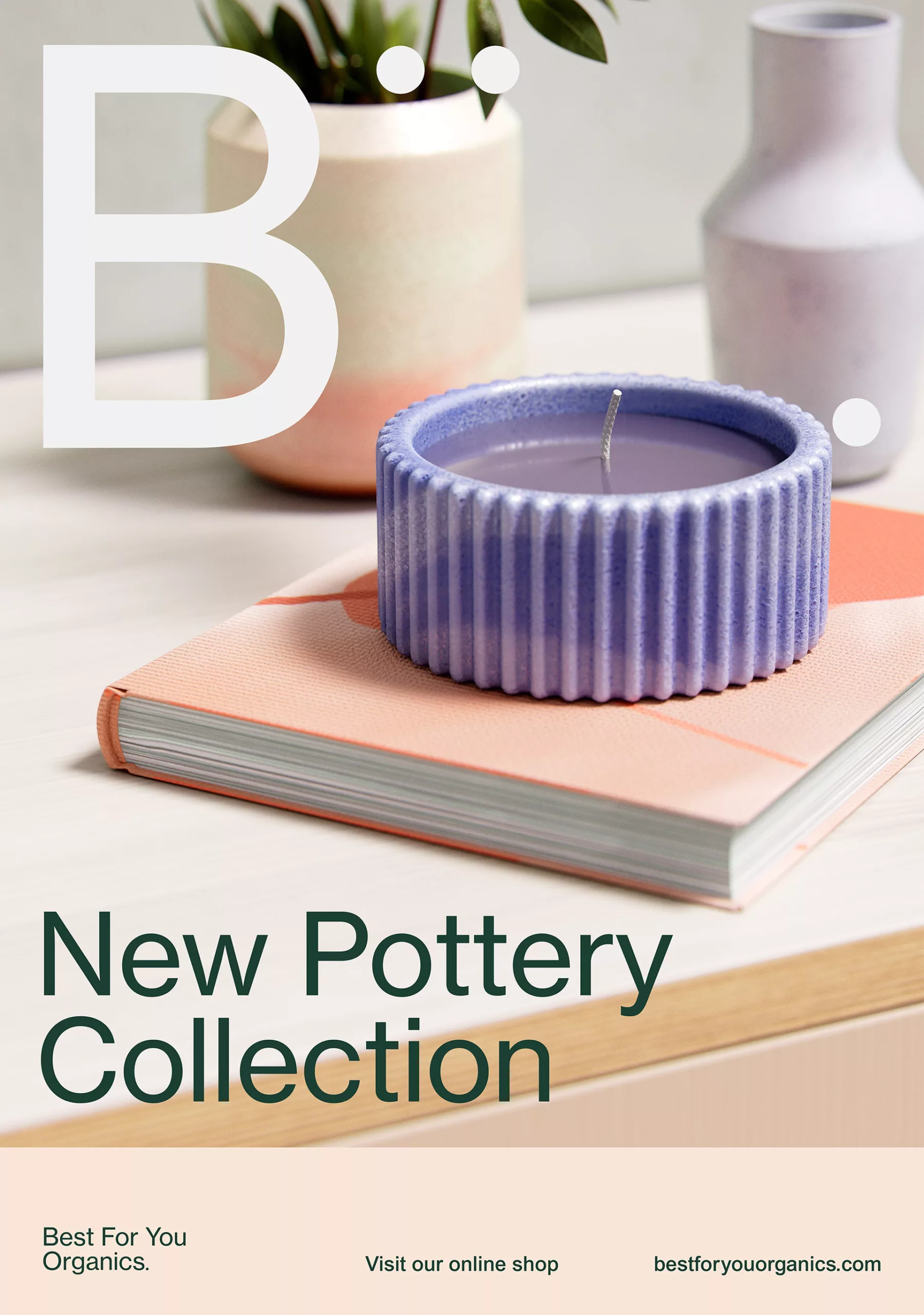
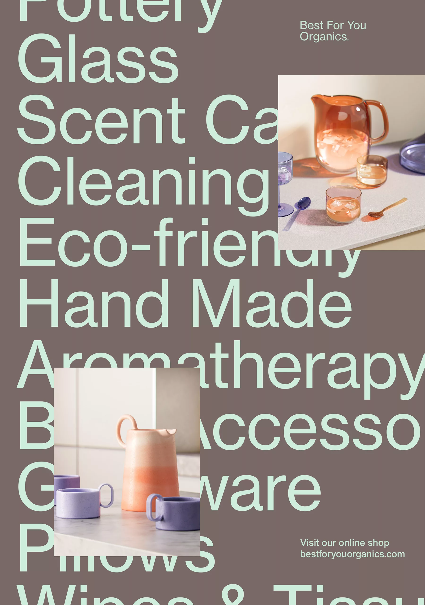
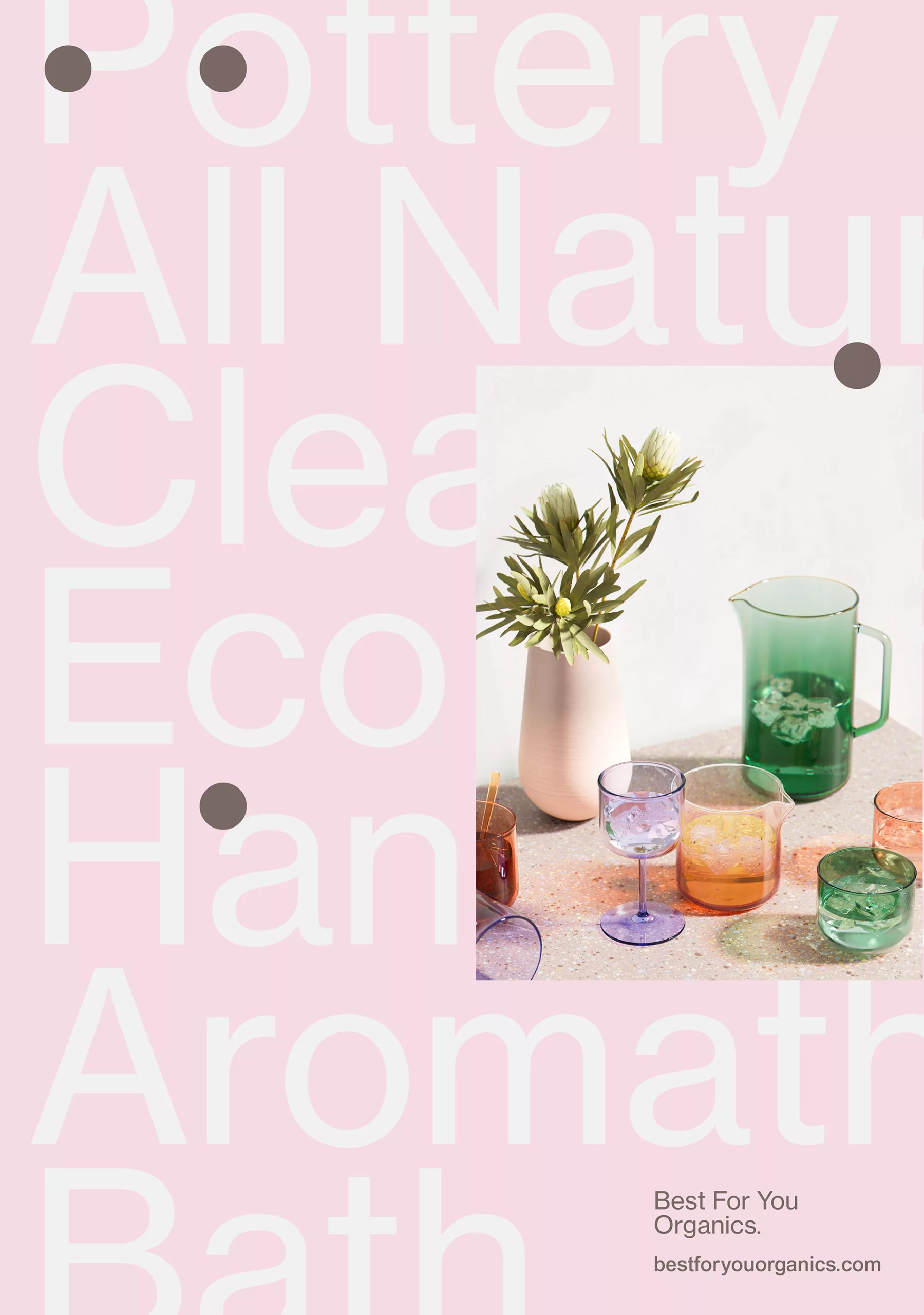
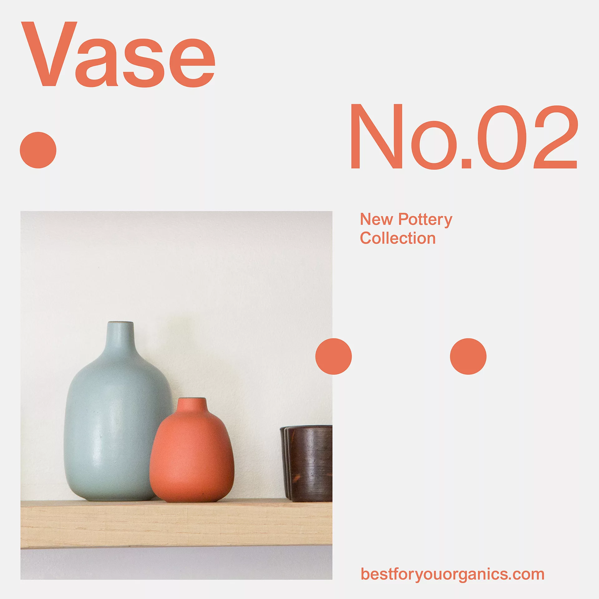
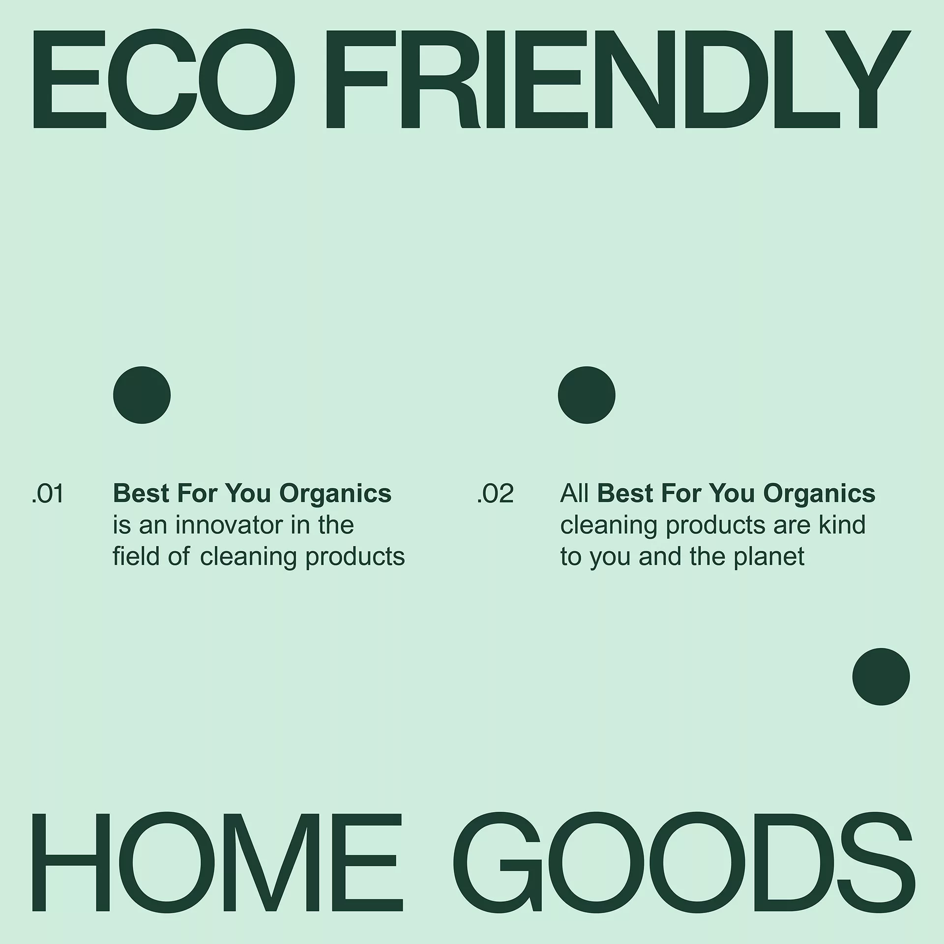
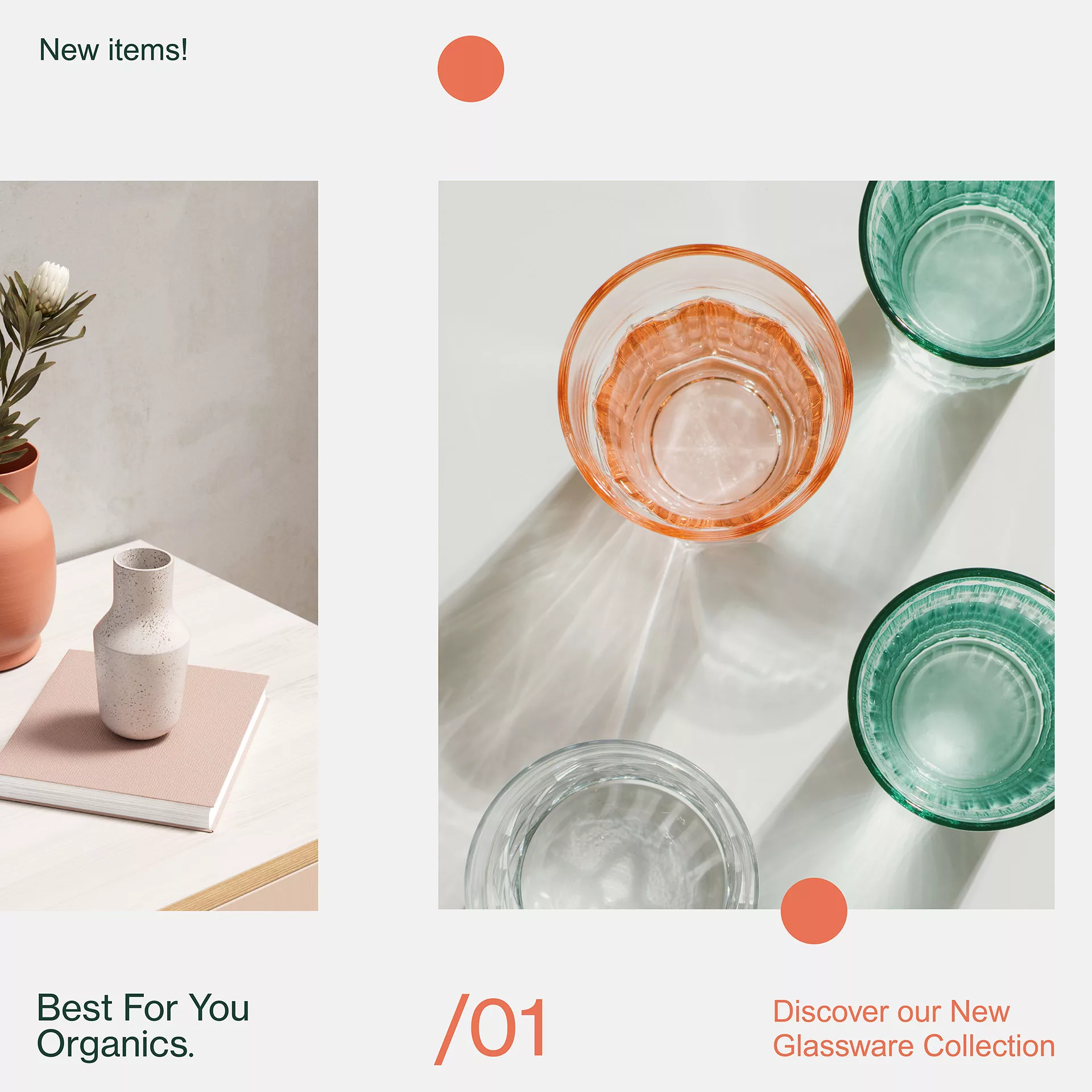
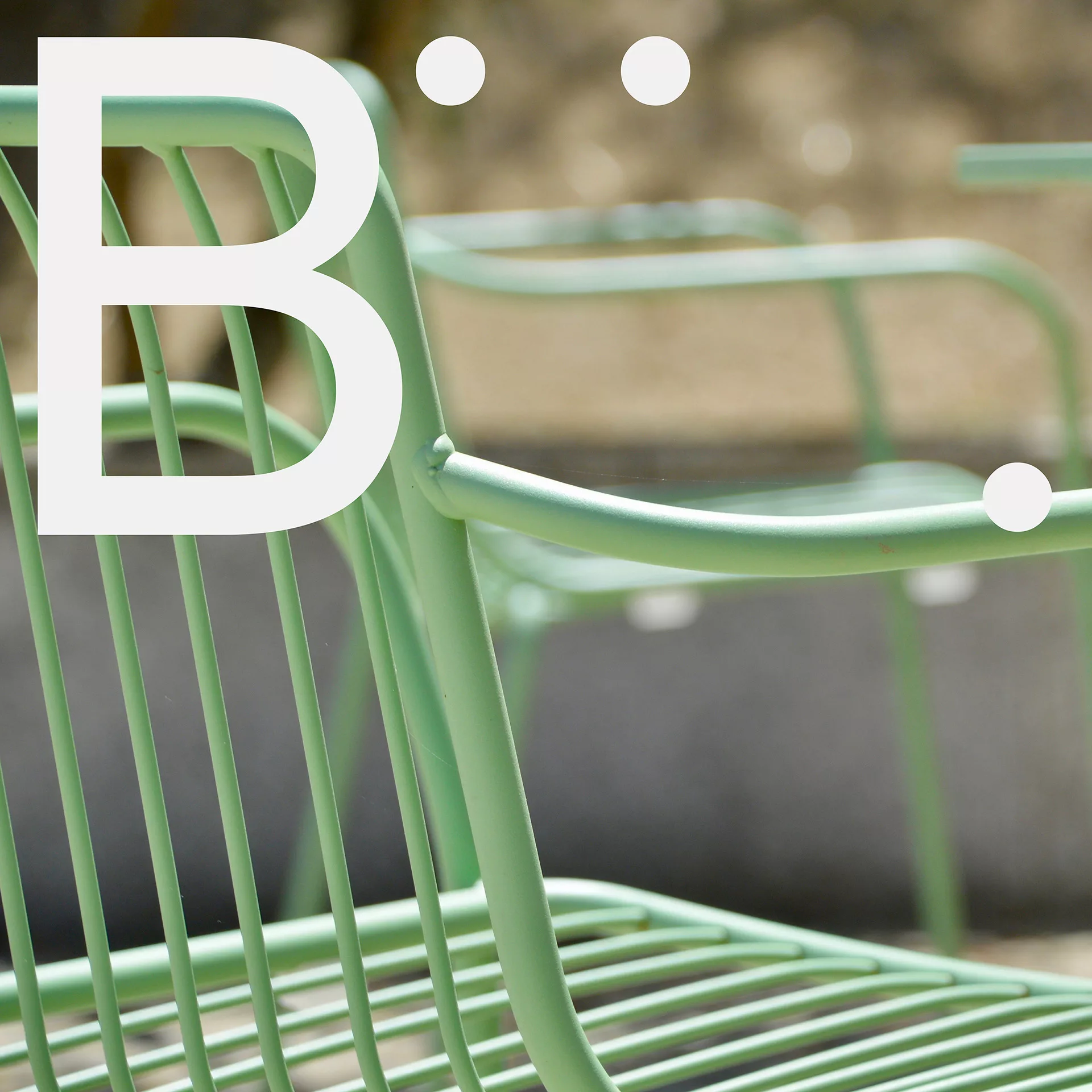
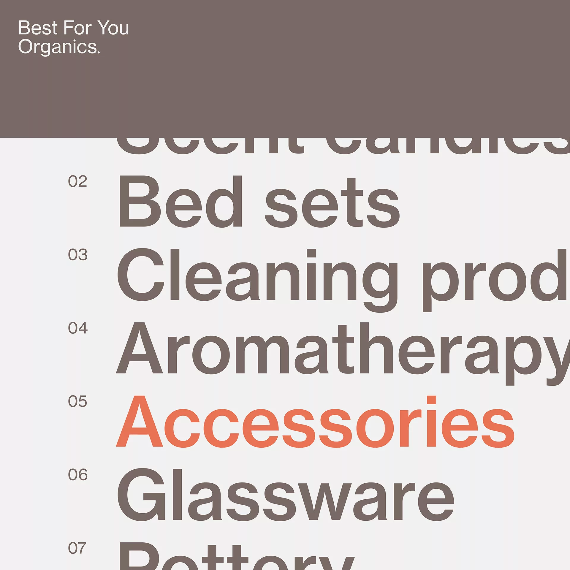
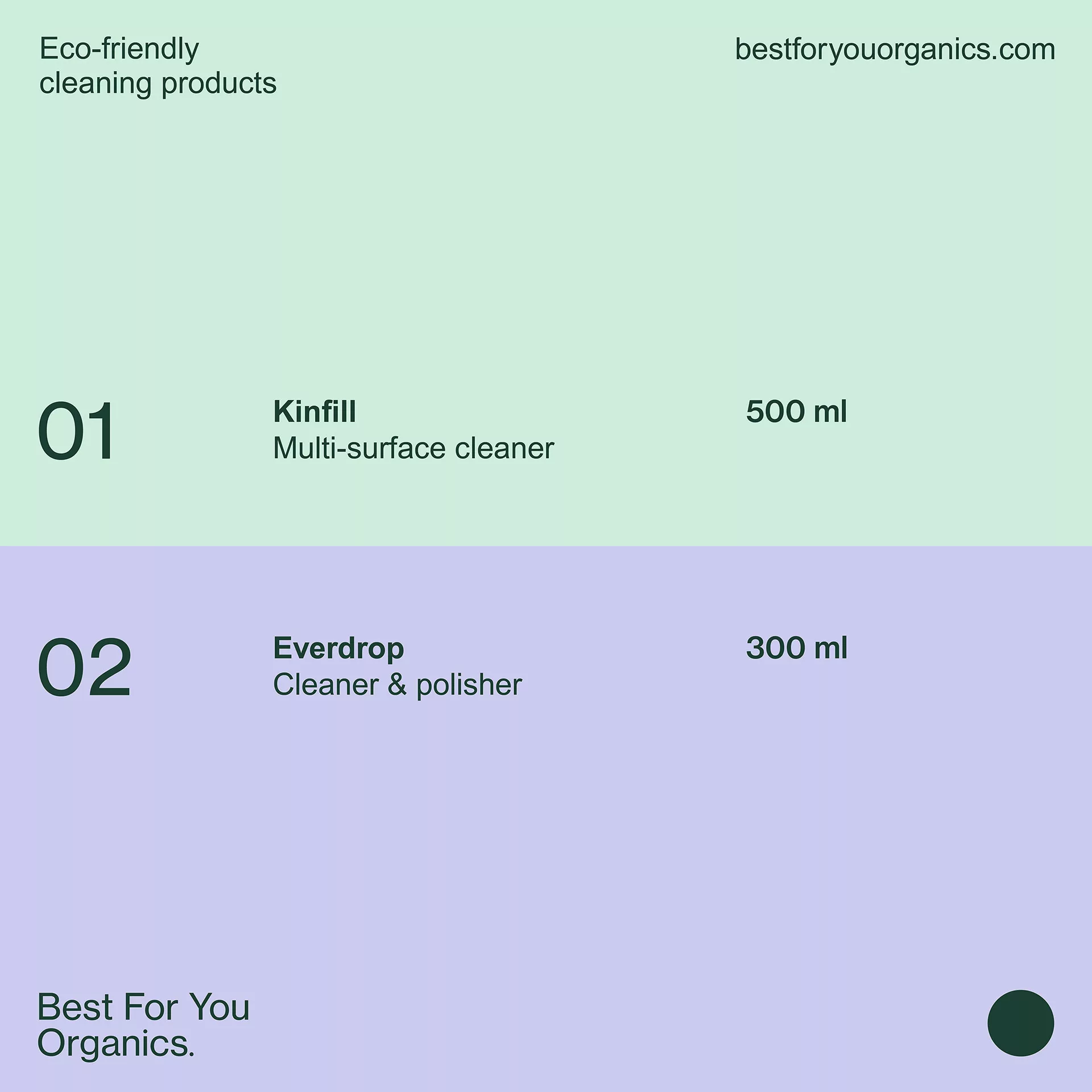
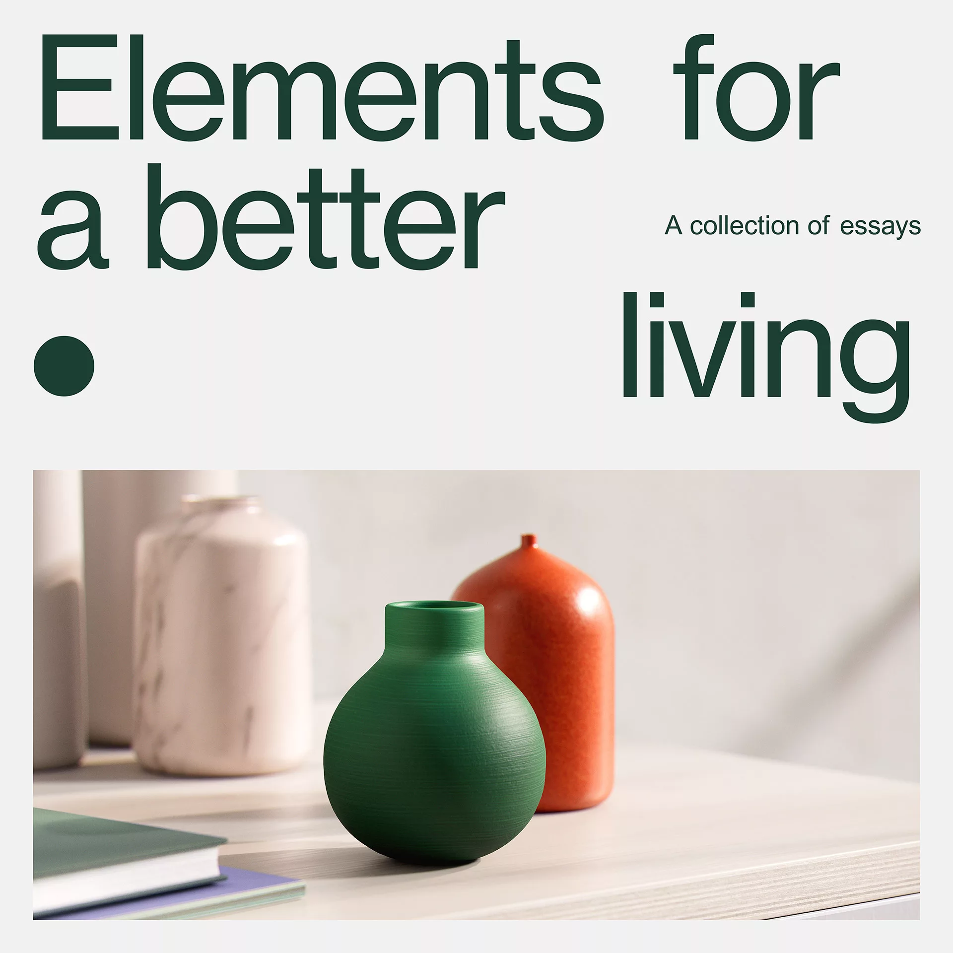
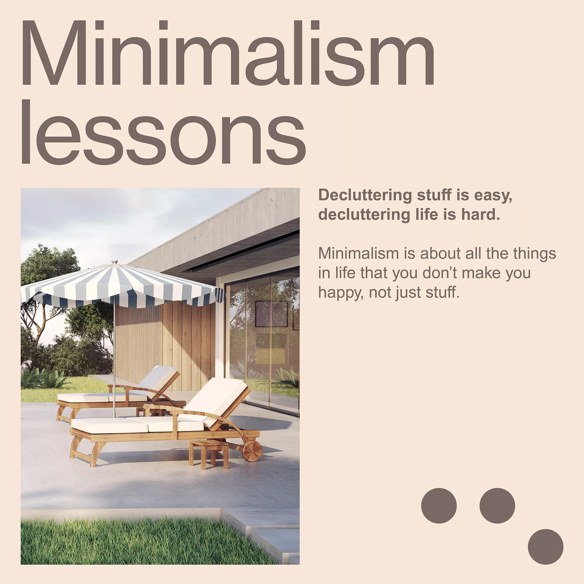
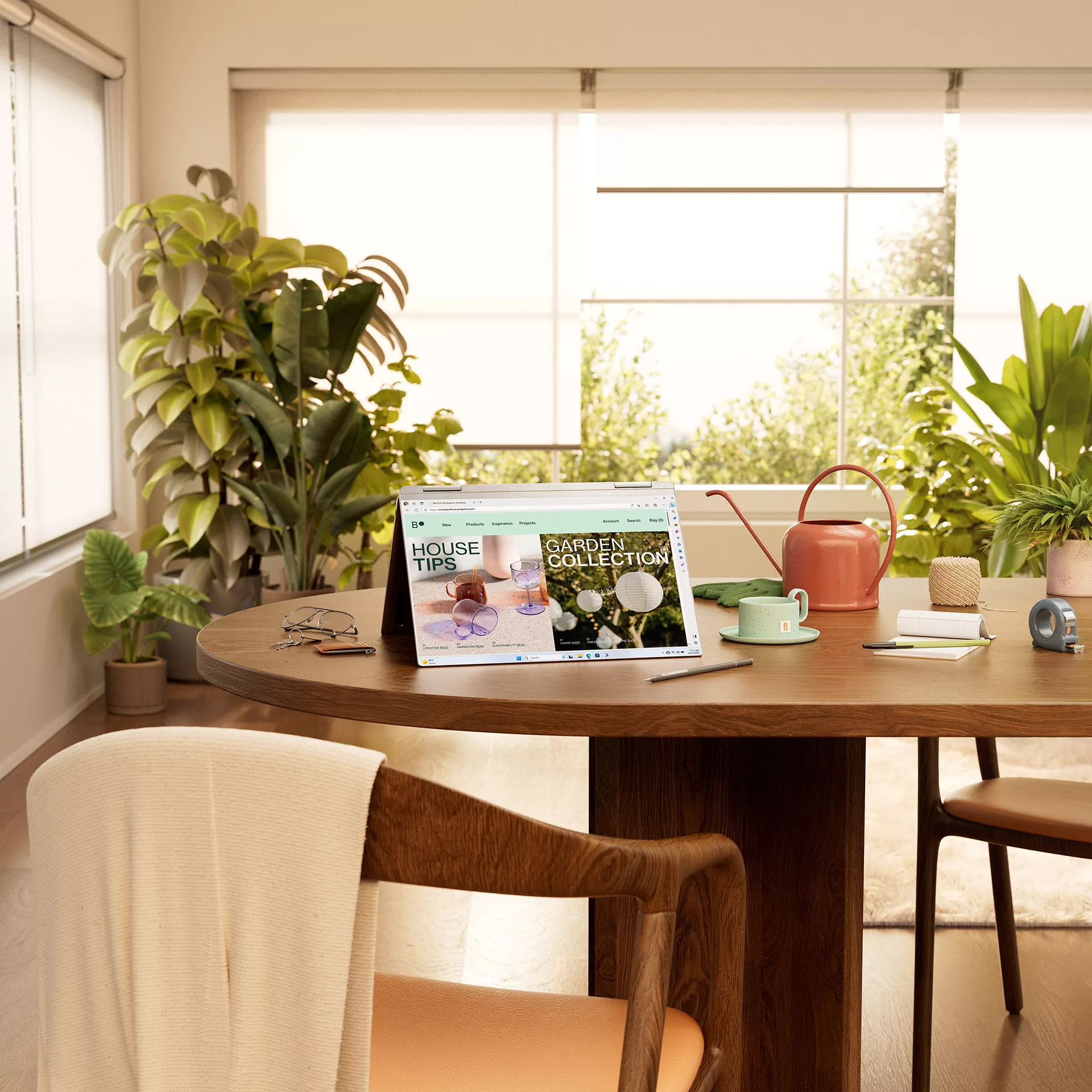
Best For You Organics - Pragmatic Planner
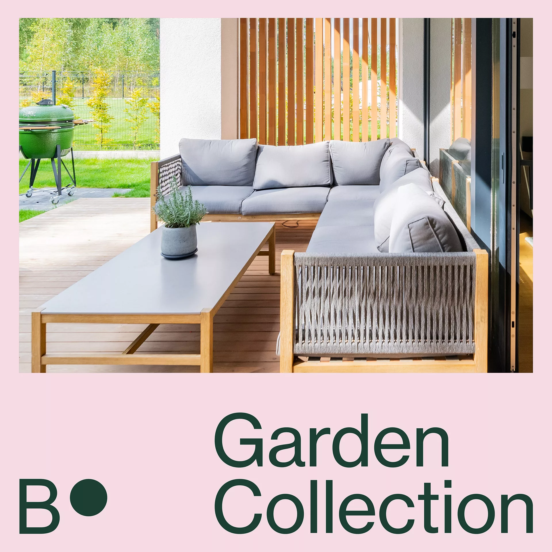
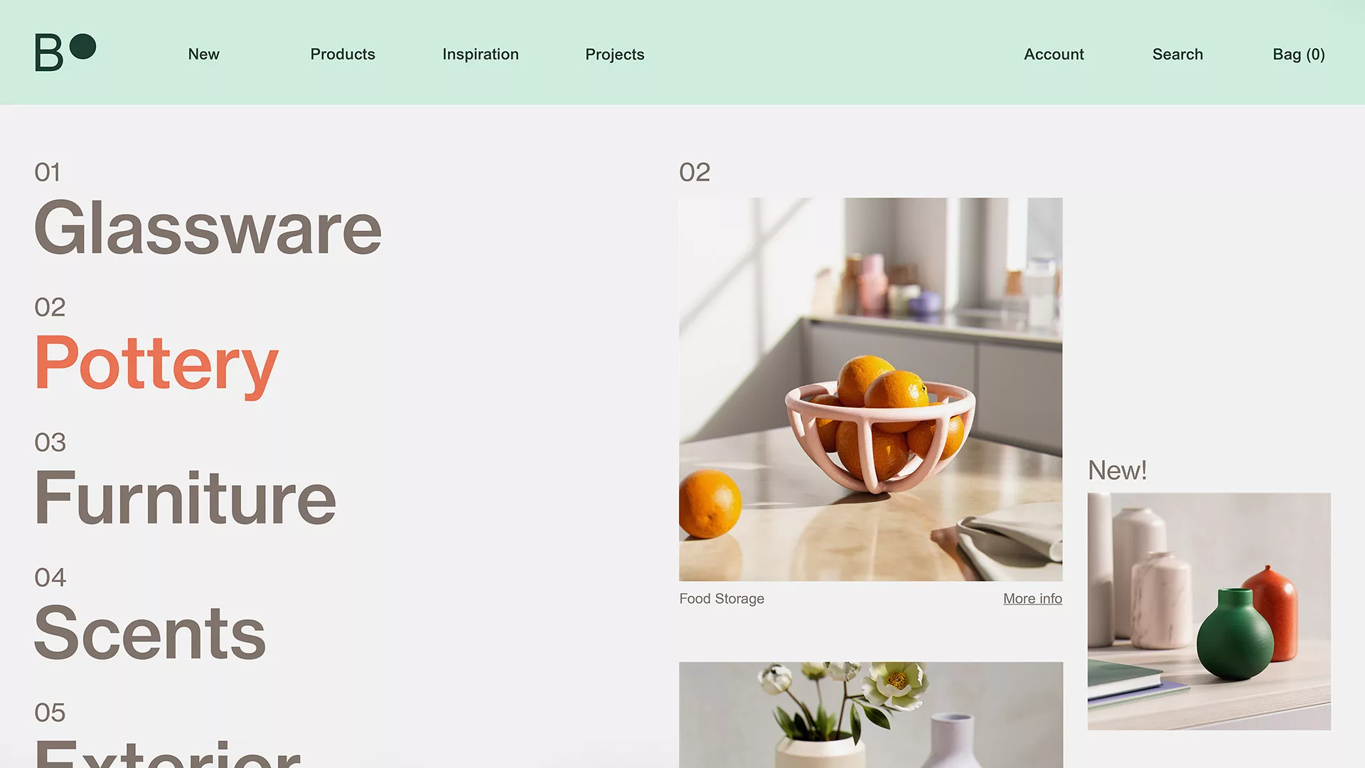
Best For You Organics, invites you to discover a haven for self-reconnection. Our carefully curated selection of items enhances relaxation and mindfulness, while our social media platforms offer invaluable resources for intentional living.
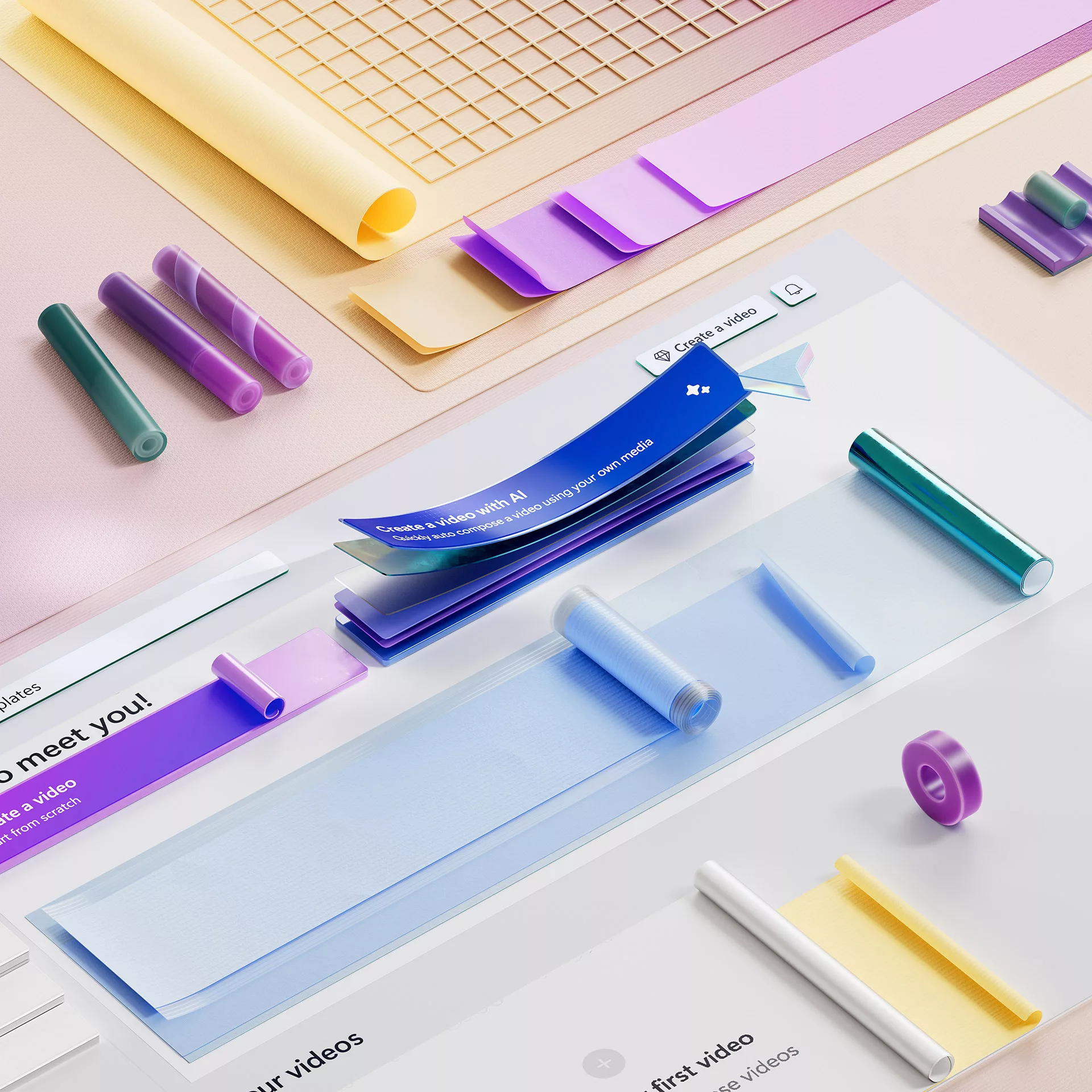
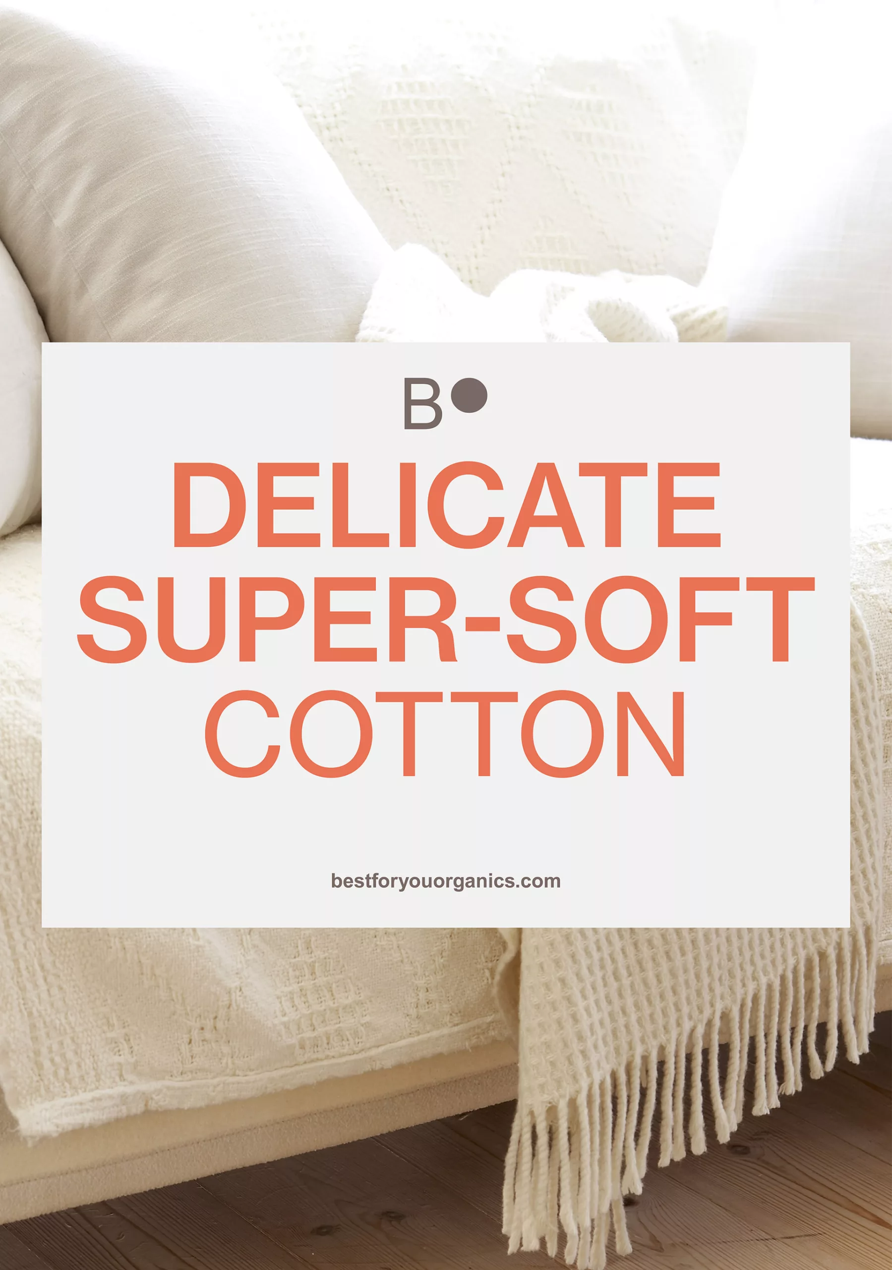
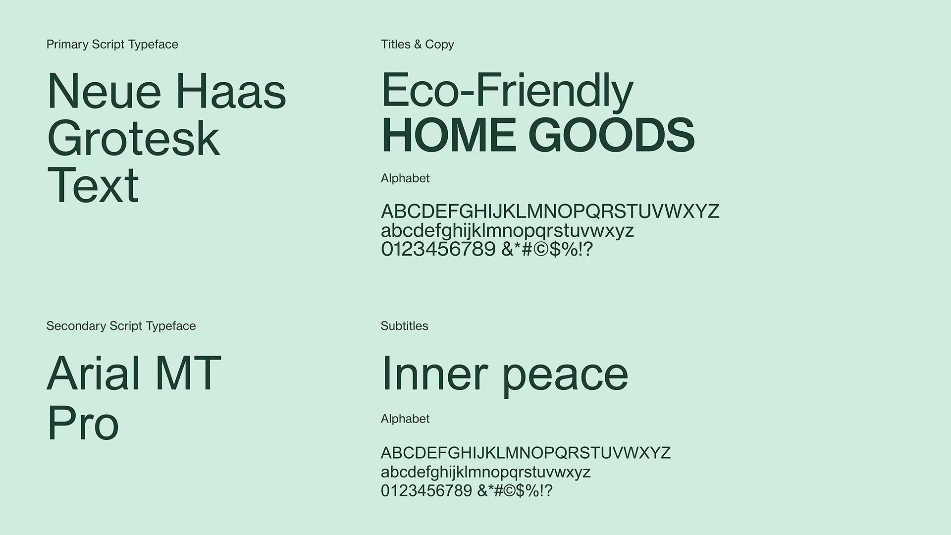
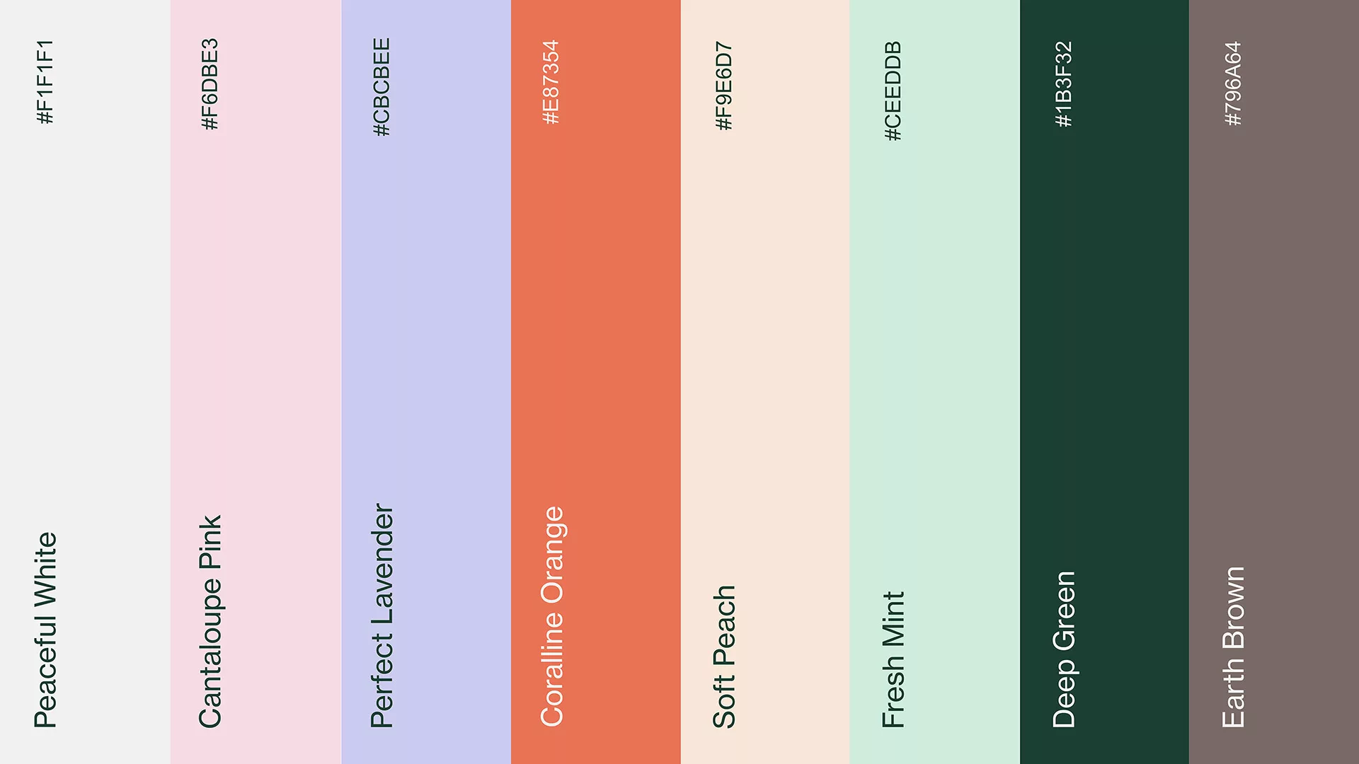
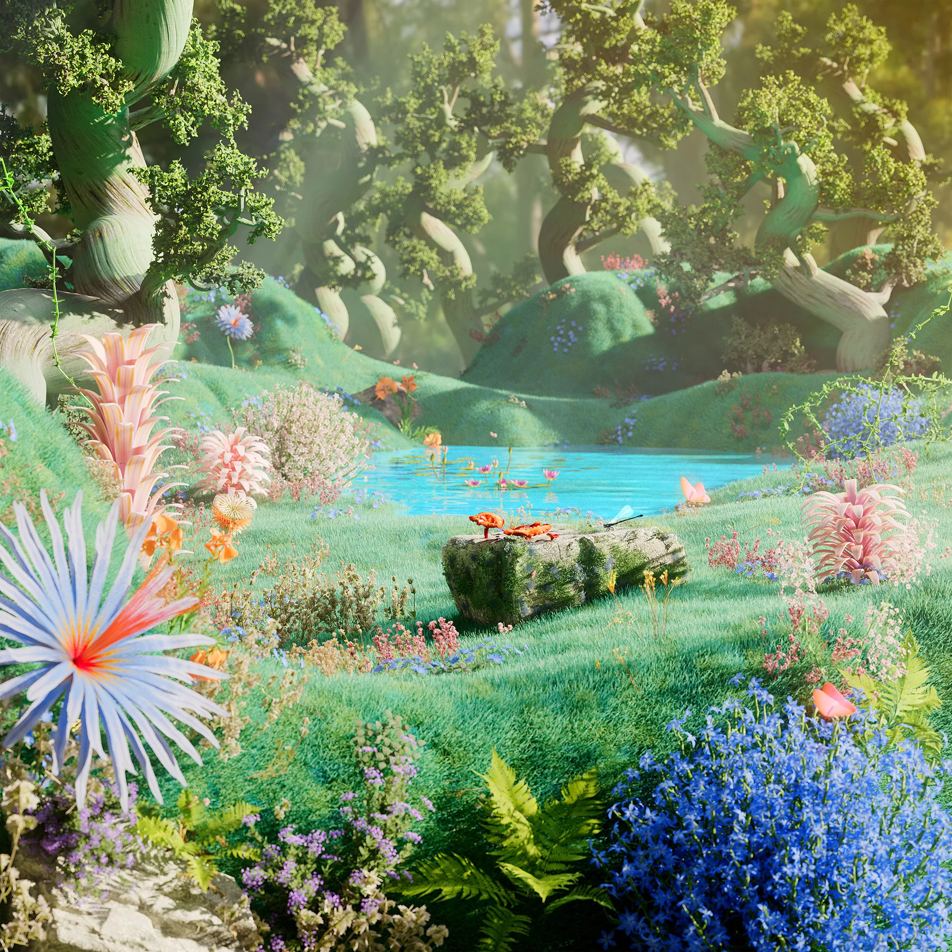
For the Pragmatic Planner user, we focus on a brand identity that reflects a minimalist and eco-friendly ethos. Inspired by nature, our color palette features earthy and muted tones, evoking a sense of tranquility and groundness. Complementing this, our typography exudes elegance with a refined sans-serif style, offering a striking contrast against the organic forms present in our photography and CGI sets.
At Best For You Organics, our mission is to cultivate a sanctuary where customers can discover inner peace, leading to a happier and healthier sense of self.
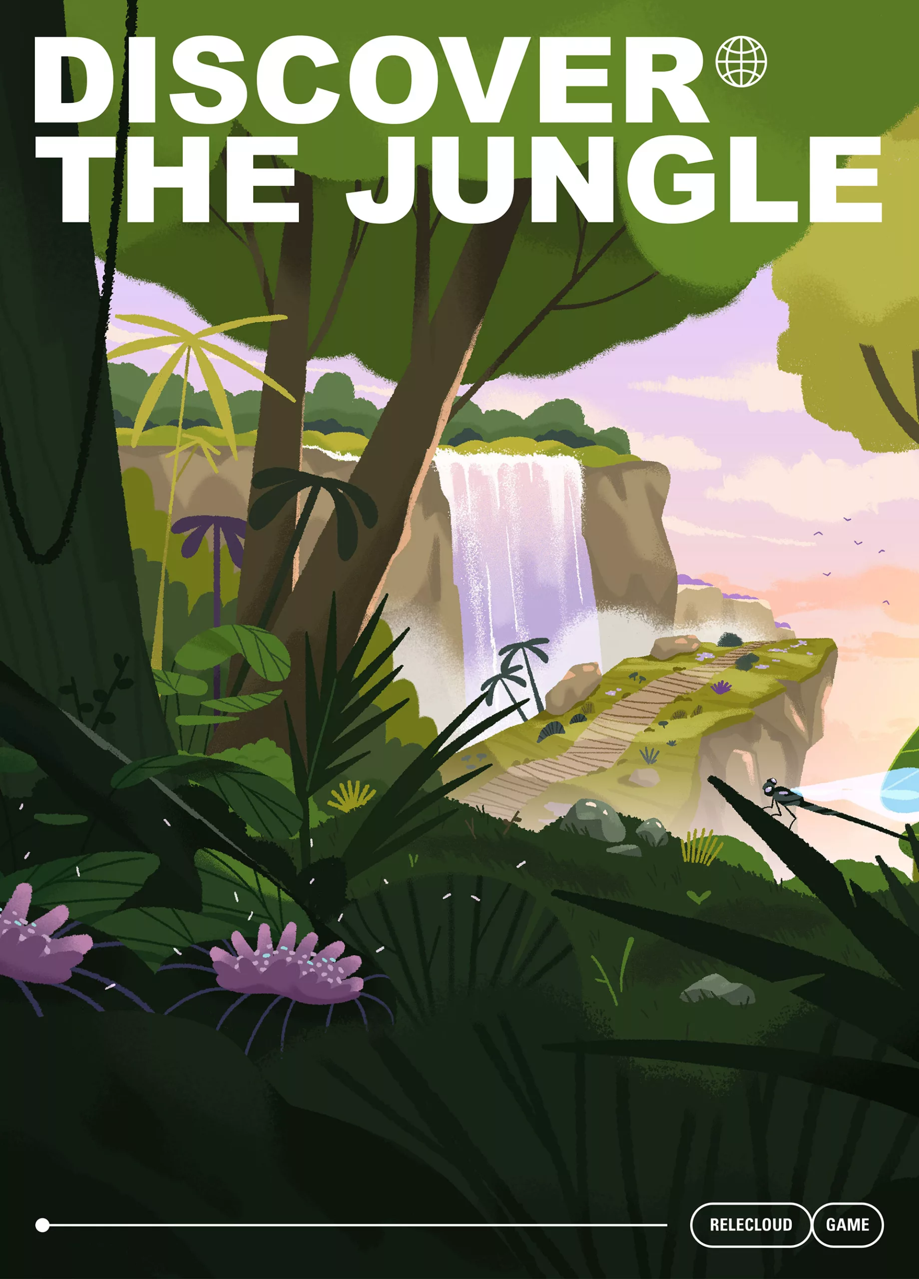
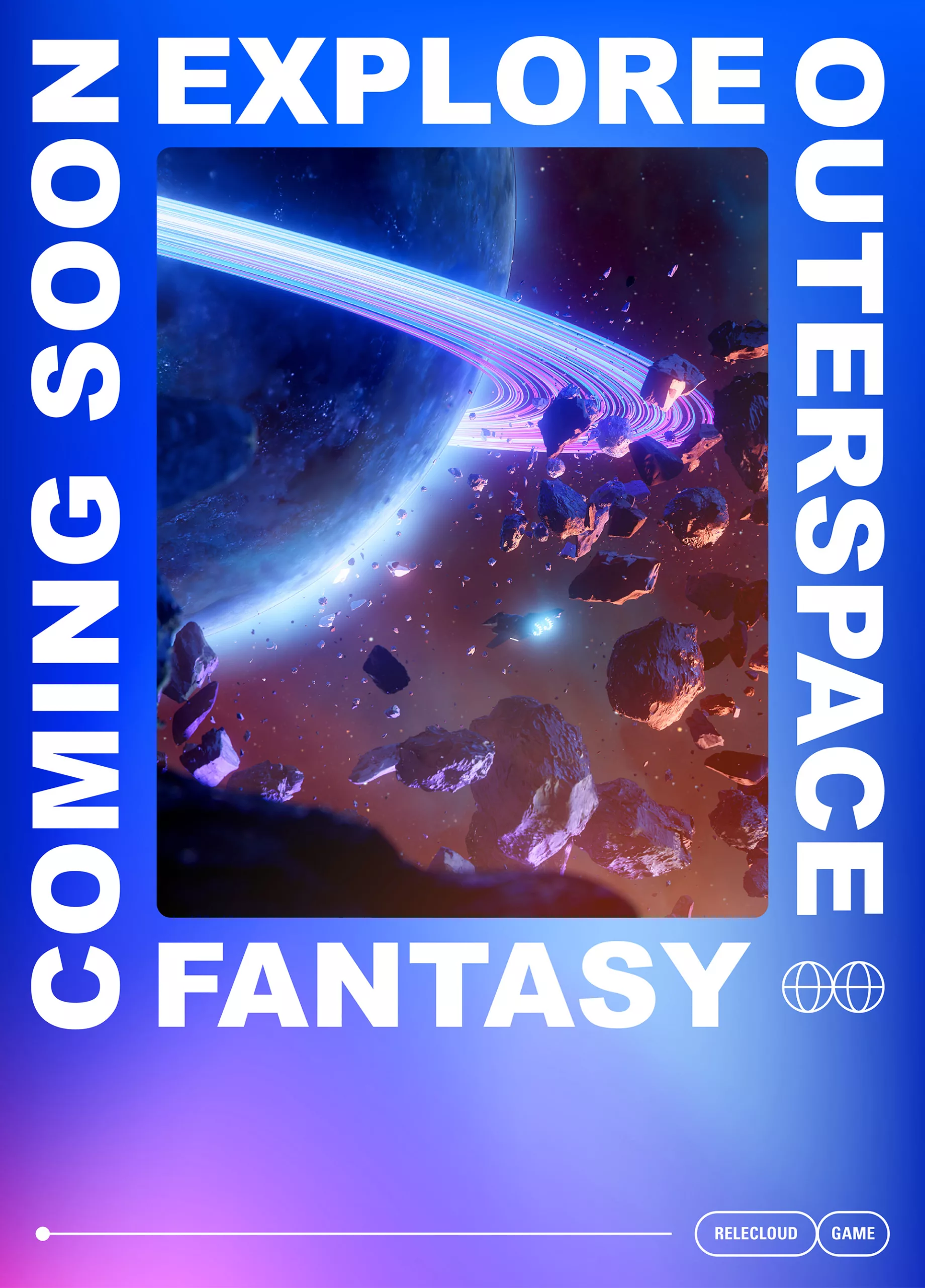
Horizon Hopper - Gamer
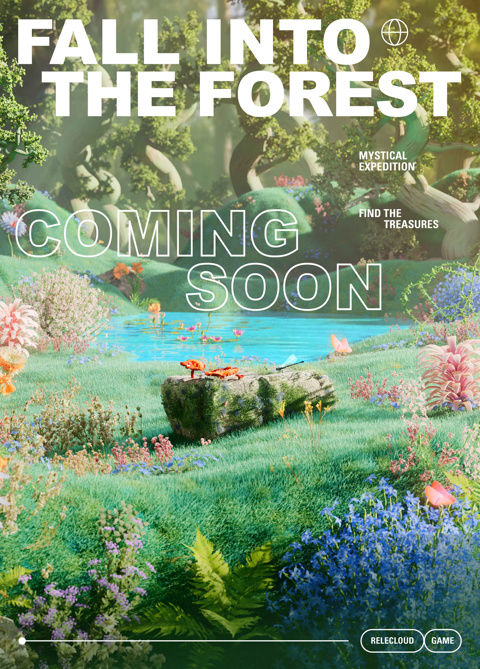
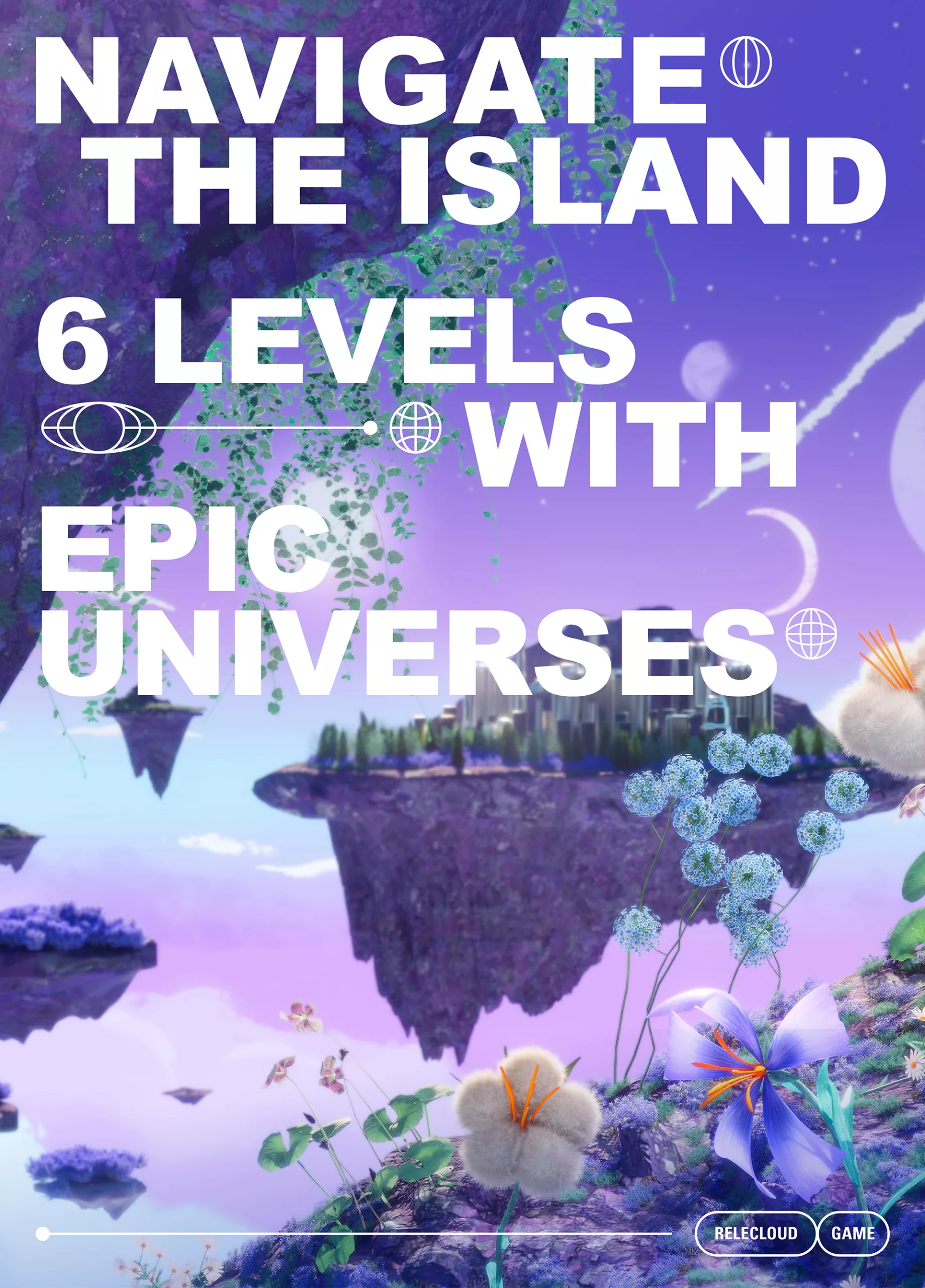
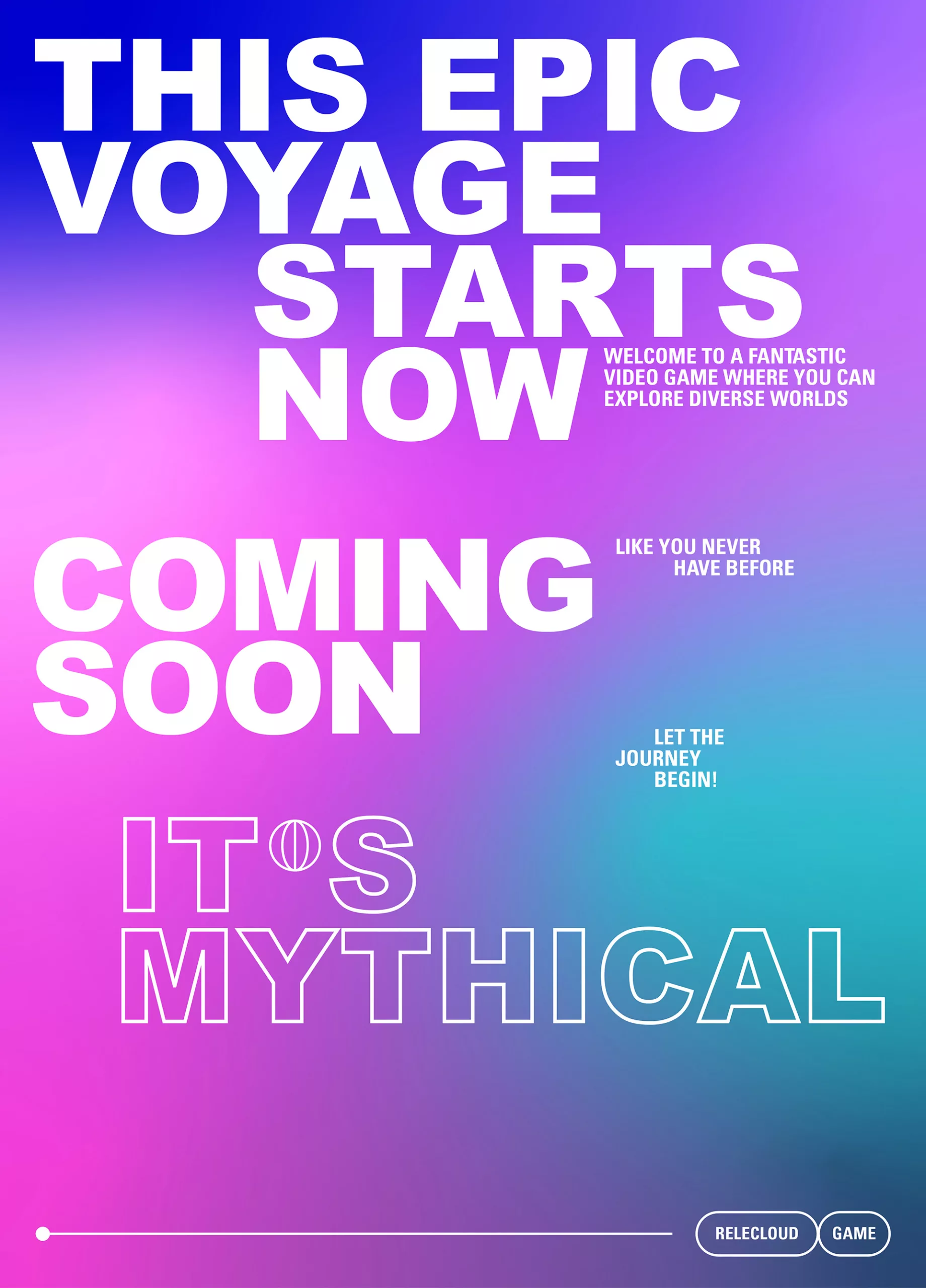
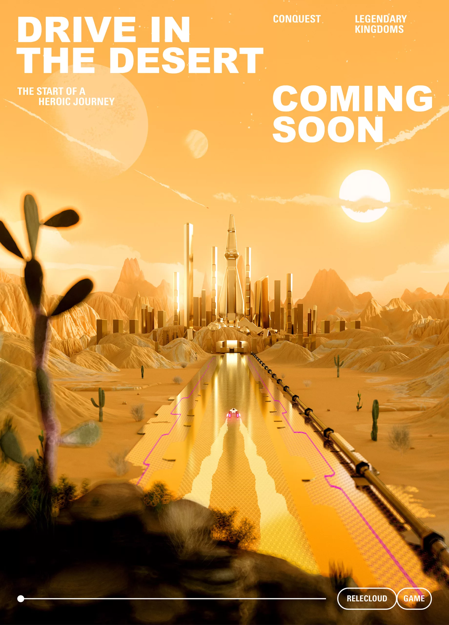
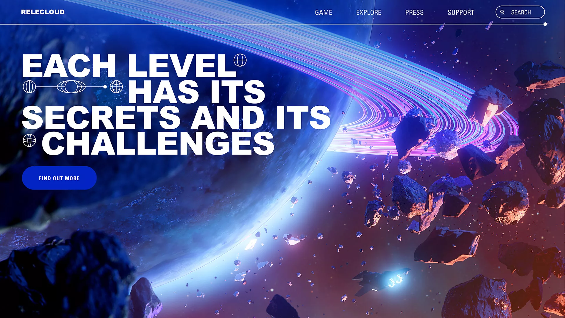
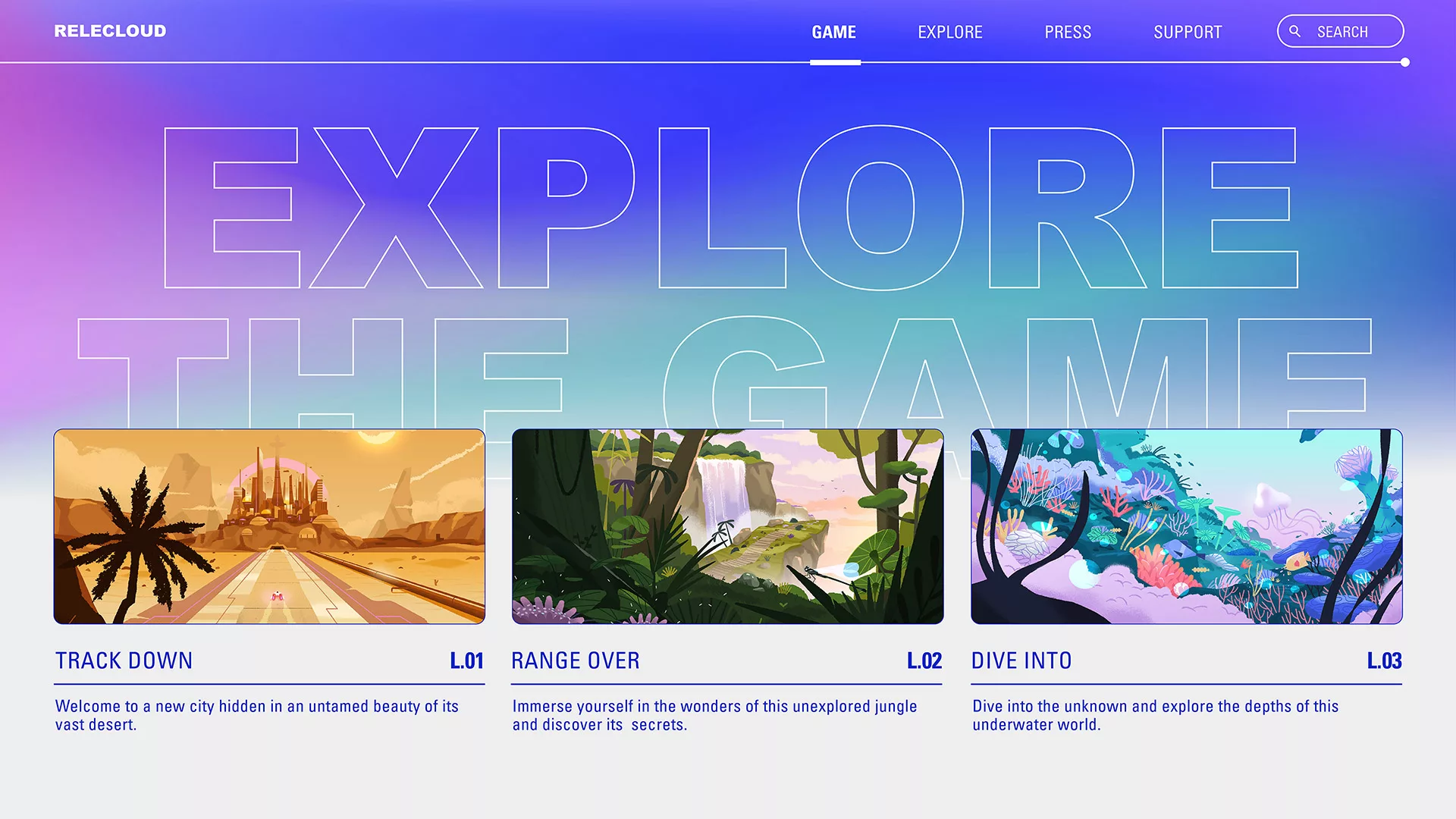
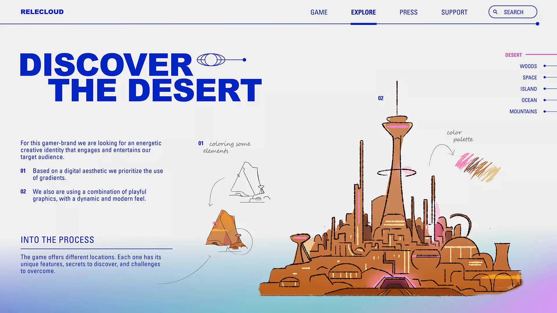
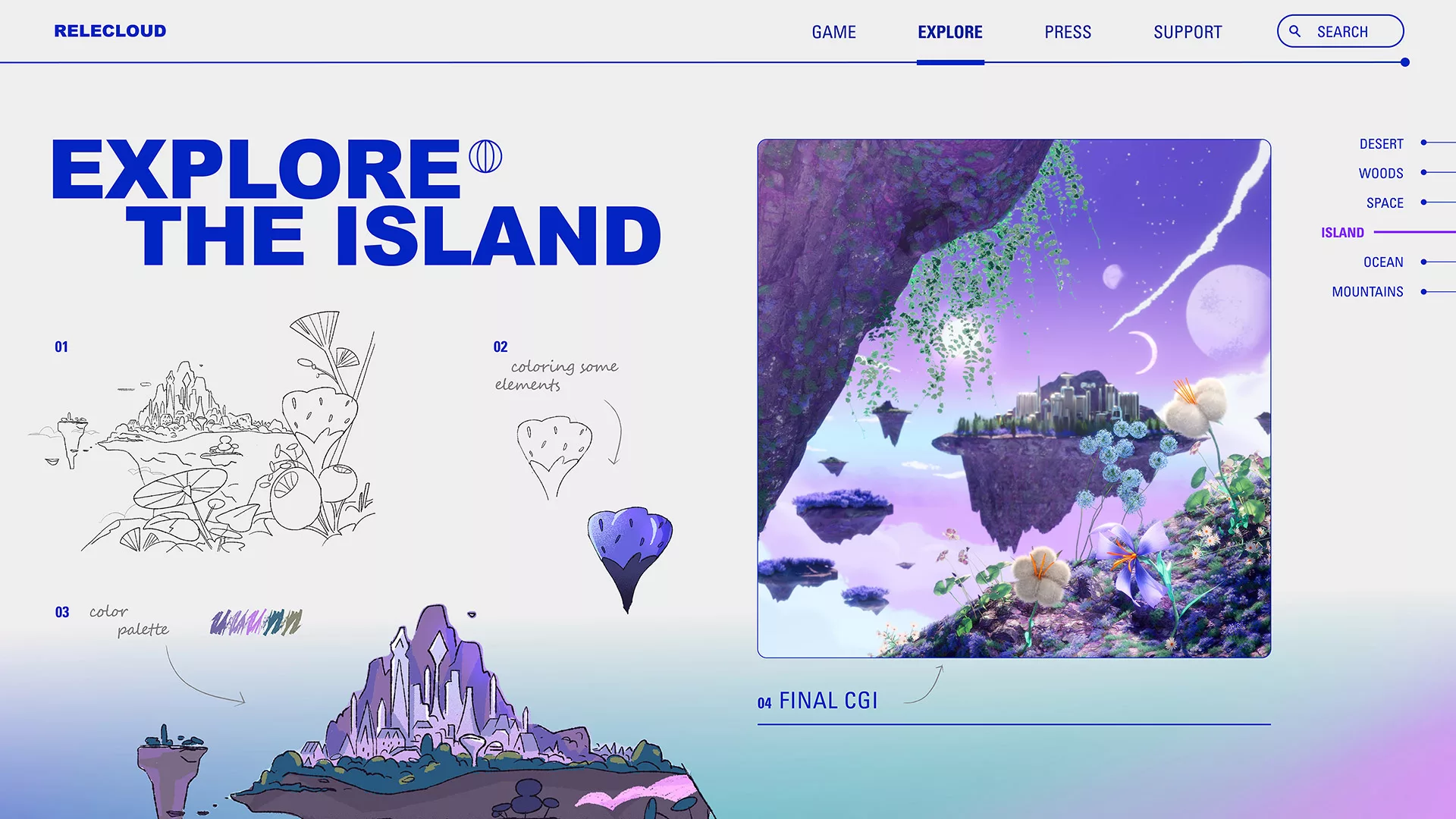
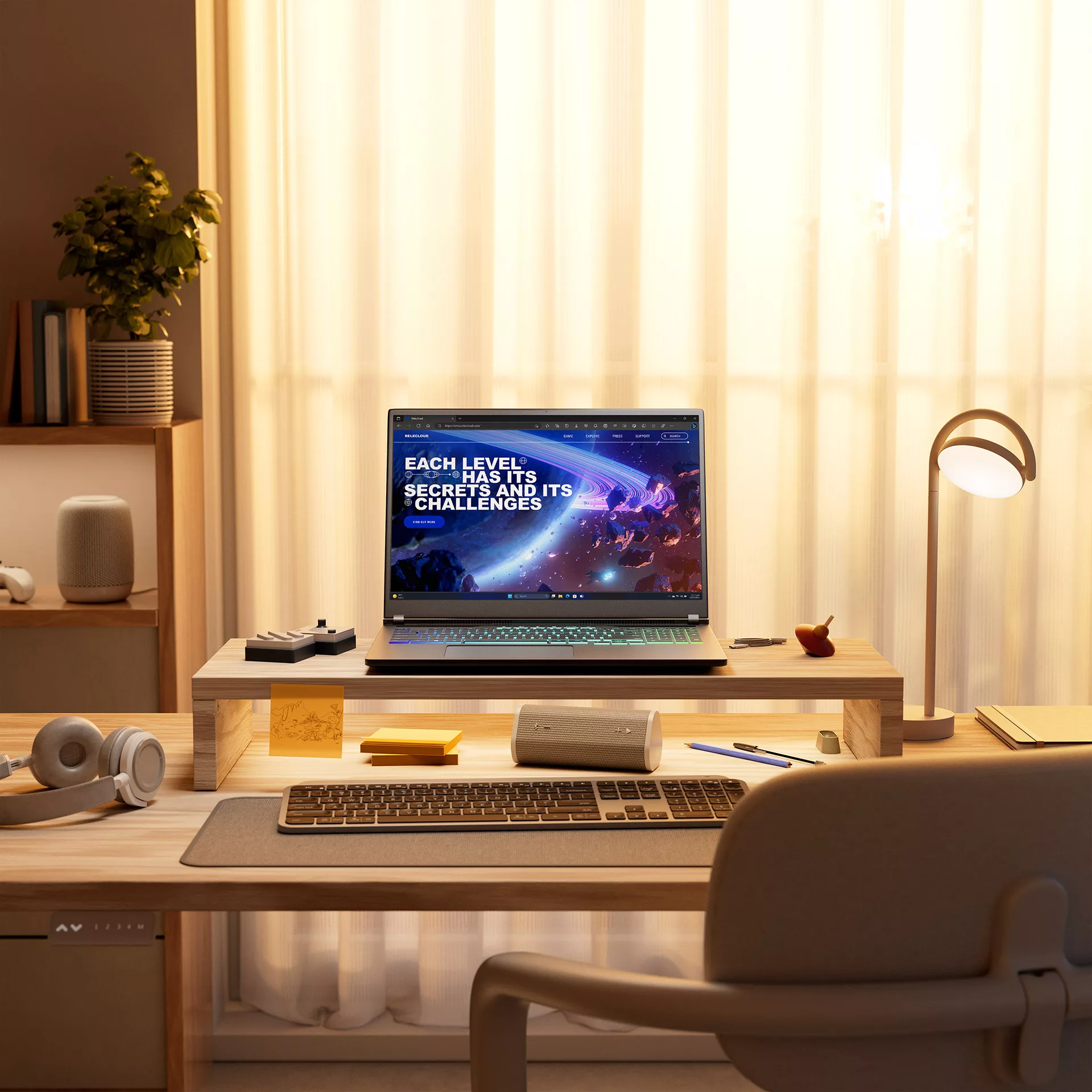
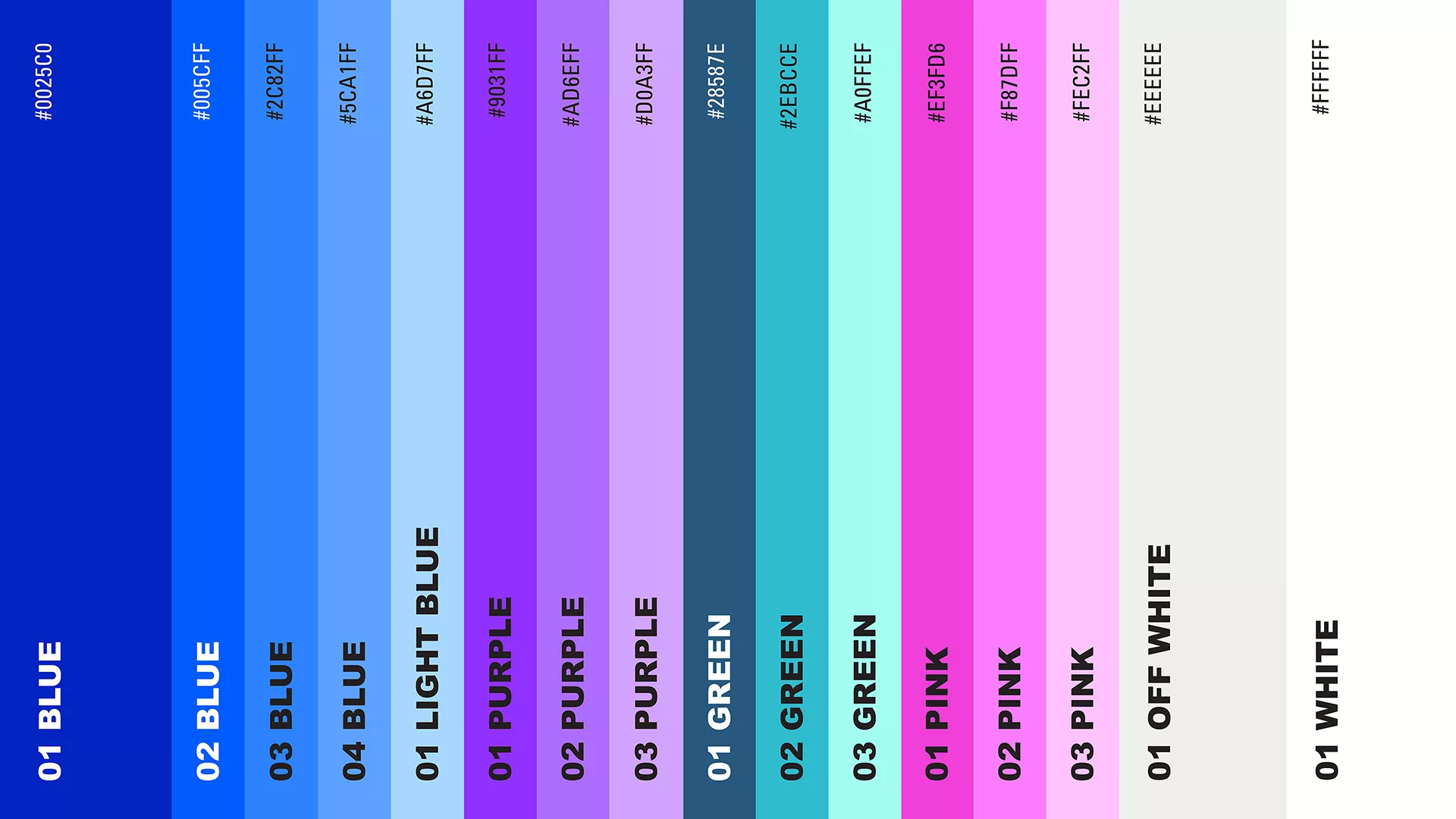
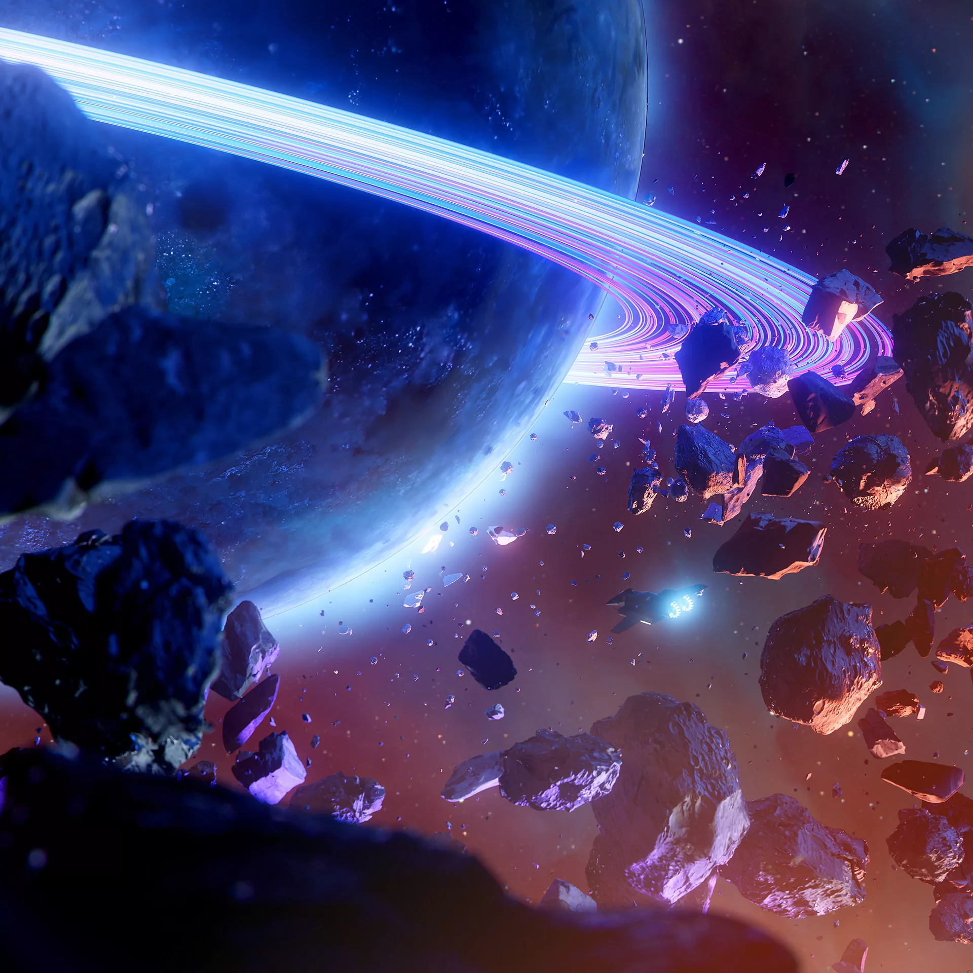
This brand focuses on the Gamer user, seeking an identity that projects energy and creativity to captivate and entertain the target audience. Embracing a digital aesthetic, we emphasize the use of gradients and streamlined typographic layouts.
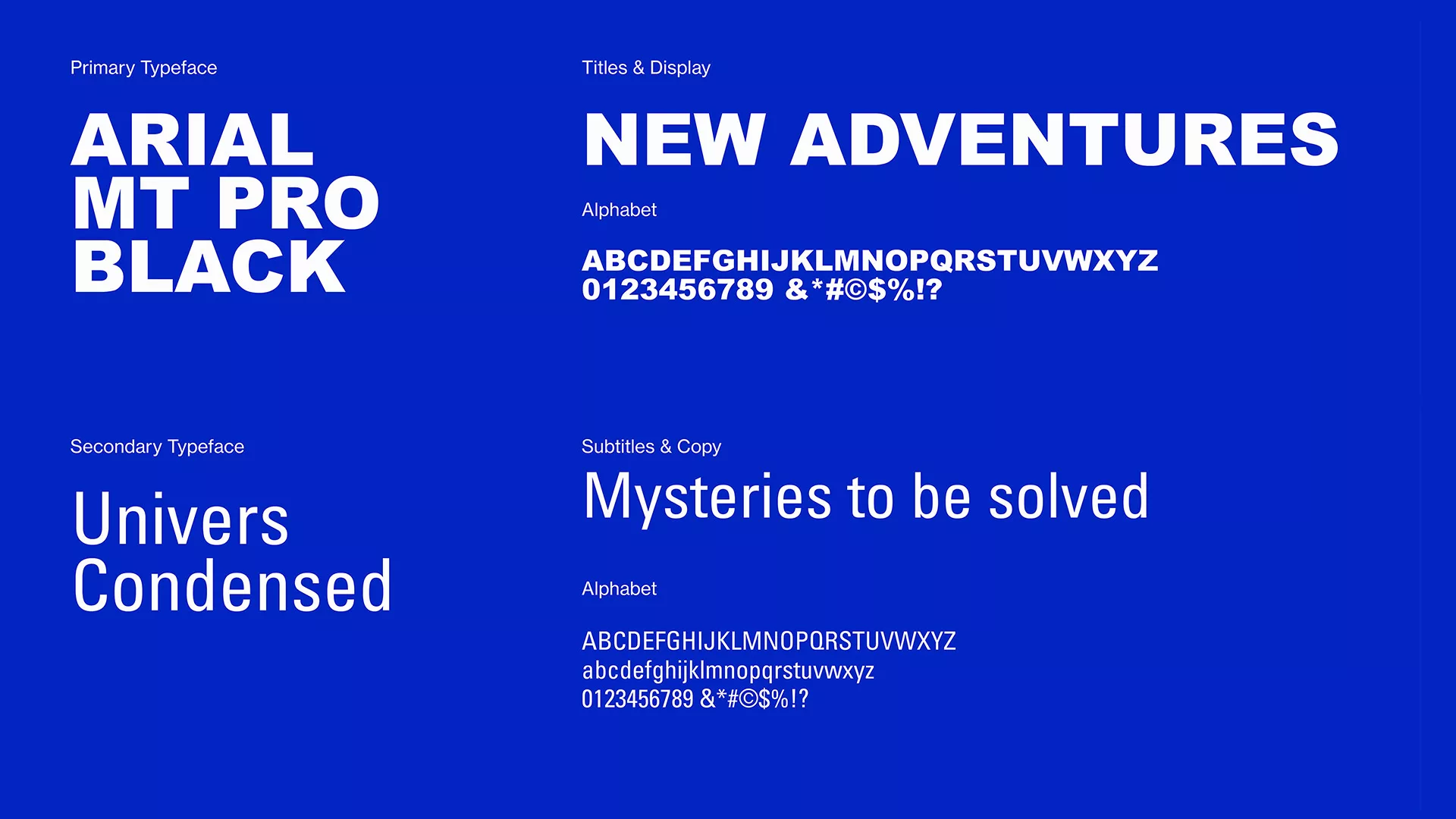
The typography selection comprises bold, uppercase letters paired with a legible sans-serif font, creating a visual impact. The color palette features vibrant hues to offer striking contrast and enhance aesthetic appeal.
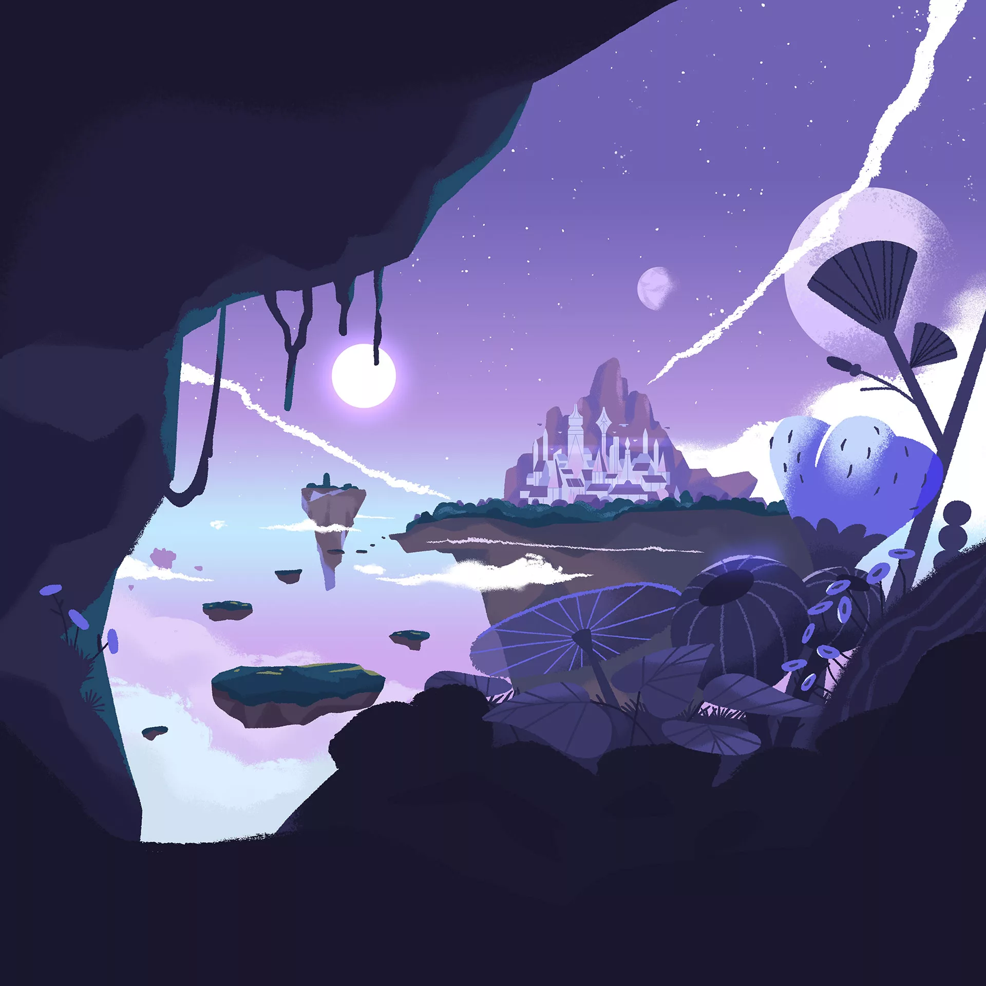
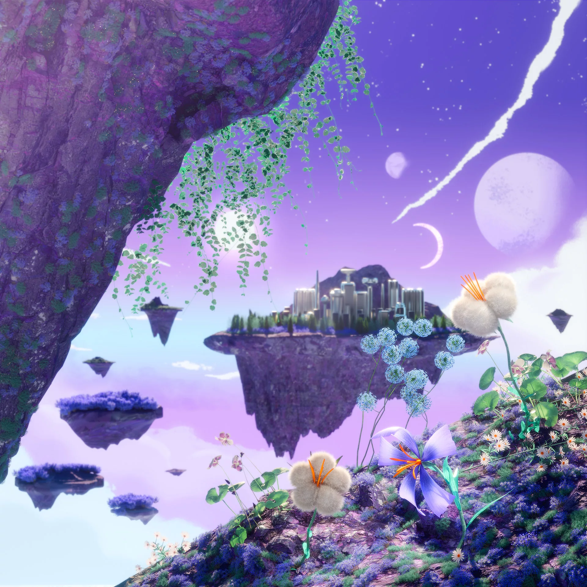
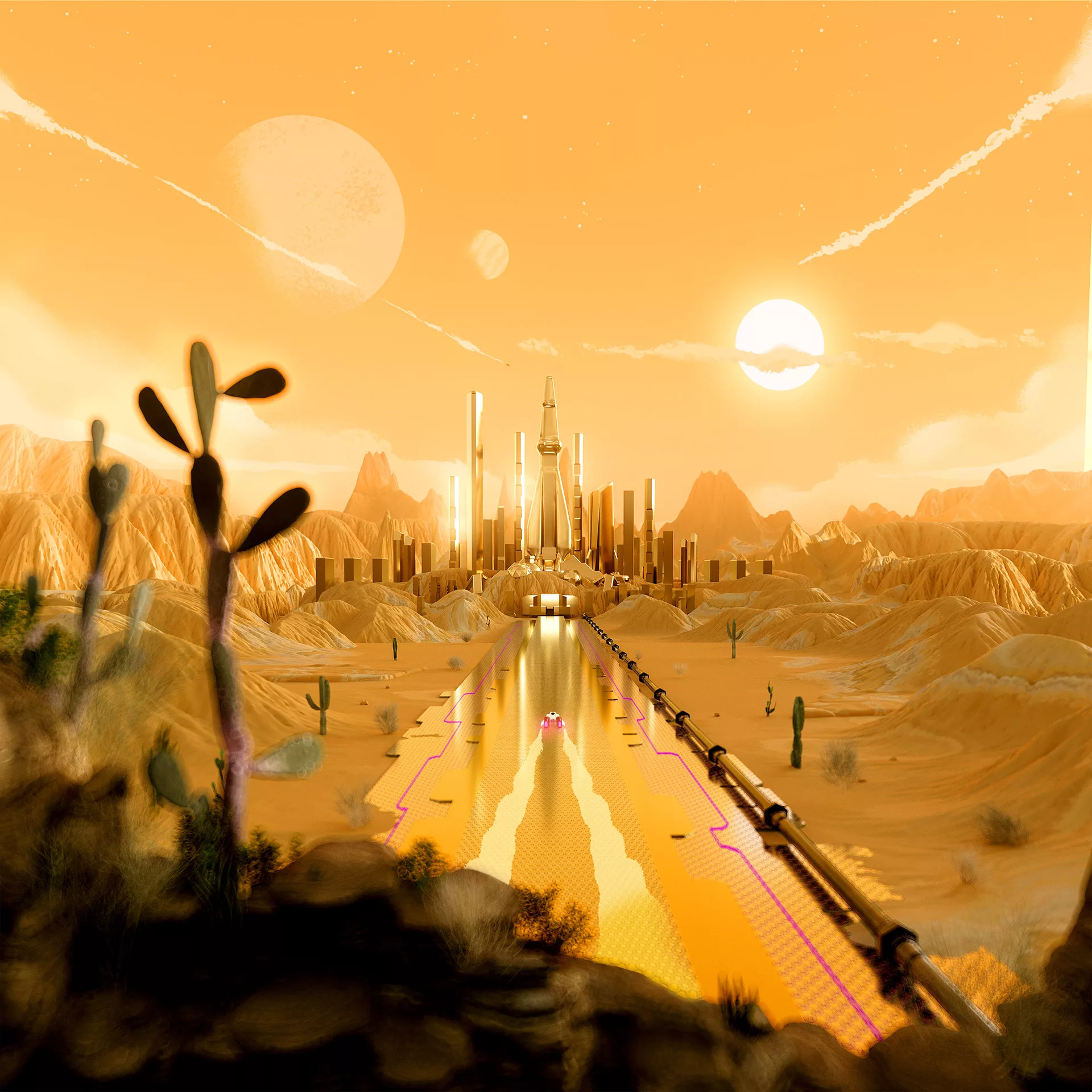
Given the constraints, we creatively curated visuals to offer gamers a glimpse into the captivating world of Horizon Hopper. In addition to branding, we've meticulously crafted the web landing page and other sections, strategically employing vibrant imagery and dynamic backgrounds. Our goal is to immerse visitors in an online experience that captures the essence of the game's excitement and magnetism.
Credits
A project by NotReal
Creative Direction: Milton Gonzalez, Valeria Moreiro
Executive Production: Roberto Connolly, Larissa Miranda
Creative Project Manager: Martin Orza
Art Direction: Lu Borzi
Animation Direction: Macarena Mosquera
Project Managers: Sofía Lopez Pumarega, Tamara Conforti
Talent Manager: Lucila Mansur
3D Design: Vitor Texeira, Juan Cioffi, Flor Tasso, Jose Llano, Friedrich Neumann, Joan García Pons, Carolina Carballo, Jordi Pages
3D Modeling: Juan Miyagi
2D Design: Flor Piovesanel, Flor Porreca, Rocío Fernandez Fuks, Fede Sanchez, Maria Pia Vivo, Martin Orza, Lu Borzi, Nico Martinetti
Illustration: Loris F. Alessandria, Naida Mazzenga, Sandra Navarro
3D Animation: Macarena Mosquera, Marcus Bakke, Nico Piccirilli, Federico Piccirillo, Jonathan Lindgren, Juan Pablo Sciaccaluga, Pato Molina, Sergio Fuego
2D Animation: Martín Muerza, Pato Molina, Martin Ayerbe, Macarena Mosquera
Rendering: Macarena Mosquera, Juan Cioffi, Vitor Texeira
2D Compositing & Color Grading: Lu Borzi, Flor Piovesanel, Martin Orza
Compositing & Color Grading: Mauricio Navas, Milton Gonzalez
Sound Design: Fabrizio Martini
Client: Microsoft
Windows Creative Director: Samuel Clarke
Windows Art Director: Jorge Concha Minguet
Windows Sr. Producer: Summer Zimmerman
Director of Windows: Karina Vivas
Windows Sr. Integrated Marketing Managers: Ricky Cardin
Windows Sr. Integrated Marketing Manager: Kerri Lazur
Windows Creative Project Manager: Katrina Tolentino
Year: 2023
